
Roland Nicolai
Brand Identity Design for Copywriter Roland Nicolai
Toy Creative developed the brand identity for Roland Nicolai, a copywriter based in Watford, Hertfordshire. The project focused on creating a confident and professional visual identity that reflects Roland’s expertise in writing, storytelling and strategic communication.

Page turning power
-
Roland Nicolai required a brand identity that would support his work as a professional copywriter and creative consultant.
The goal was to create a visual identity that communicates clarity, confidence and professionalism while remaining flexible enough to work across his website, digital communications and marketing materials.
-
Toy Creative developed a clean and confident logo that reflects the precision and creativity associated with professional writing.
The design uses strong typography and simple graphic elements to create a brand that feels modern, intelligent and distinctive.
-
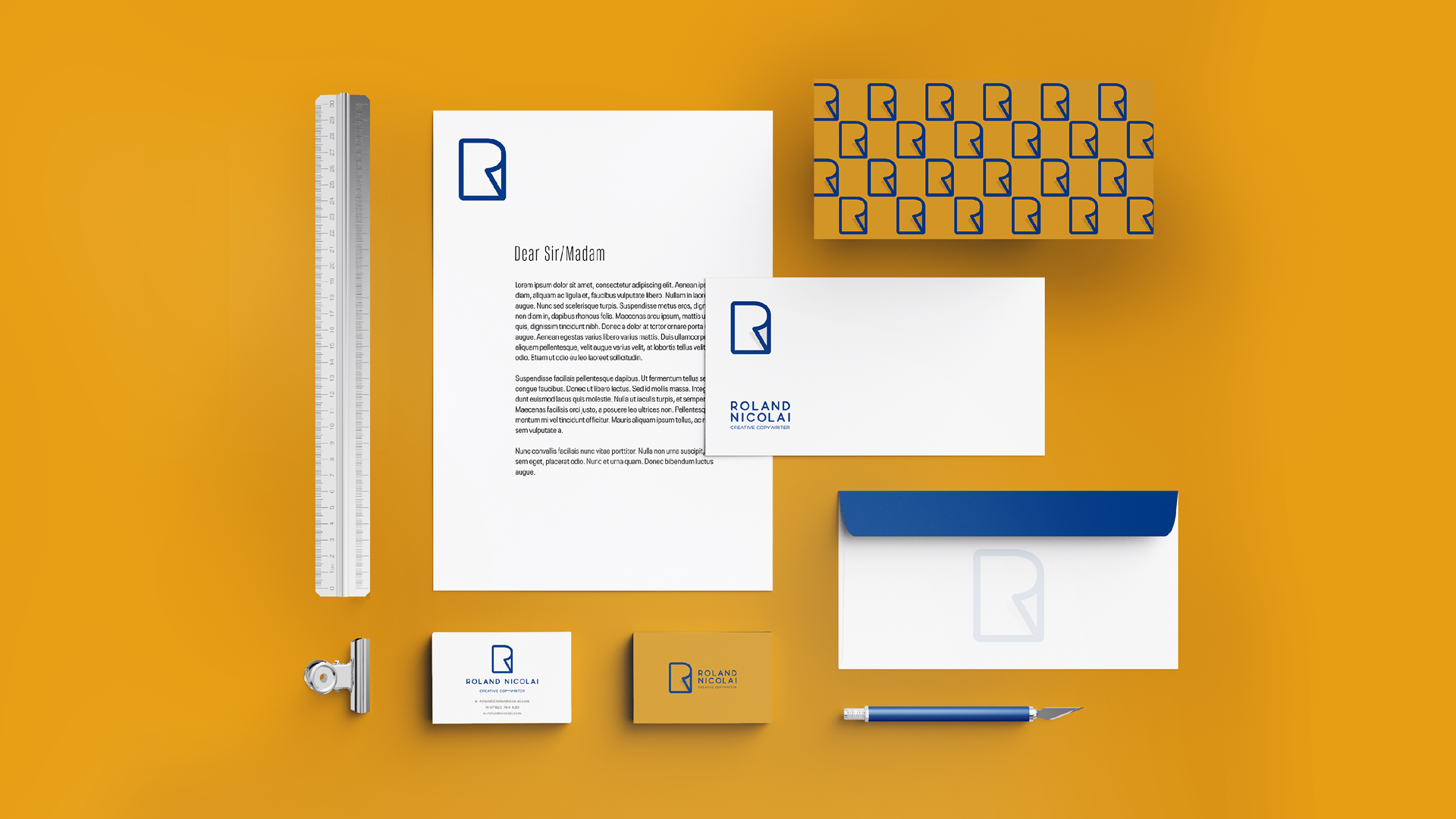
The identity was designed to work across multiple touchpoints including:
website branding
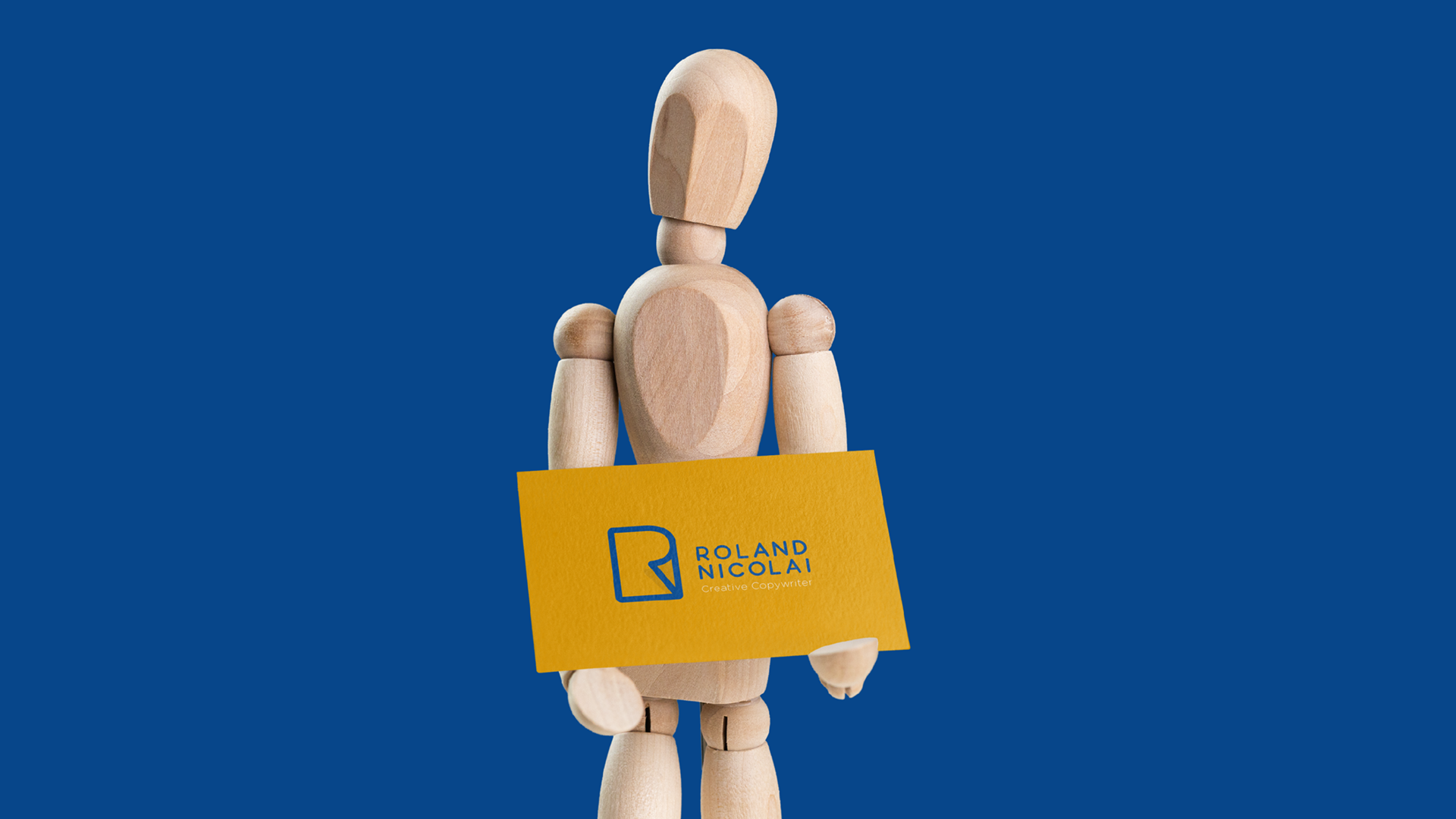
business cards and stationery
marketing materials
digital communications
This ensures the Roland Nicolai brand remains consistent across all platforms.
-
The final identity gives Roland Nicolai a confident and professional brand presence that supports his work as a copywriter.
The project also highlights Toy Creative’s experience working with creative professionals and businesses across Watford and Hertfordshire.

-
York based photographic studio Smart Sights tasked us at Toy Creative with creating a logo and branding identity that represents their huge visual talent. We needed to create a visual that married the great outdoors of Yorkshire with the essential photographers tool- the Camera.
We spent time with Steven first. Observing him shoot, watching him walk the roads and marshes of Yorkshire. We recognised the same essential tools in use each time. A simple DLS camera, with a quintessentially British flat cap adorned. This simple but charming image forms a huge part of what their subjects see in the process, so we created a logo that owned this perfect pairing of essentials.
We took this simple visual and crafted it into a symbol of the brand identity. It meant whether it’s used as a simple pattern or large and bold, the tone is set almost immediately. We coupled this with colours influenced by the tones and hues of the Yorkshire cobbles to complete the identity. Theres something really disarming about the relaxed demeanour of this photography team, something we really wanted to get across in the identity.