
Rob Ackerman
Brand Identity Design for London Sound Engineer Rob Ackerman
Toy Creative developed the brand identity for Rob Ackerman, a London-based sound engineer working across music production, recording and live events. The project focused on creating a bold and professional visual identity that reflects the precision, creativity and technical expertise associated with sound engineering.

Making the brand personal
-
Client: Rob Ackerman
Industry: Music Production / Sound Engineering
Services: Brand identity design, logo design, visual identity
Location: London, UK -
Rob Ackerman required a personal brand identity that would support his work as a professional sound engineer.
The identity needed to communicate both the technical precision of sound engineering and the creative energy of music production, helping establish a recognisable presence within the industry.
-
Toy Creative developed a logo and visual identity inspired by the world of audio and sound production.
The design uses bold typography and structured graphic elements that reference sound waves and audio engineering, creating a brand that feels both technical and creative.
-
The identity was designed to work across a variety of touchpoints including:
website branding
digital marketing materials
promotional graphics
social media content
This ensures the Rob Ackerman brand remains consistent across both online and offline communications.
-
The final identity gives Rob Ackerman a strong and professional brand presence within the London music and audio production scene.
The project also highlights Toy Creative’s experience creating brand identities for creative professionals across London and the South East.
-
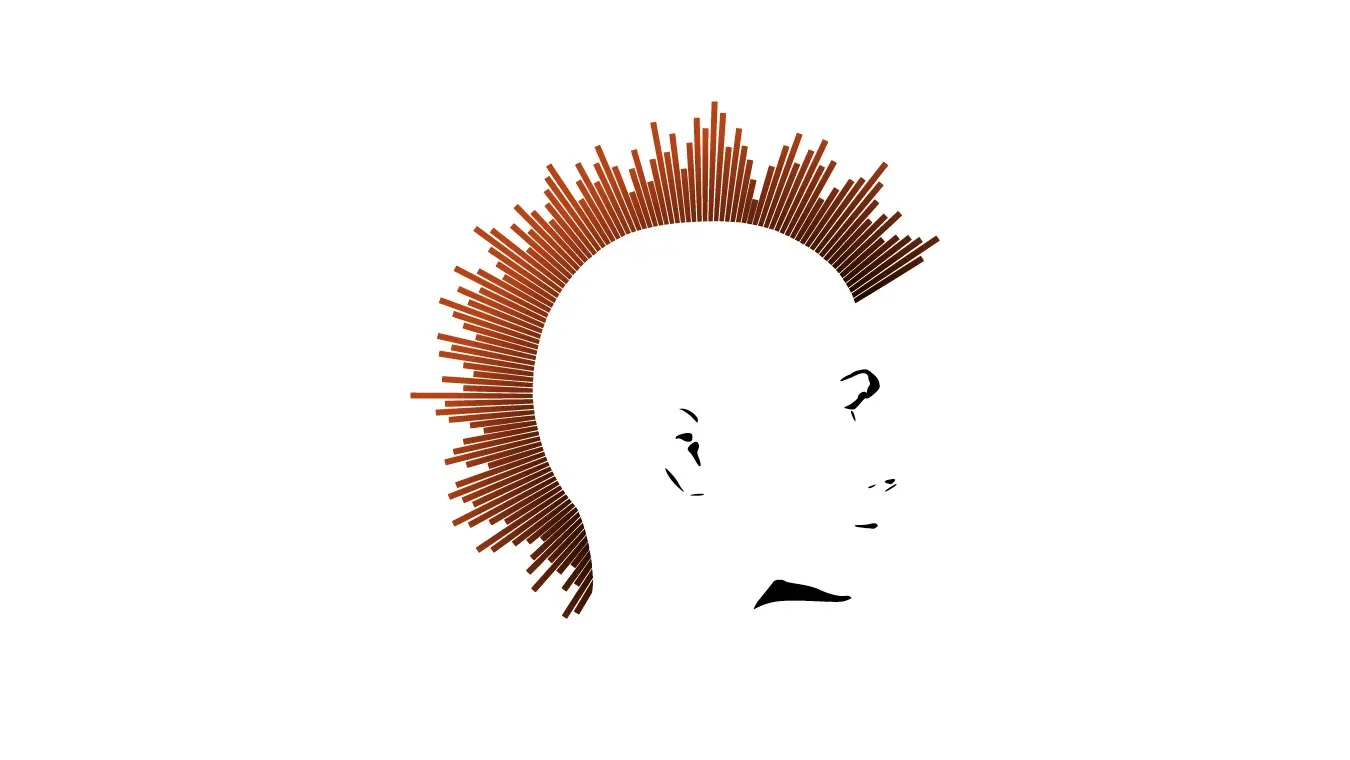
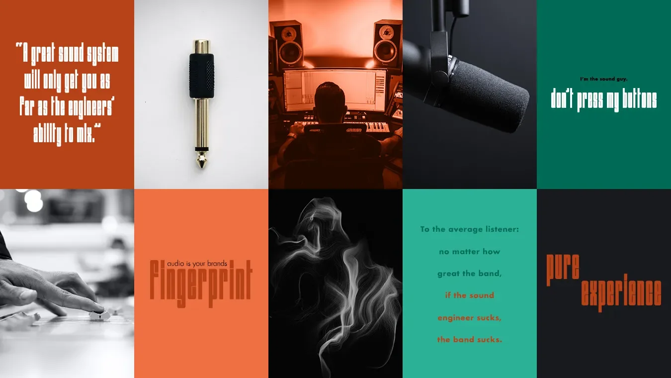
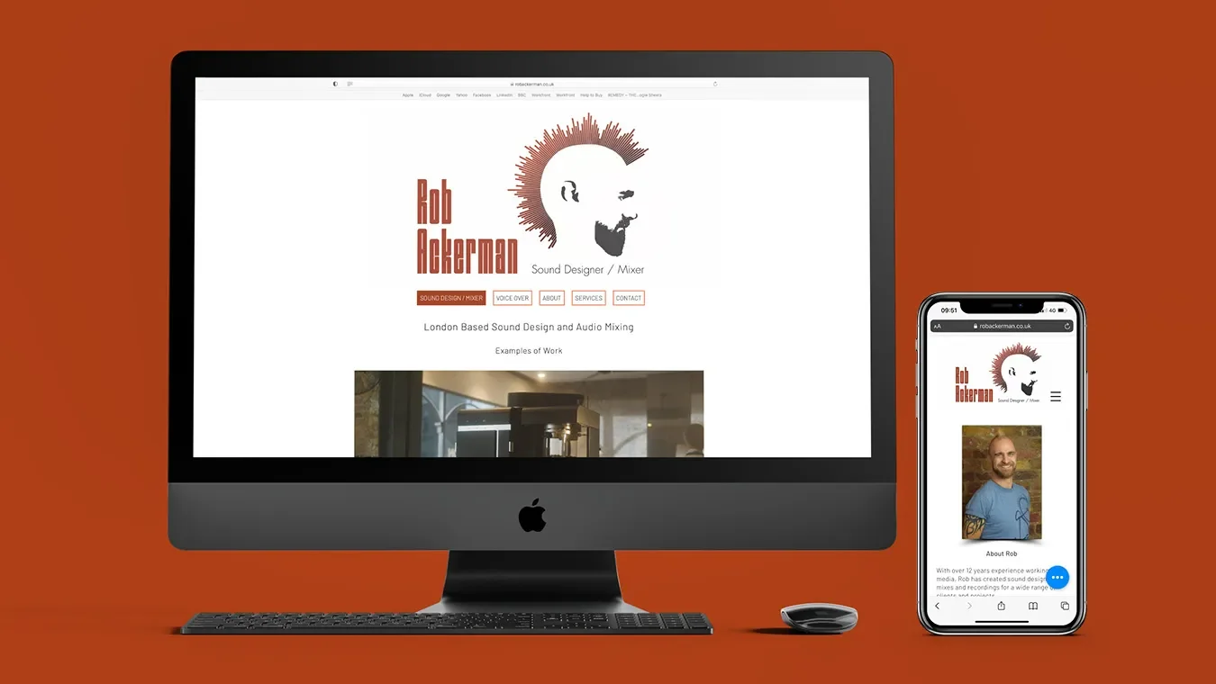
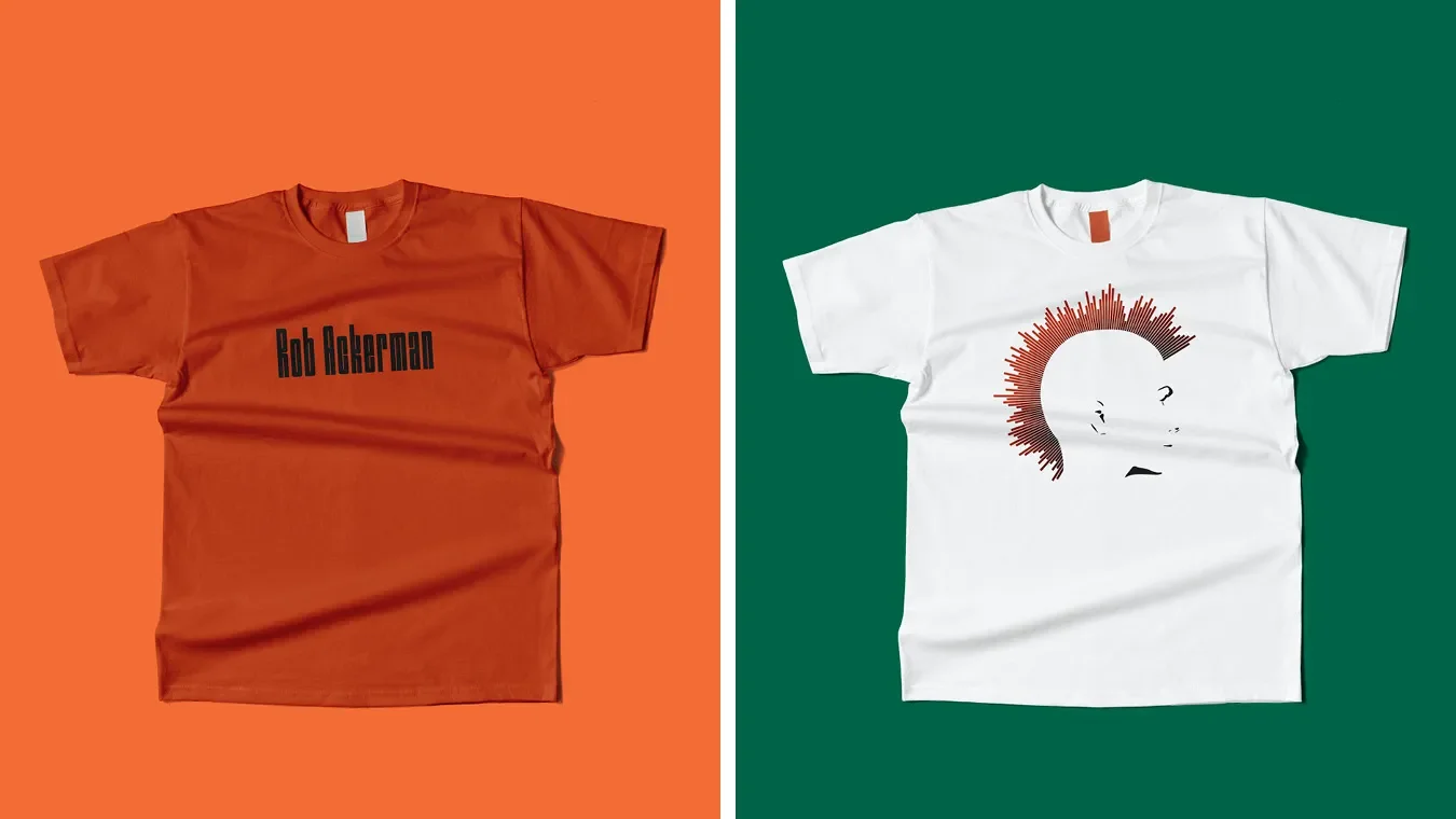
A distinctive brand identity was developed for London based sound engineer Rob Ackerman, with the design centred around his personality and energetic creative style. The logo was created as a side-profile illustration of Rob, instantly recognisable by his signature mohawk. The traditional hair shape was replaced with flowing audio wave lines to reflect his craft and highlight the connection between character and sound. This approach ensured the identity communicated both individuality and technical expertise, aligning perfectly with the London sound engineer identity.
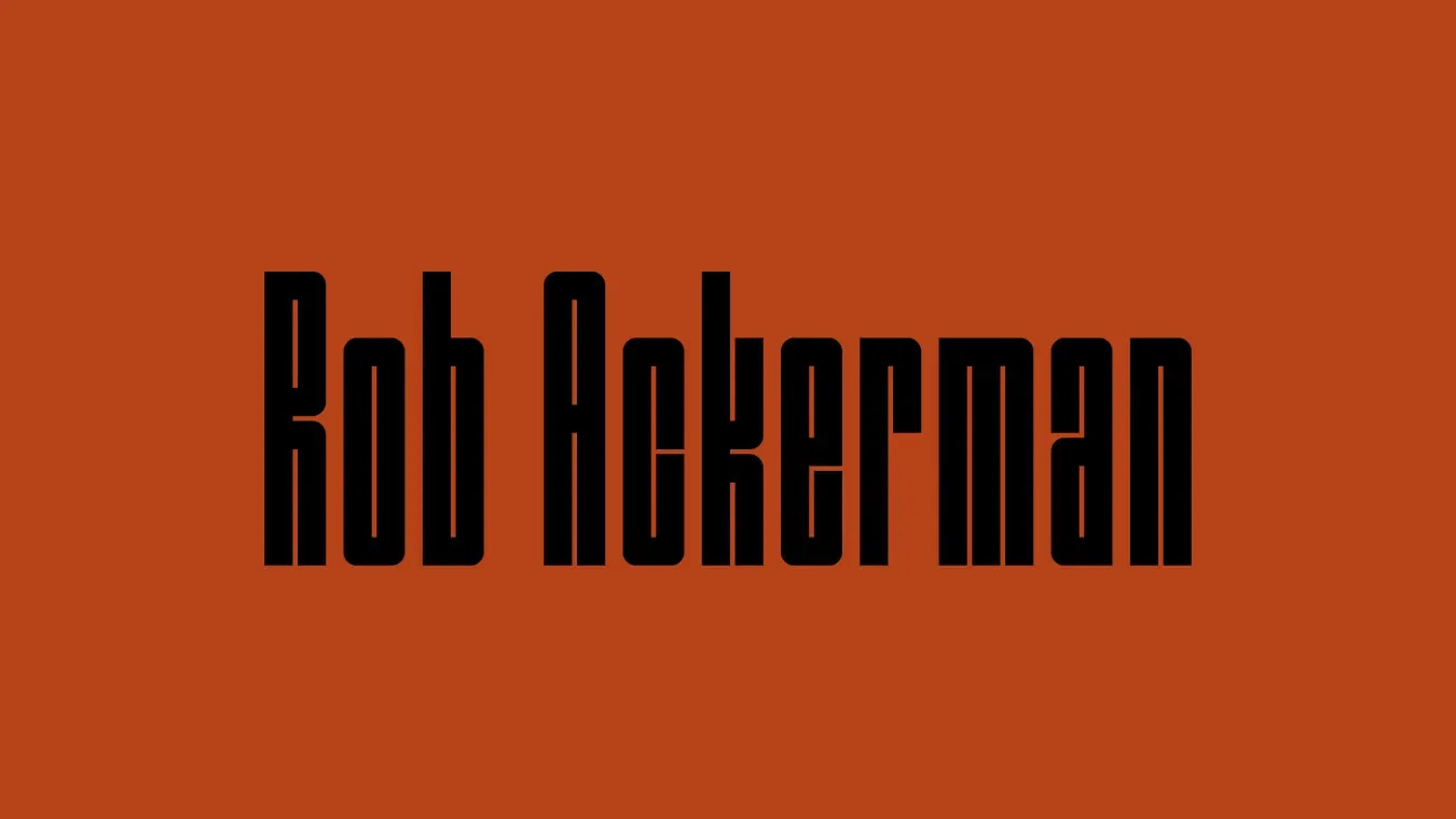
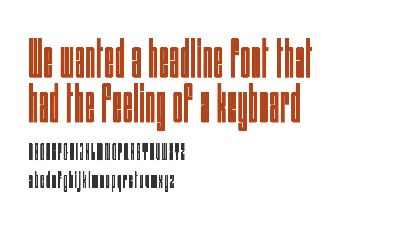
Typography played a key role in supporting the concept. A tall and narrow typeface was selected for his name, chosen specifically for its resemblance to piano keys. This subtle reference to musical structure reinforced Rob’s connection to audio production and complemented the wave-driven illustration. The brand system was kept clean and adaptable so it could be used across digital platforms, promotional materials and recording-studio assets.
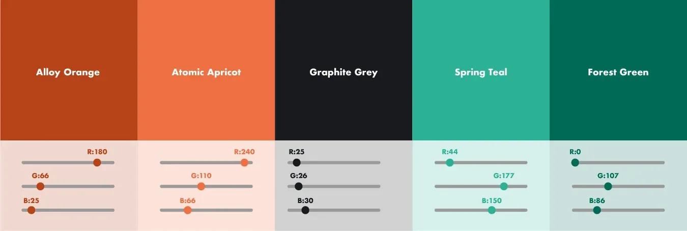
Colour choices and layout decisions were guided by a desire to create a modern and confident presence that would resonate with clients in London’s audio and post-production community. The design was further shaped by Rob’s location on Oxford Street, London, an area associated with creativity, media and entertainment. This influence ensured the identity felt authentic to both his personality and his professional environment.
The completed brand identity provided Rob Ackerman with a cohesive visual presence that celebrates his character, his craft and his position within one of London’s most vibrant creative districts.