
Intokusan
Japanese Restaurant Branding and Identity for Intokusan
Toy Creative created a vibrant brand identity for Intokusan, a sushi restaurant based in Windsor. The project included the development of a bespoke calligraphic logo and supporting visual elements designed to celebrate the craft and energy of Japanese cuisine while appealing to a modern audience.
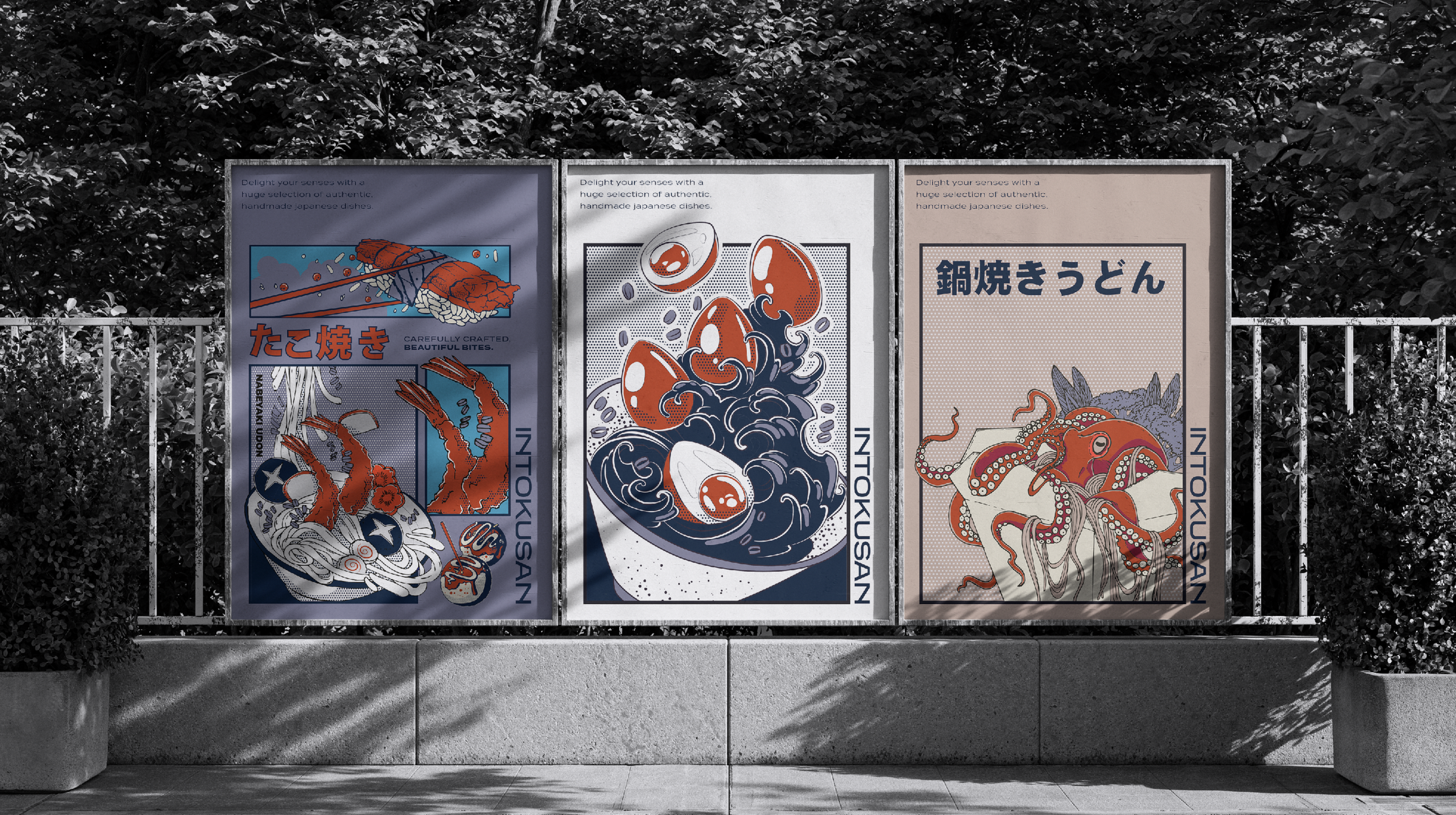
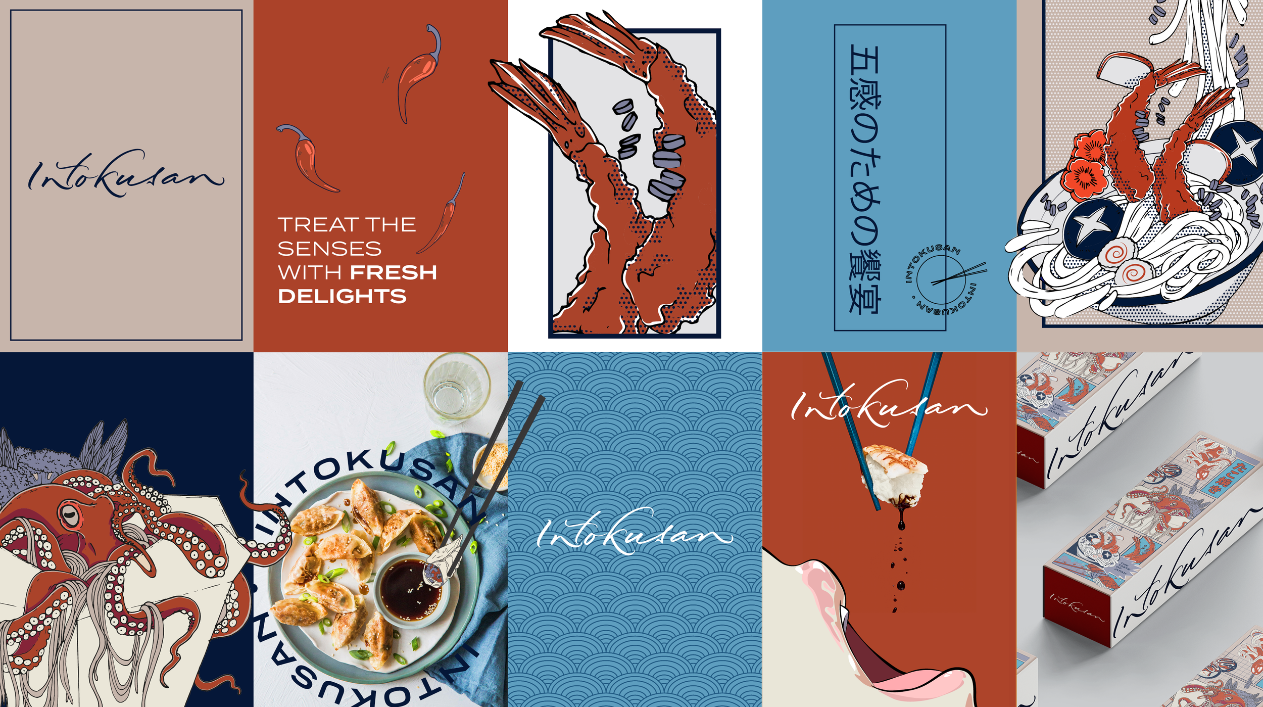
Japanese-inspired branding, drawn by hand
-
Client: Intokusan
Industry: Hospitality / Japanese Restaurant
Services: Brand identity design, logo design, illustration
Location: Windsor, UK -
Intokusan required a brand identity that would capture the energy and artistry behind its sushi offering while helping the restaurant stand out in a competitive dining market.
The new brand needed to celebrate the craft and tradition of Japanese cuisine while presenting a bold and contemporary personality that would appeal to a younger audience.
-
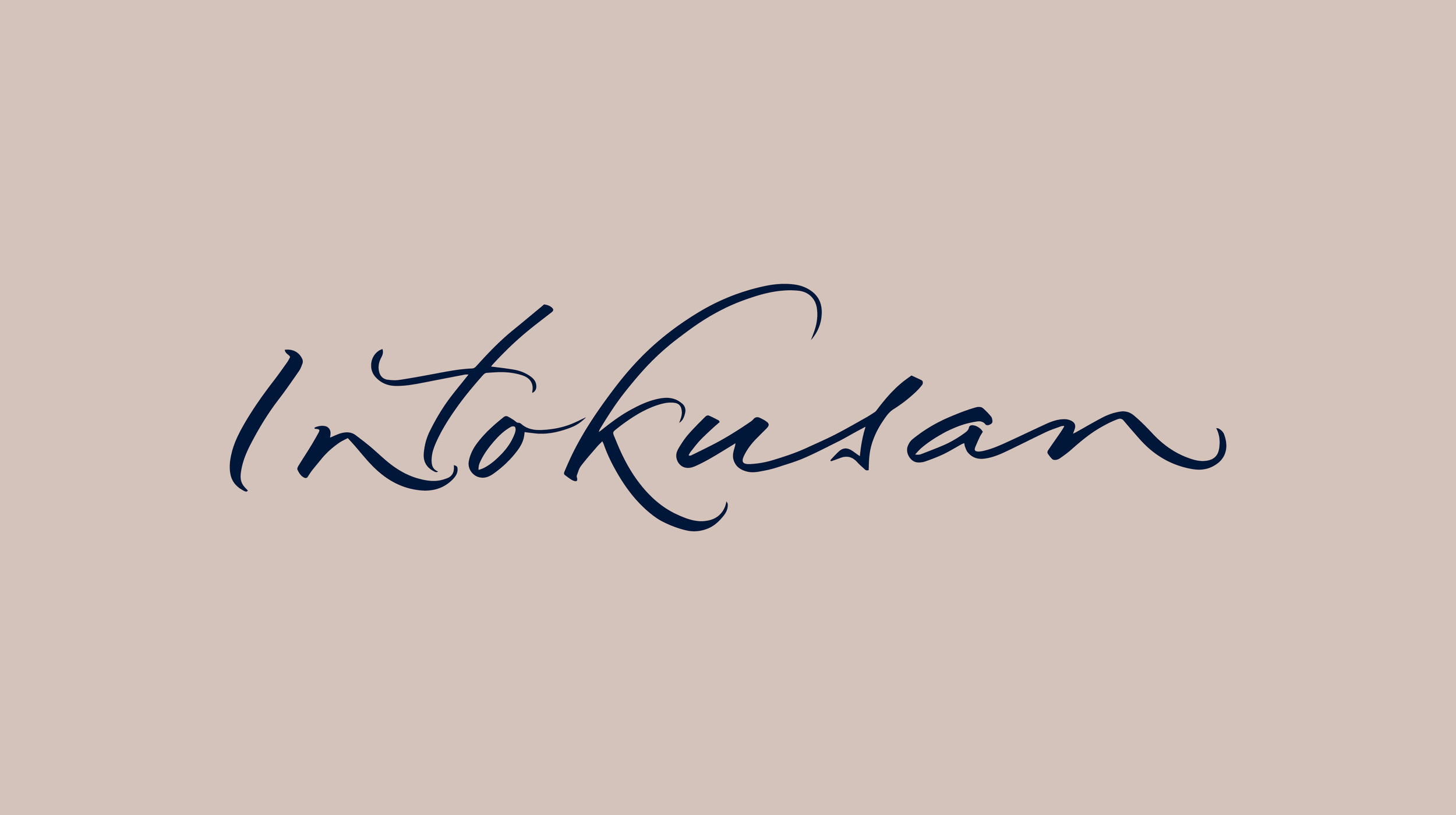
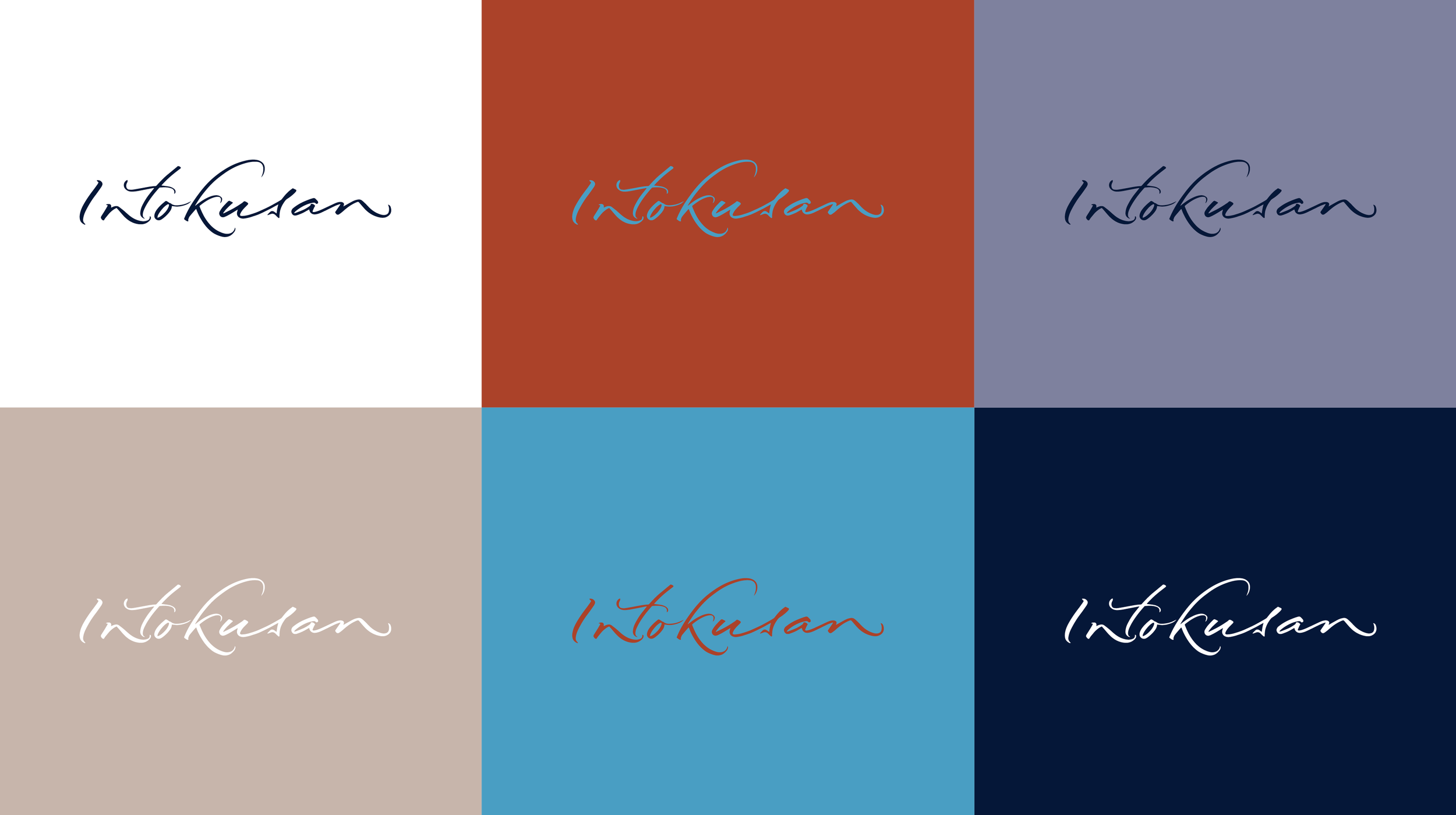
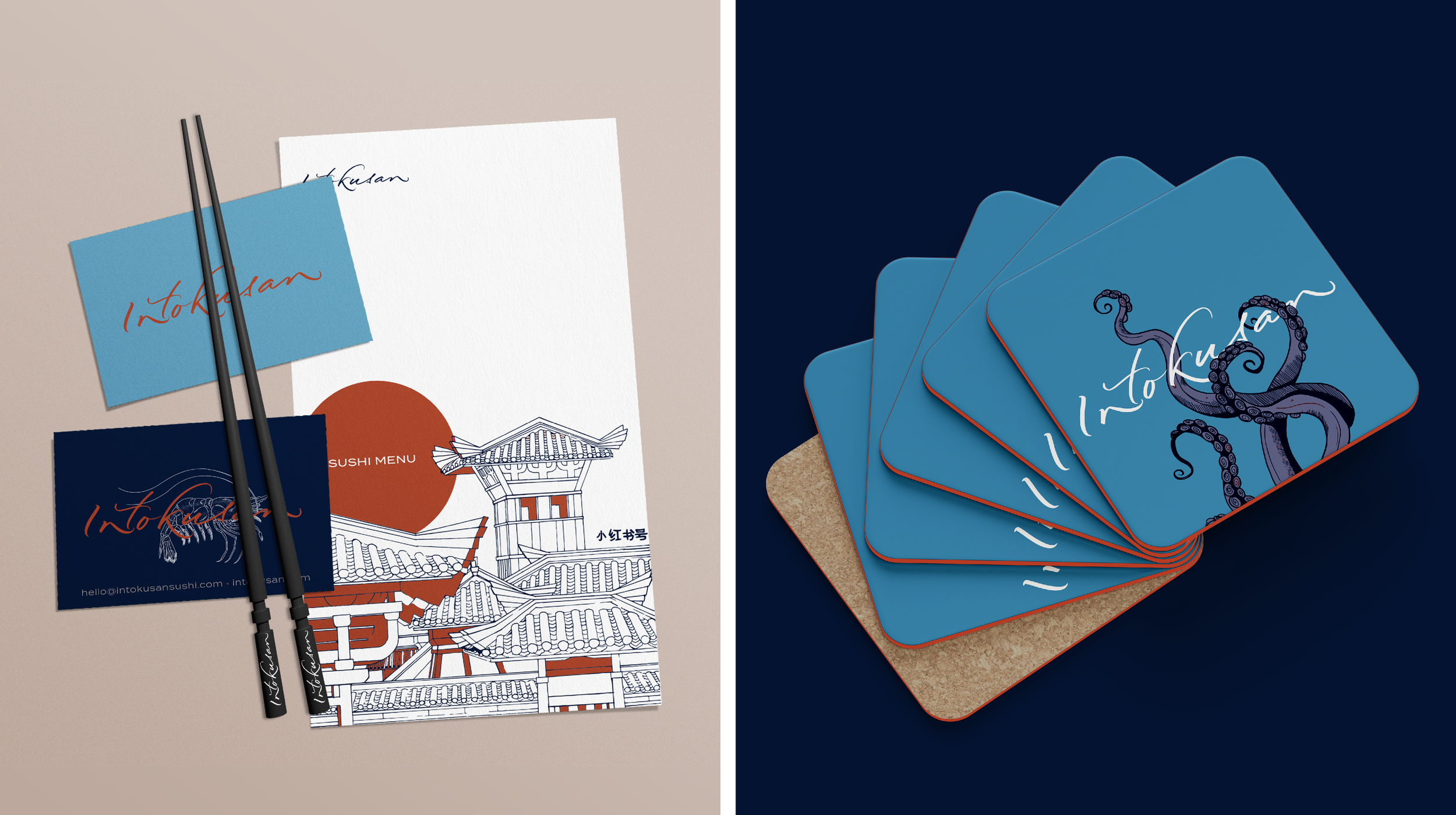
Toy Creative developed a bespoke calligraphic logo that reflects the precision and artistry associated with Japanese food culture. The typography was designed to convey movement and craft while remaining clear and versatile across different brand applications.
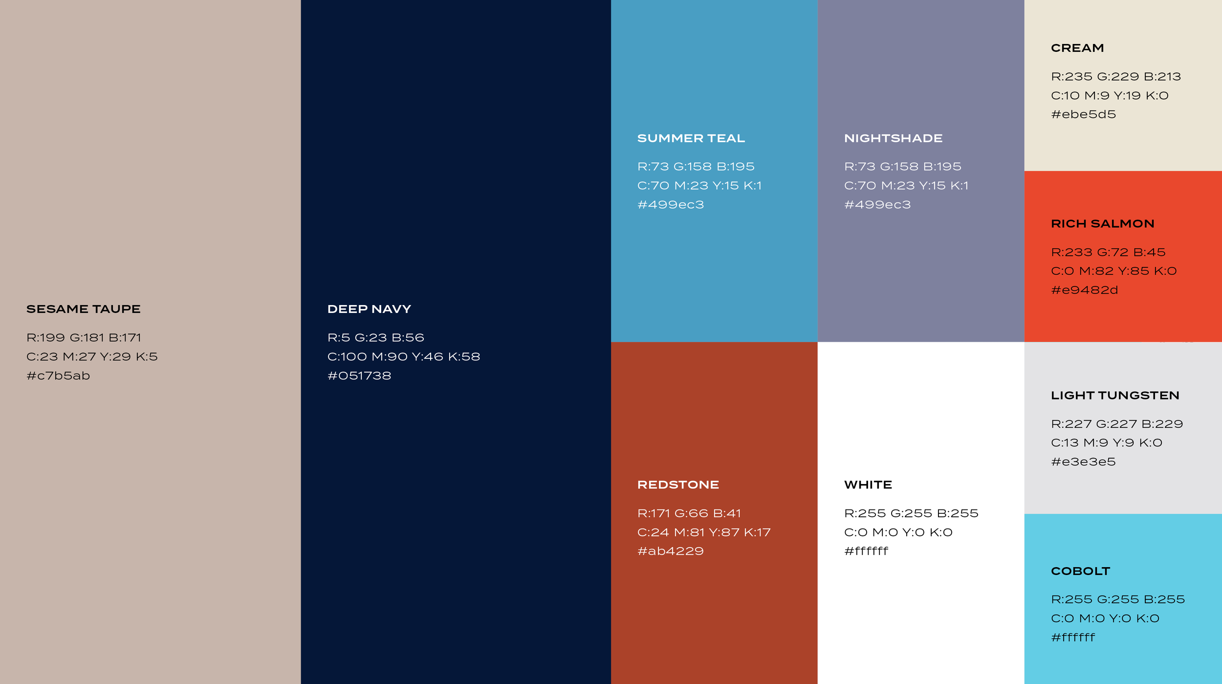
The visual identity balances traditional influences with a modern graphic style, helping the brand feel authentic while remaining accessible to a wide audience.
-
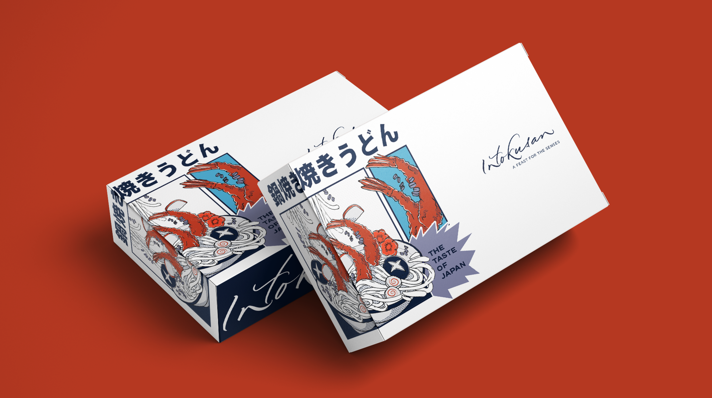
To reinforce the personality of the brand, we introduced anime-inspired illustration elements that bring energy and character to the visual identity.
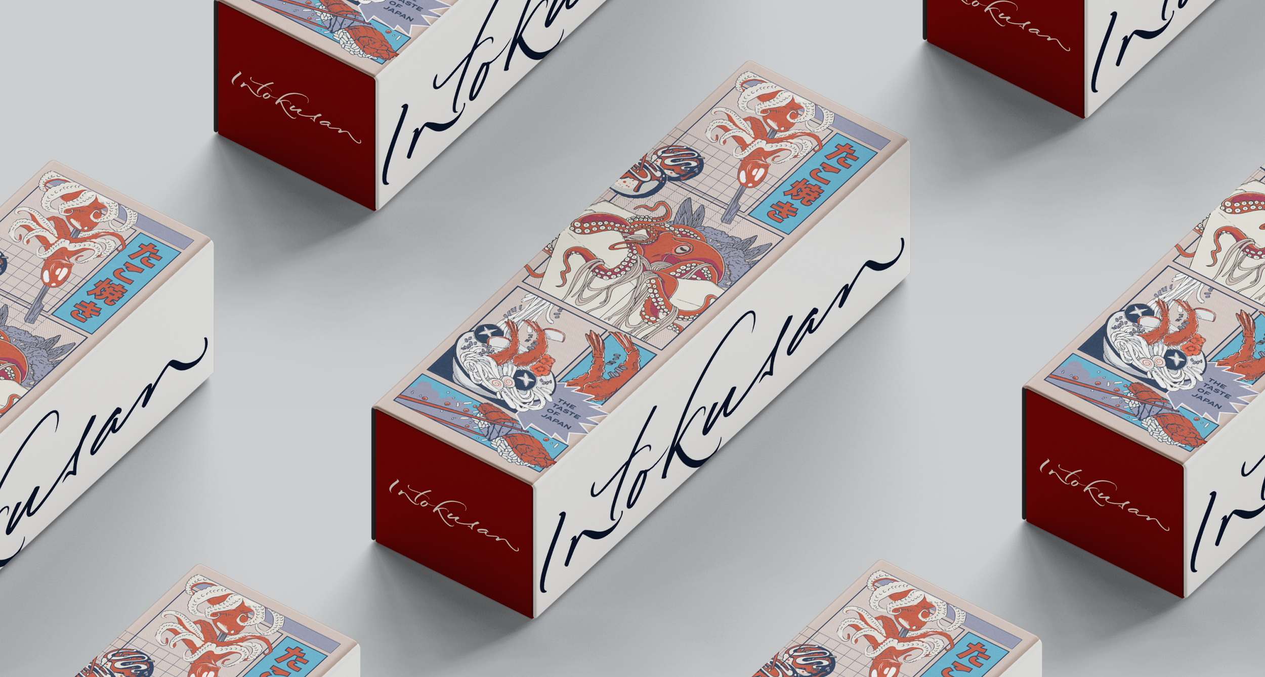
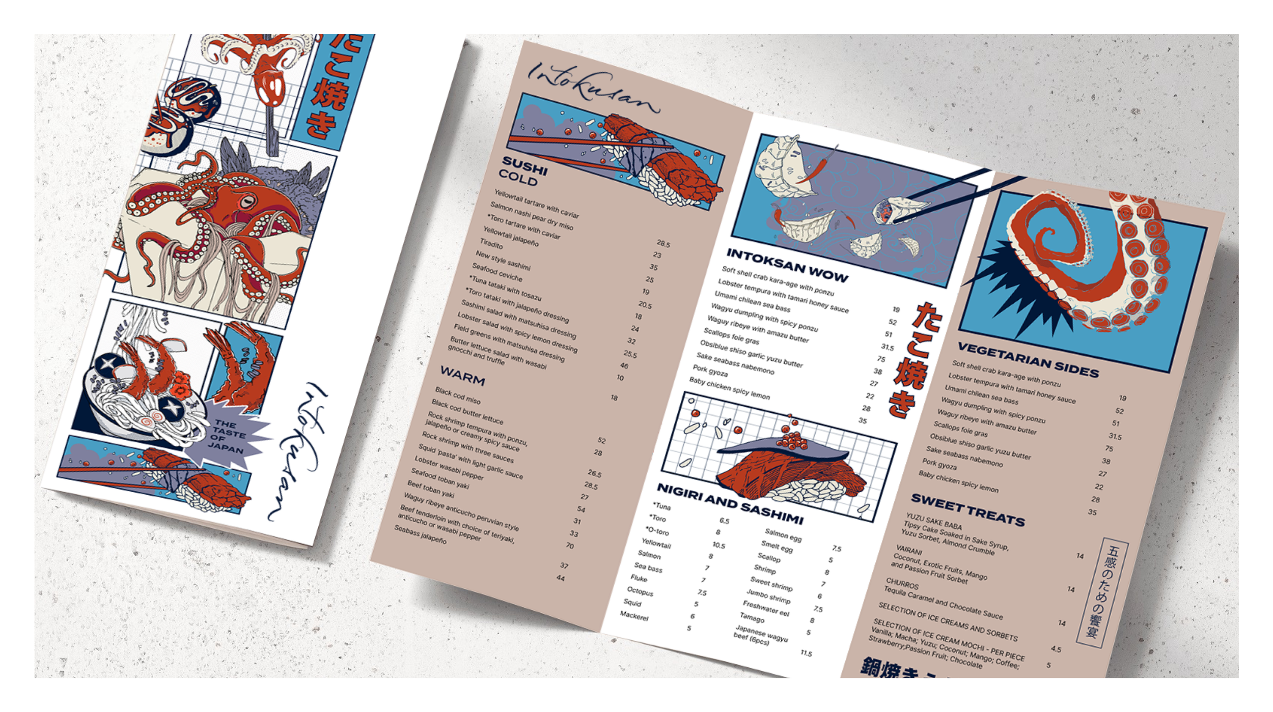
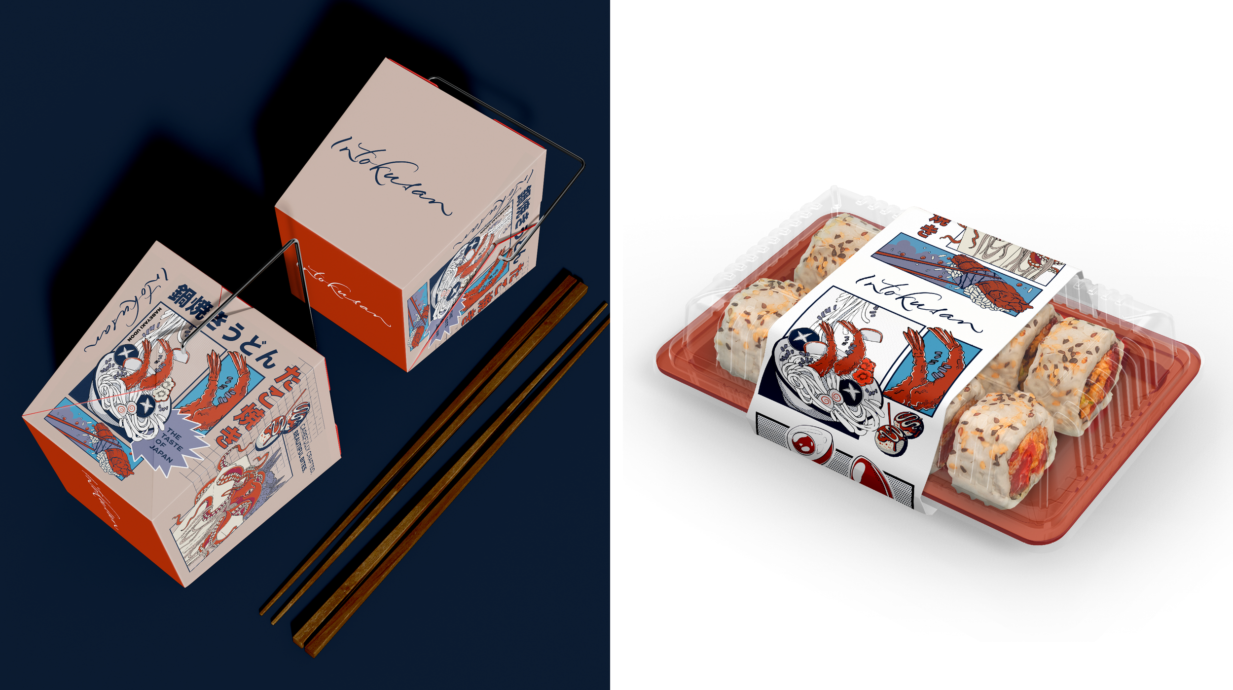
These illustrations provide flexible graphic assets that can be used across menus, packaging and promotional materials, helping the restaurant create a distinctive and memorable presence.
-
The identity was designed to work across a range of touchpoints including restaurant signage, menus and marketing materials.
By combining bold typography with playful illustration, the brand captures the vibrant spirit of the restaurant while celebrating the artistry of sushi.
-
The final brand identity gives Intokusan a bold and recognisable visual presence that reflects the creativity and craftsmanship of its food.
The combination of calligraphic typography and anime-inspired graphics creates a distinctive Japanese restaurant brand that feels both authentic and contemporary.
Toy Creative provides brand identity design, signage design and creative services for hospitality, retail and lifestyle brands across Hertfordshire, Buckinghamshire and the wider UK.
Our work includes restaurant branding, logo design, packaging design and signage design.
-
We recently embarked on an exciting rebrand for “Intokusan,” an innovative new sushi restaurant in Windsor. Our objective was to blend the rich tradition of Japanese culture with a contemporary flair, mirroring the dynamic and vibrant culinary experience Intokusan offers. This rebrand aimed to create a visual identity that is both authentic and captivating, resonating with a diverse audience.
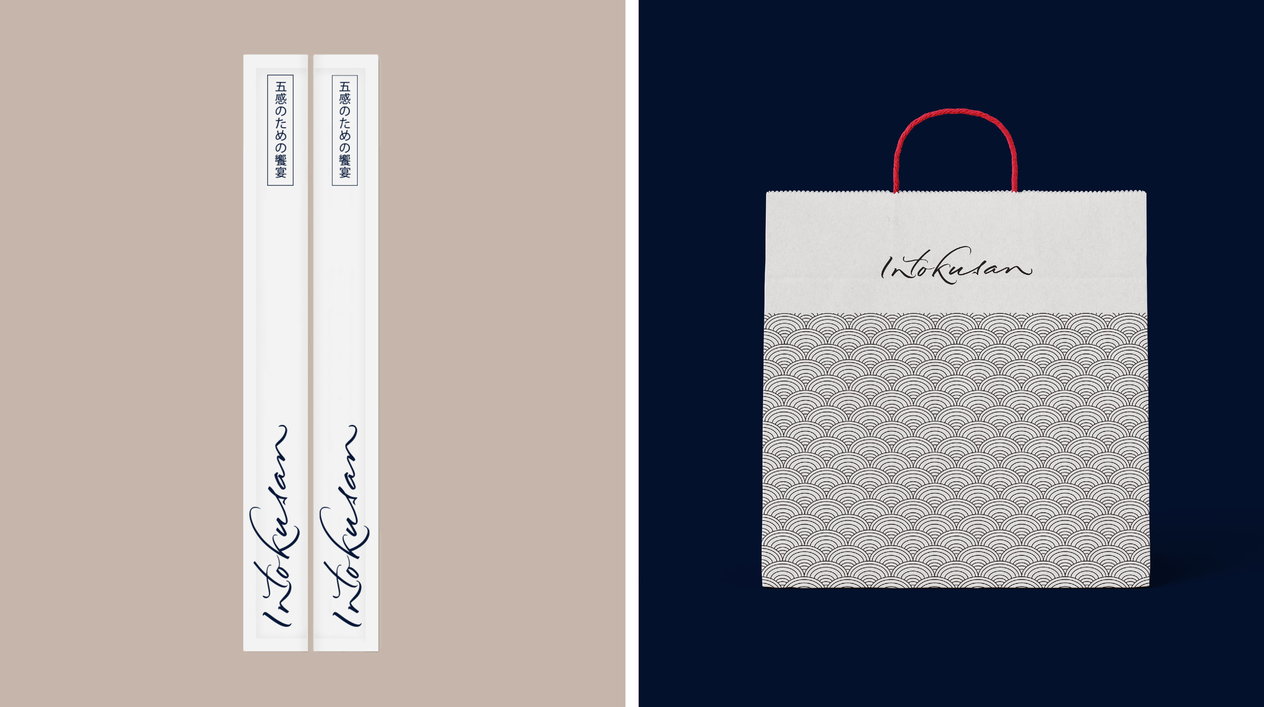
At the heart of this rebranding effort is a bespoke calligraphic logo. This logo was meticulously crafted to embody the elegance and precision of traditional Japanese calligraphy. The fluid and graceful strokes of the logo not only reflect the artistry and skill involved in sushi-making but also evoke a sense of heritage and sophistication. The calligraphic style serves as a visual signature for Intokusan, making it instantly recognisable and imbued with cultural significance.
The logo
Complementing the refined logo, we introduced a unique visual identity that leverages anime illustrations. These illustrations are lively, colorful, and full of character, celebrating the culinary delights and vibrant atmosphere of the restaurant. Each illustration tells a unique story. From the journey of fresh ingredients to the creation of exquisite sushi dishes, to scenes of joyful dining experiences. The anime art style adds a playful and contemporary twist, appealing to both anime enthusiasts and a broader audience who appreciate fun and creativity.
The integration of anime illustrations into the restaurant’s visual identity serves multiple purposes. It enhances the dining experience by providing an engaging and visually stimulating environment. The illustrations also create a sense of anticipation and excitement, inviting customers to immerse themselves in the world of Intokusan. This artistic approach sets the restaurant apart, offering a distinctive and memorable brand experience.
In addition to the logo and illustrations, we extended the visual identity across various touchpoints, including menus, signage, packaging, and digital presence. Each element was thoughtfully designed to ensure consistency and cohesiveness, reinforcing the brand’s unique character and story.
By combining traditional calligraphy with contemporary anime art, we created a visual identity for Intokusan that is both culturally rich and refreshingly modern. This rebrand positions Intokusan as a standout destination in Windsor, promising an unforgettable dining adventure that delights the senses and captivates the imagination. With its unique blend of tradition and innovation, Intokusan is set to become a beloved spot for sushi lovers and culinary explorers alike.