
Glow
Skincare Clinic Brand Identity Design for Glow
Toy Creative created a vibrant brand identity for Glow, a skincare clinic located in the heart of Beaconsfield. The project focused on developing a distinctive visual identity that reflects the confidence and individuality of the clinic’s clients while positioning the brand within the premium beauty market.
Bold beauty, built around confidence
-
Glow wanted a brand identity that would stand out in the competitive skincare industry while appealing to the affluent Beaconsfield market.
The identity needed to communicate confidence, individuality and premium beauty services while reflecting the personality of the clinic and its clients.
-
Toy Creative developed a bold and expressive visual identity centred around the concept of empowerment.
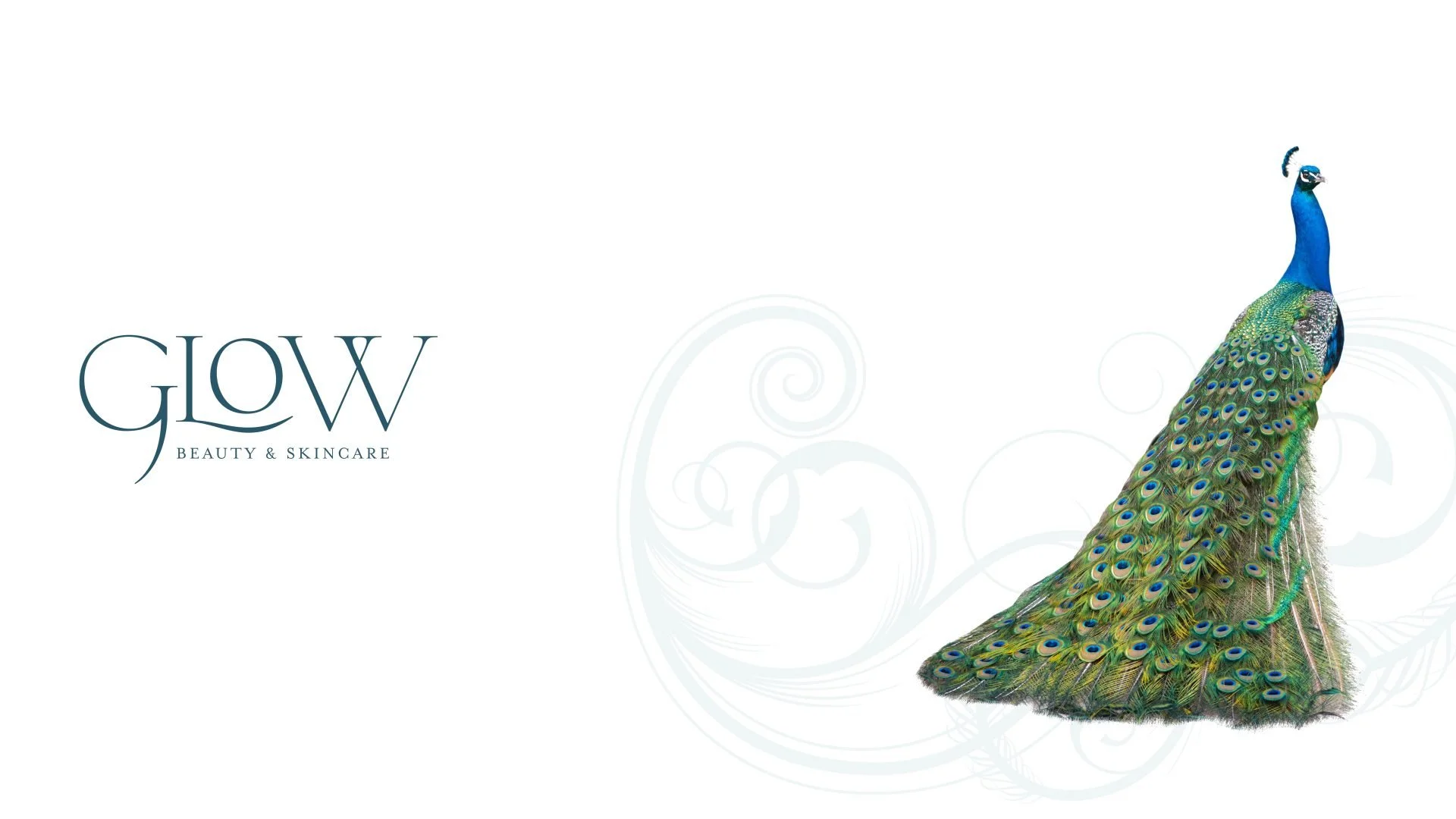
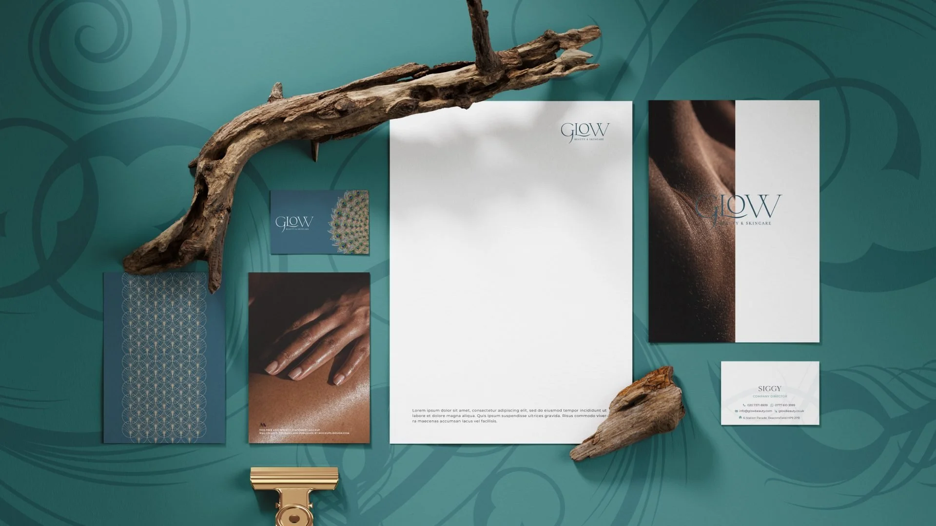
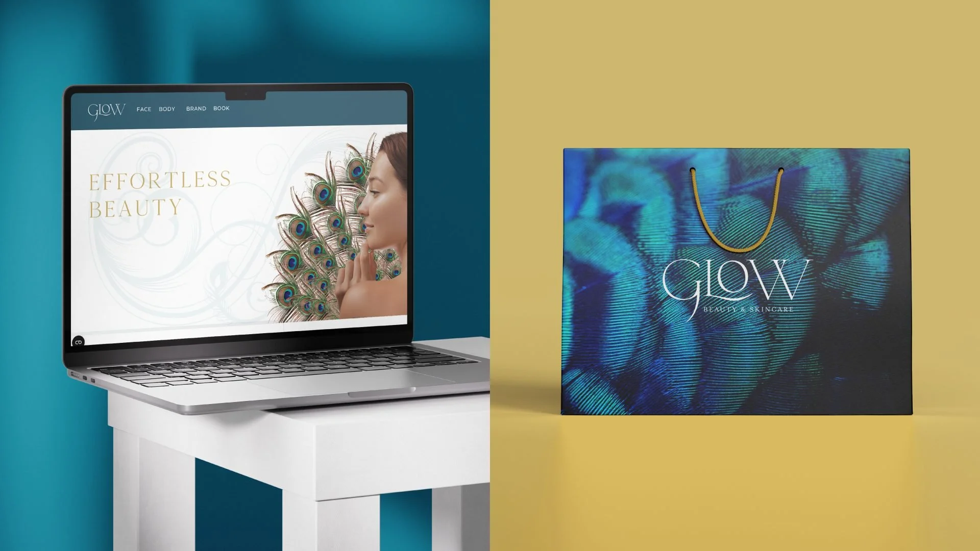
The design introduces a distinctive peacock mascot, a symbol traditionally associated with beauty, confidence and individuality. This graphic element gives the brand a memorable personality and creates a recognisable visual anchor across marketing materials.
-
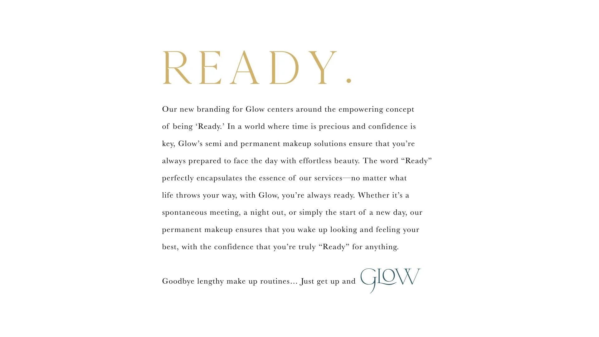
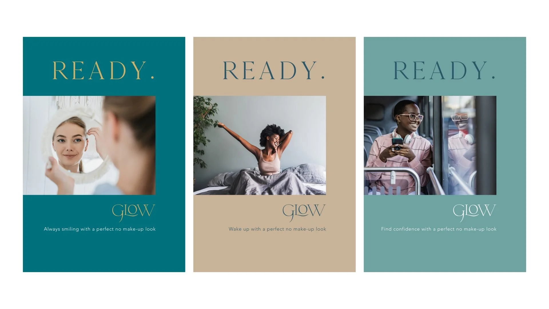
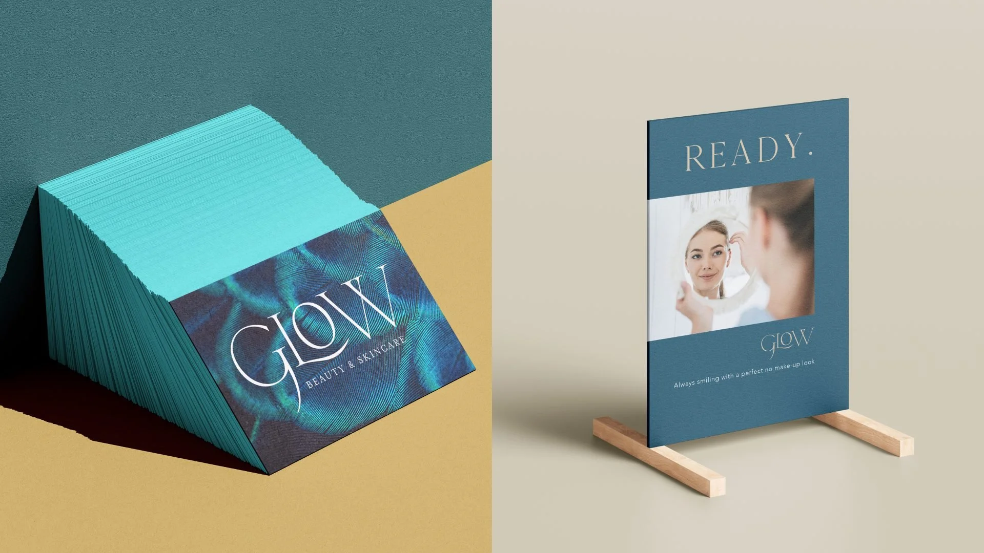
The brand identity combines vibrant colour palettes, expressive graphic elements and confident messaging built around the concept of being “ready”.
These elements help the brand stand out while communicating the aspirational and empowering nature of the Glow experience.
-
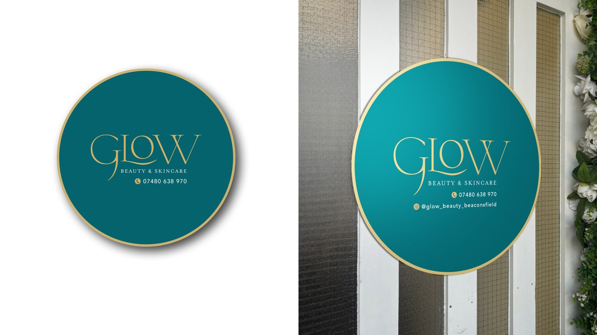
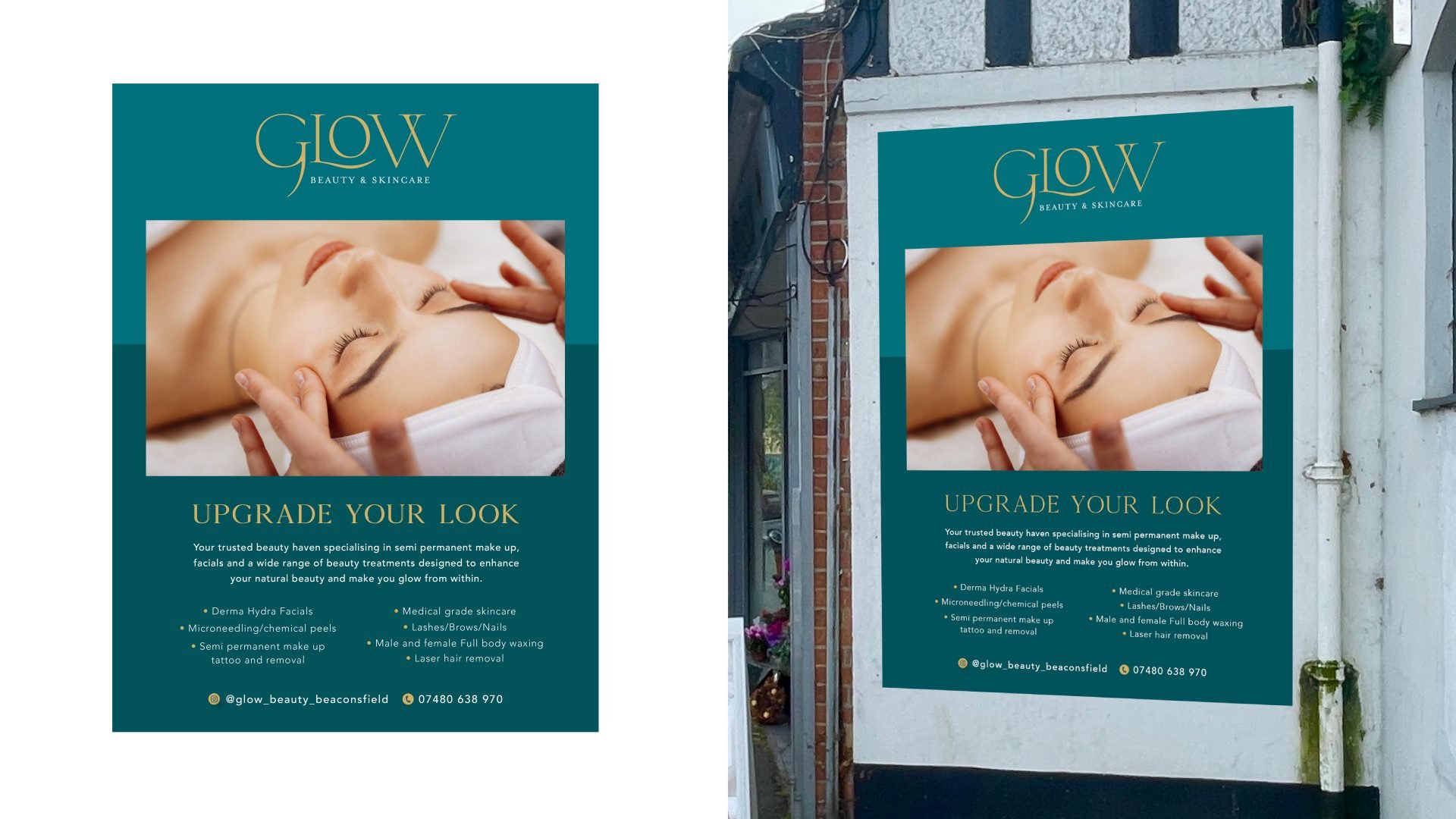
The identity was designed to work across multiple brand touchpoints including digital marketing, clinic signage, printed materials and social media content.
This cohesive visual system helps Glow maintain a strong and recognisable presence across both online and in-clinic experiences.
-
The final brand identity positions Glow as a confident and distinctive skincare brand within the Beaconsfield beauty market.
Through vibrant colours, bold graphics and an empowering brand message, the identity reflects the personality and aspirations of the clinic’s clientele.
-
In the heart of Beaconsfield, Buckinghamshire, a new beauty brand emerges with a captivating identity that reflects their core values of bravery, beauty and elegance. The fresh branding is a standout amidst a crowded market dominated by soft pastels and muted tonal colours. By drawing inspiration from the vibrant and majestic peacock, this Beaconsfield-based beauty business has created a visual identity that not only turns heads but also tells a compelling story.
A Bold Mascot: The Peacock
The peacock, a symbol of grace, confidence and allure, takes centre stage as the brand’s mascot. Much like the specialists themselves, the peacock embodies bravery, beauty and elegance — qualities that are integral to the services offered. The decision to use the peacock wasn’t just aesthetic; it was deeply symbolic. Every aspect of this bird resonates with the brand’s mission: to empower clients to feel bold and beautiful in their own skin. From its striking plumage to its poised demeanour, the peacock represents the transformation that clients experience after visiting these beauty experts in Beaconsfield.
The Power of “Ready”
The second cornerstone of the brand identity is the word “ready”. It succinctly captures the purpose and impact of their permanent makeup solutions. These treatments are designed to help clients feel effortlessly prepared for whatever challenges the day may bring. Whether it’s a boardroom meeting, a school run or a night out in Buckinghamshire, the brand’s services ensure that clients wake up feeling polished and confident. “Ready” is more than a tagline; it’s a promise of empowerment and convenience for the modern individual.
A Vibrant Colour Palette: Inspired by Nature
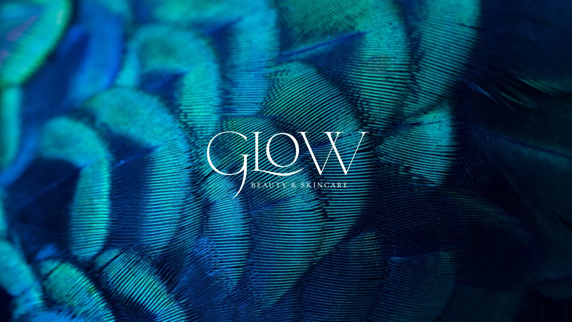
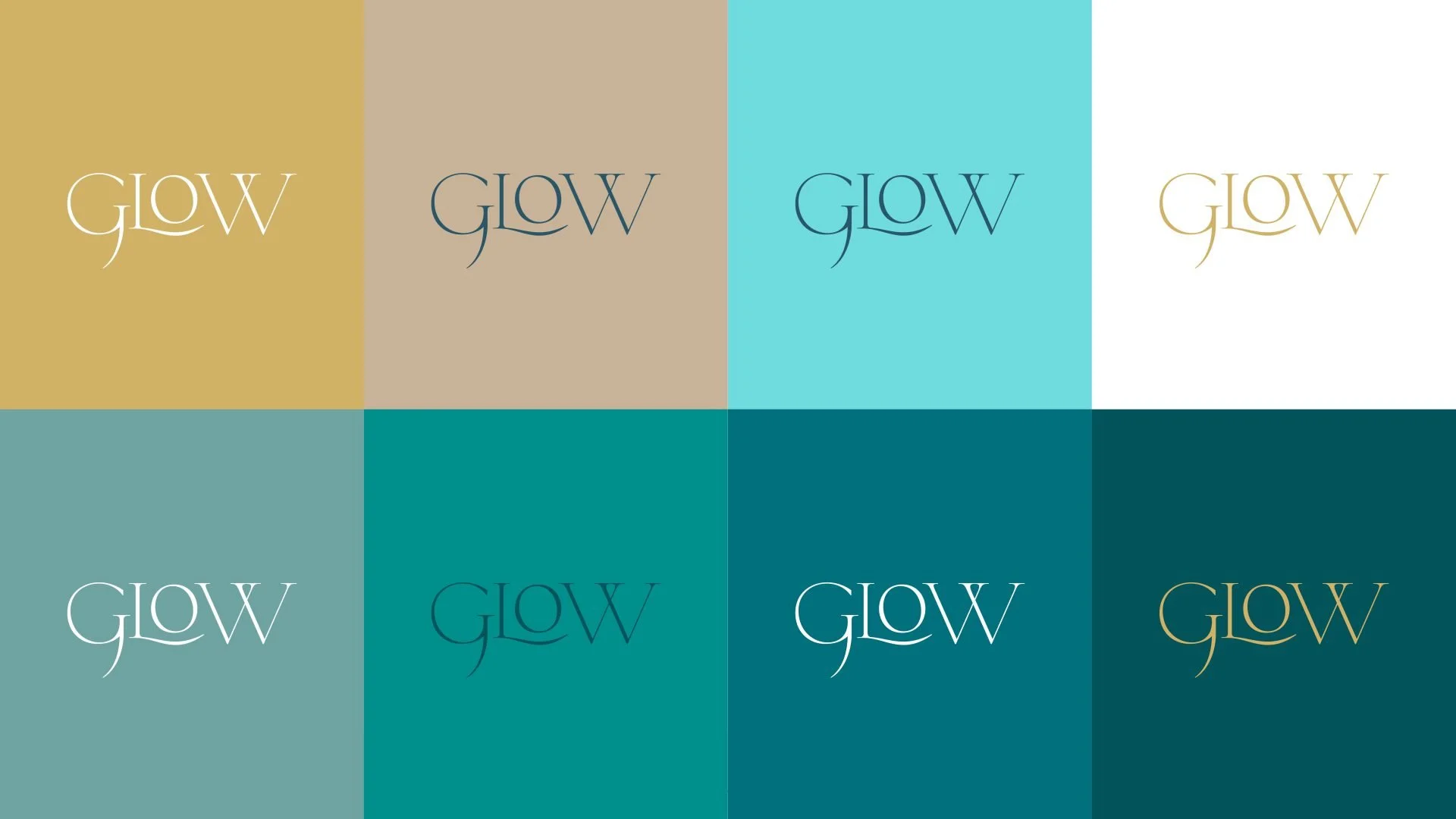
Breaking away from the pastel-dominated beauty market, the new brand identity employs a bold colour palette inspired by the iridescent hues of a peacock’s feathers. Rich navys, striking greens and vibrant blues form the foundation of the visual aesthetic. These colours reflect sophistication while simultaneously injecting energy and individuality into the brand. This daring choice not only sets the brand apart in Beaconsfield’s beauty industry but also aligns with their commitment to being a trailblazer in permanent makeup.
Standing Out in a Saturated Market
In an industry where soft, tonal colour schemes have become the norm, this bold approach ensures the brand remains memorable and unique. The saturated palette paired with the symbolic strength of the peacock disrupts the monotony of pastels commonly seen across beauty brands. This distinctive identity appeals to clients who value quality and individuality — qualities synonymous with Beaconsfield’s discerning residents.
Why Beaconsfield Matters
The choice to root this identity in Beaconsfield, Buckinghamshire, adds another layer of significance. Known for its charm and affluence, Beaconsfield is a hub for clients who seek premium beauty services. This local connection further reinforces the brand’s identity as a trusted, high-end provider in the community.
Confidence, Beauty and Boldness
Through the integration of the peacock mascot, the empowering concept of “ready” and a vibrant colour palette, this beauty brand has established itself as a beacon of confidence and elegance in Beaconsfield. The new identity not only differentiates it in a saturated market but also reflects the values and aspirations of its clientele. For those in Buckinghamshire seeking unparalleled beauty services, this brand ensures you’ll always feel bold, beautiful and ready.