
The Snapshot People
Photography Brand Identity Design for The Snapshot People
Toy Creative developed a vibrant brand identity for The Snapshot People, a London-based photography team known for dynamic street imagery and candid moments. The identity reflects the energy, movement and spontaneity of their photography.
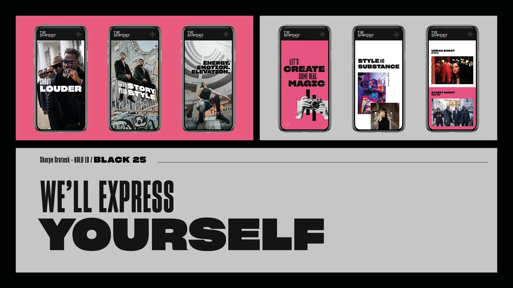
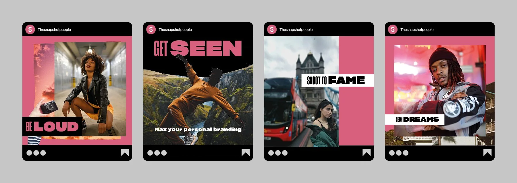
Street energy, captured in a brand
-
Client: The Snapshot People
Industry: Photography / Creative Services
Services: Brand identity design, logo design, visual identity
Location: London -
The Snapshot People wanted a brand identity that would communicate the fast-paced energy of their photography.
As a team that began shooting clients on the streets of London, their work is rooted in urban culture and spontaneous moments. The new identity needed to capture that spirit while helping the brand stand out in a competitive industry.
-
Toy Creative began by researching the team’s portfolio, studying their existing visual materials and speaking directly with stakeholders to understand the brand’s values and creative approach.
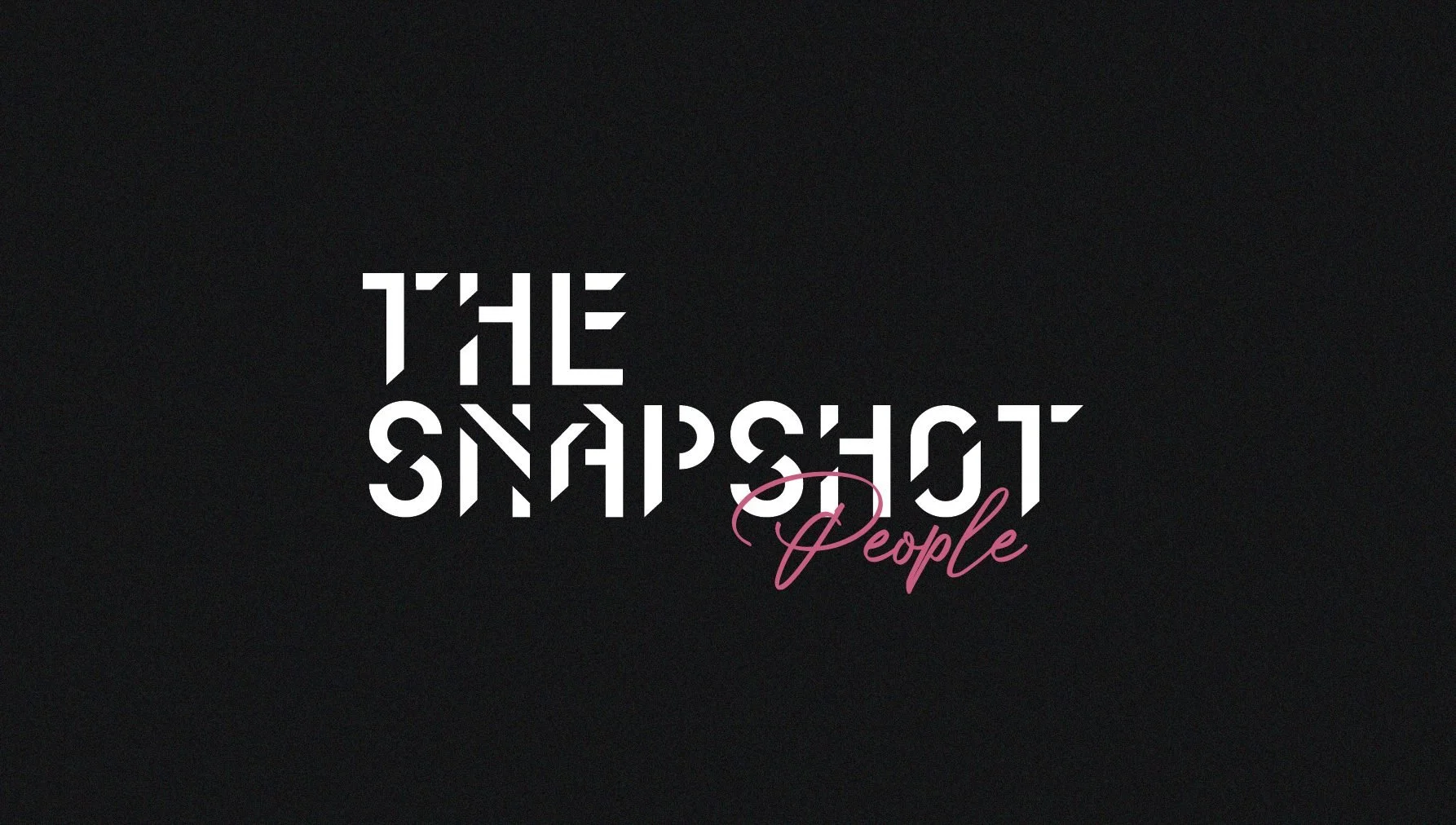
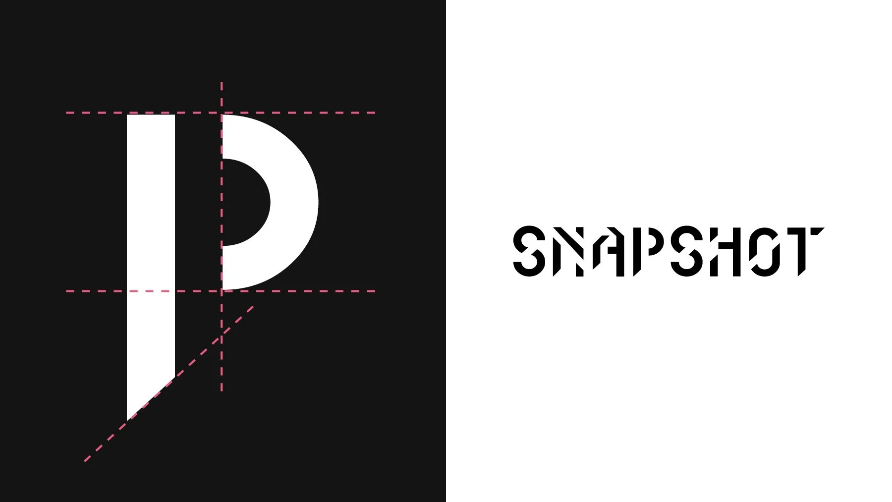
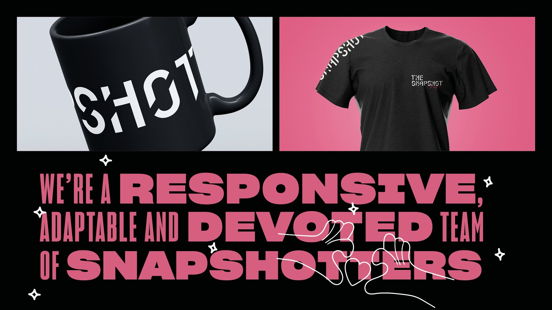
The resulting logo uses fluid lines and bold typography to convey motion and spontaneity, reflecting the photographers’ ability to capture fleeting moments with precision and style.
-
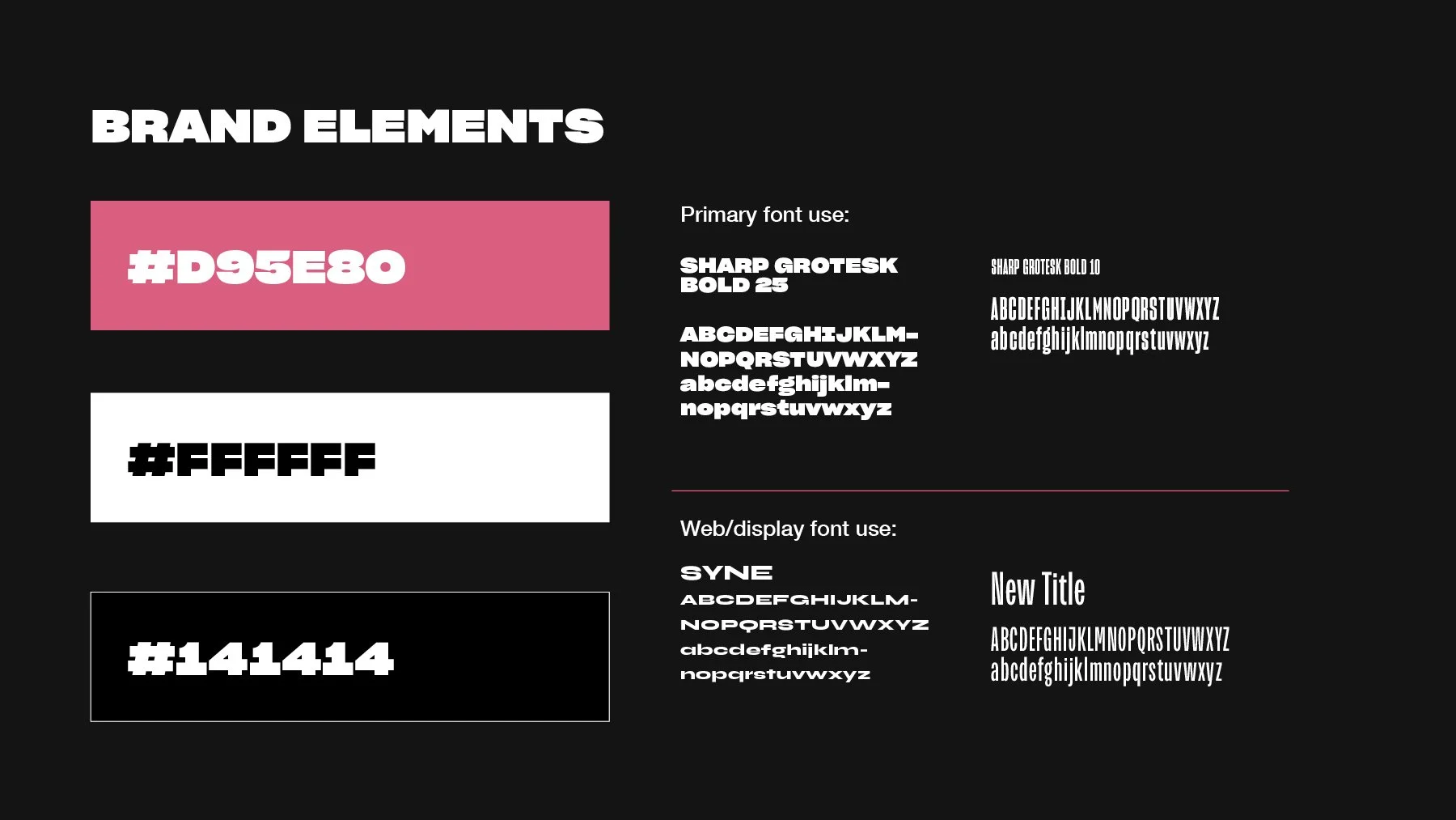
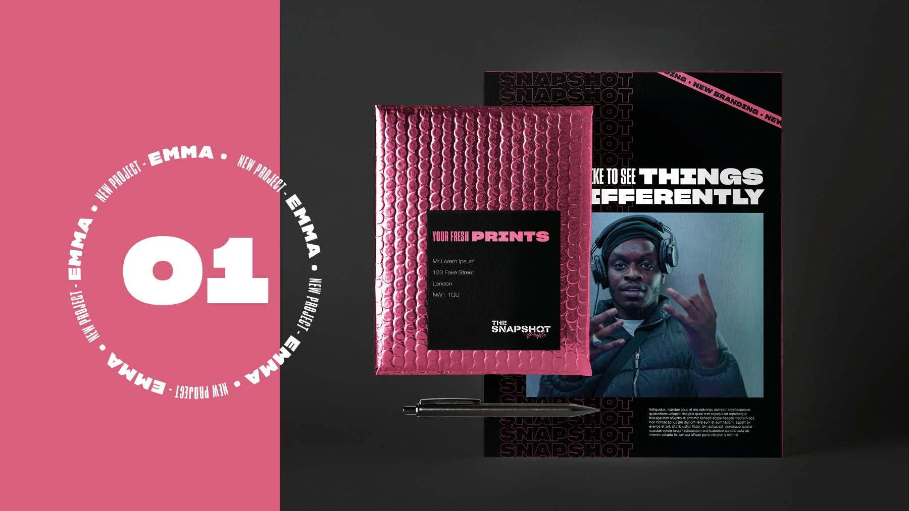
The visual identity combines bold, energetic colour palettes, contemporary typography, and graphic patterns inspired by motion and movement.
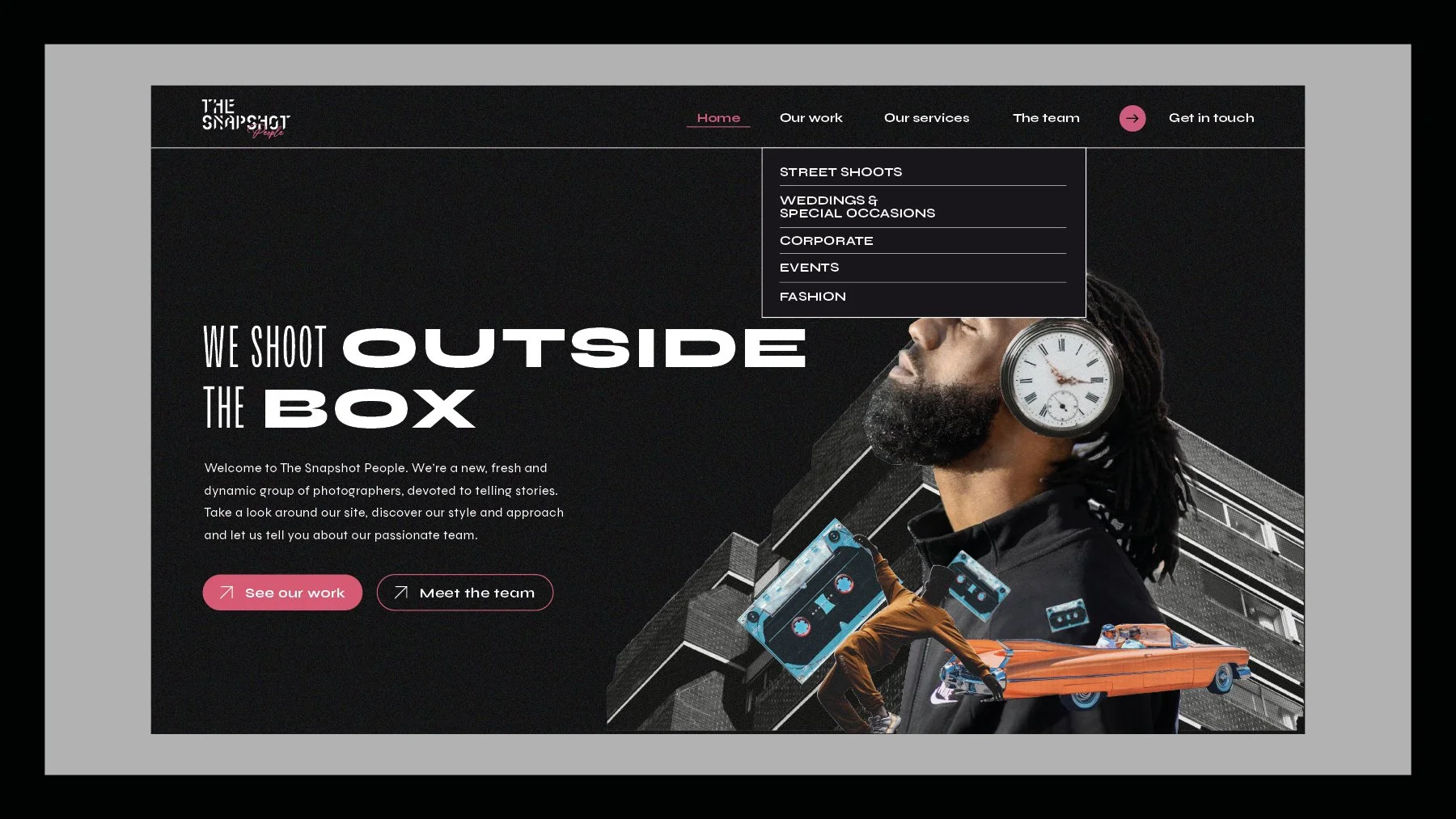
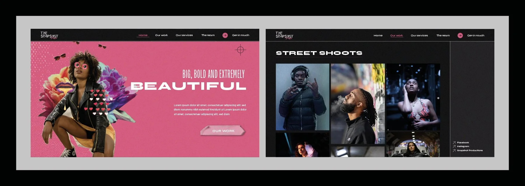
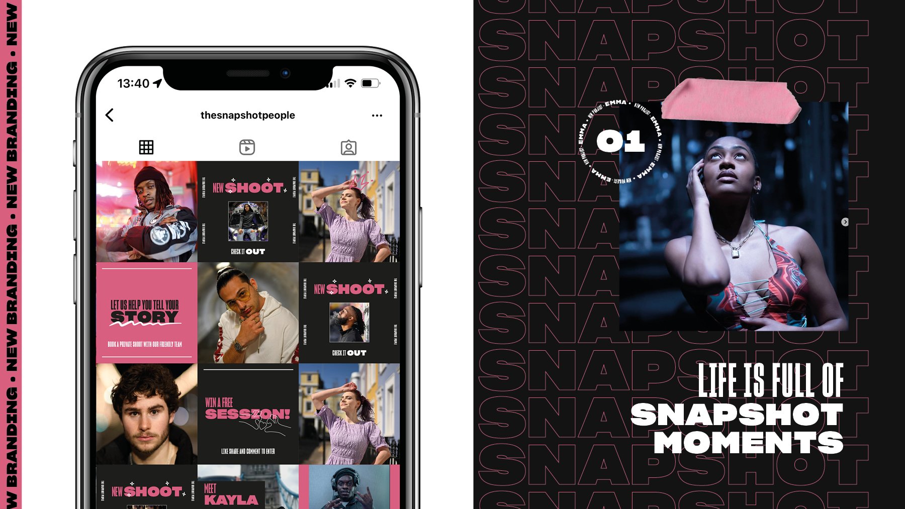
These elements reinforce the dynamic personality of the brand and allow the identity to adapt across marketing materials, digital platforms and photography presentations.
-
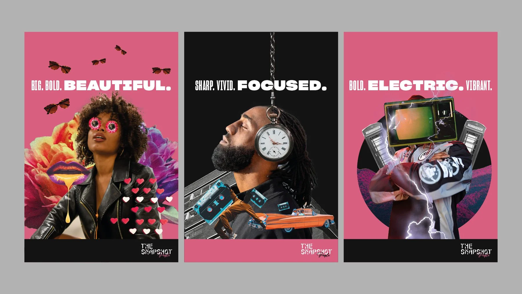
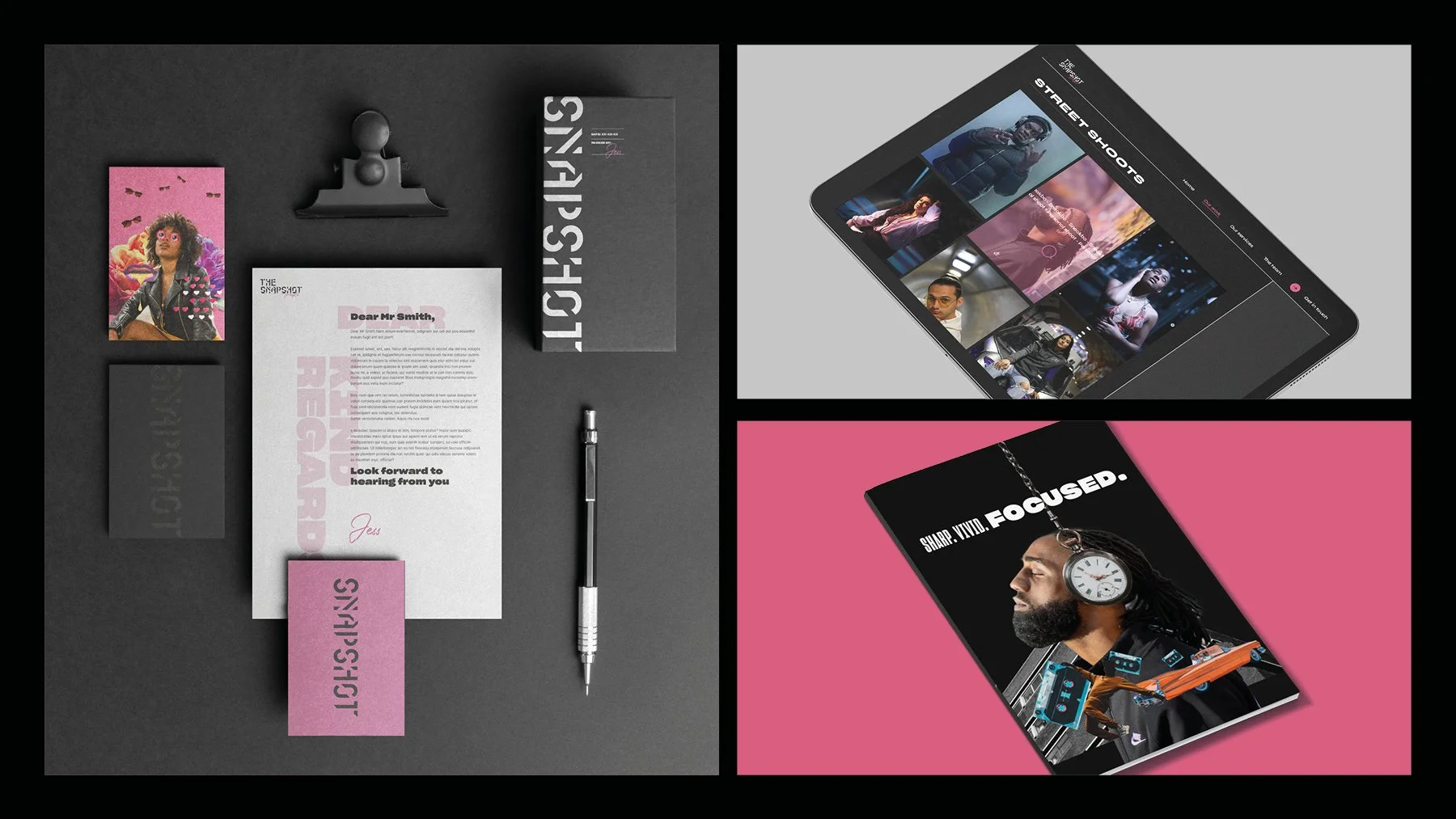
To extend the brand beyond the logo, Toy Creative created a library of graphic elements and visual patterns that could be used across multiple touchpoints.
This system keeps the brand consistent across marketing materials, promotional assets and digital content while maintaining the energetic style associated with The Snapshot People.
-
The new brand identity positions The Snapshot People as a bold and contemporary photography brand.
By combining dynamic typography, vibrant colours and expressive graphic elements, the identity reflects the energy of the team’s work while helping the brand stand out within the photography industry.
-
In an increasingly competitive photography industry, capturing attention and standing out from the crowd is essential. The Snapshot People are an energetic photography team looking to redefine the boundaries of creativity and visual storytelling, and they recognised how much a strong brand identity mattered to that ambition.
To capture their essence properly, our design team went through thorough research and consultation. We studied their portfolio and existing branding materials, and interviewed key stakeholders. Based in London, the team hail from the streets — their journey started shooting clients on the ground in the city, and it was important that the new identity captured that energy.
Armed with those insights we moved into concept development. Inspired by the fast-paced nature of photography and the vibrancy the team exude, we set out to create an identity that would communicate their distinctiveness and hold a viewer’s attention.
At the heart of the process was the logo. We aimed to convey movement, energy and spontaneity, combining fluid lines, bold typography and simple colours into a mark that symbolises the team’s ability to capture fleeting moments. Building on it, we curated a colour palette of bold, eye-catching tones chosen to evoke joy, excitement and vitality, paired with contemporary, versatile typography.
To extend the identity beyond the logo we developed a cohesive visual language: a library of graphic elements and patterns that gives flexibility across marketing materials while keeping everything recognisably theirs.
The result is a vibrant brand identity that resonates with their audience and reflects exactly the kind of work they make.