
Kohda Living
Homeware Packaging Design for Kohda Living
Toy Creative created packaging design and product branding for Kohda Living, a premium homeware brand specialising in innovative kitchen textiles. The project focused on developing packaging that communicates the quality, sustainability and functionality of the brand’s kitchen towel range while supporting the brand’s online retail presence.

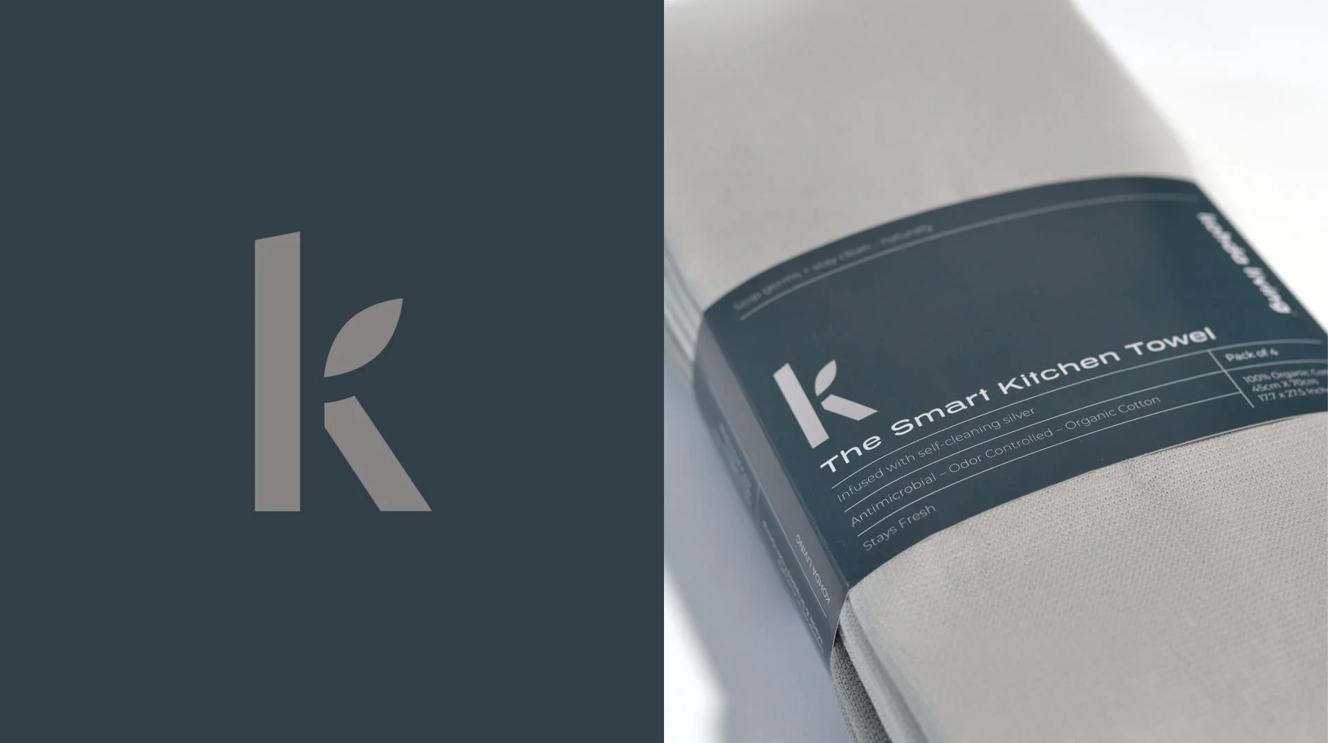
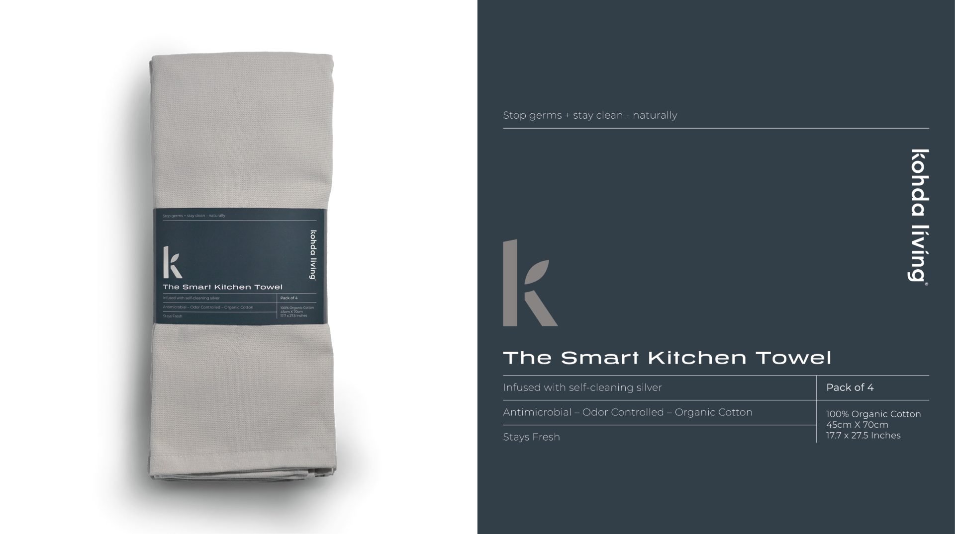
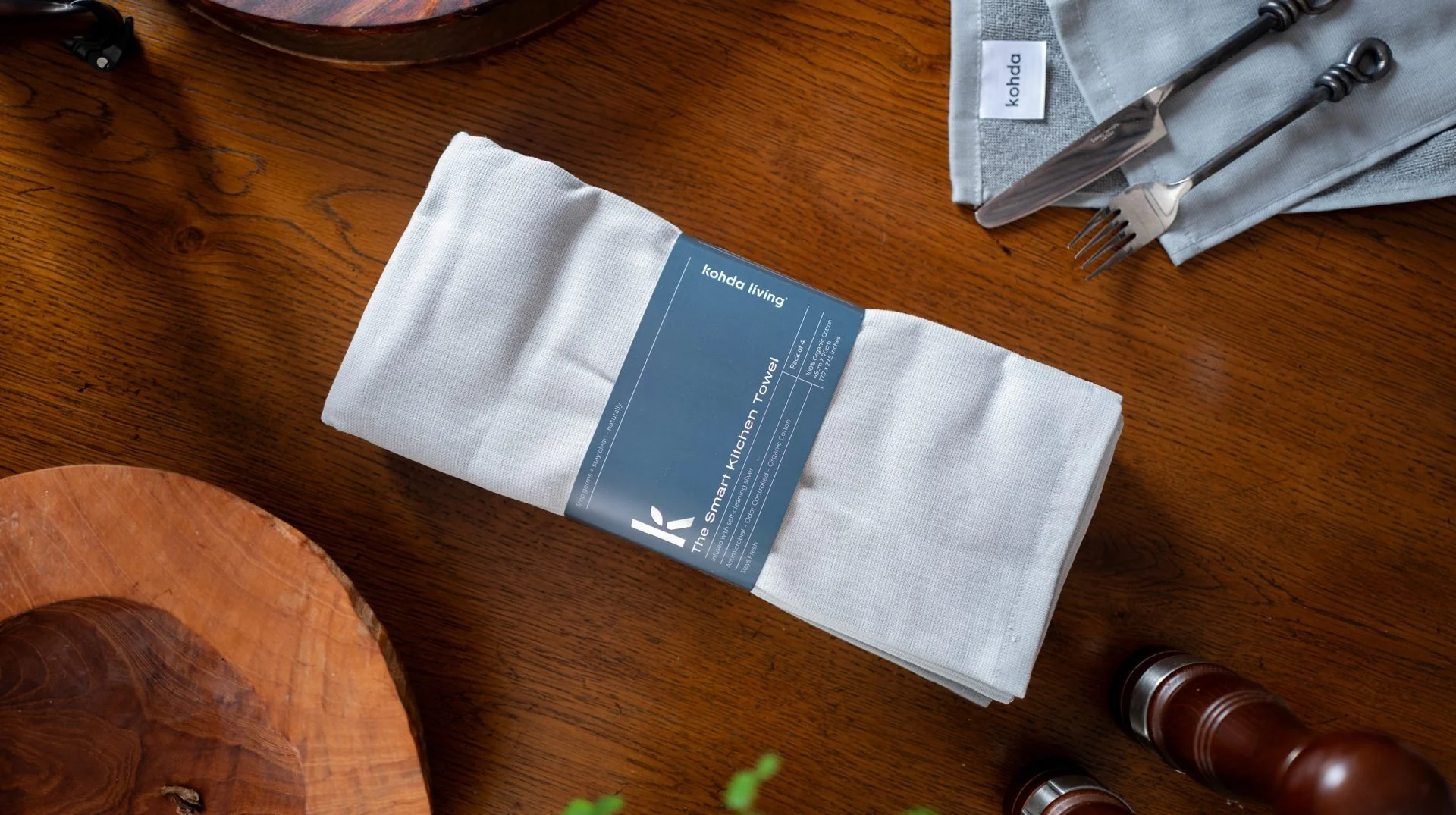
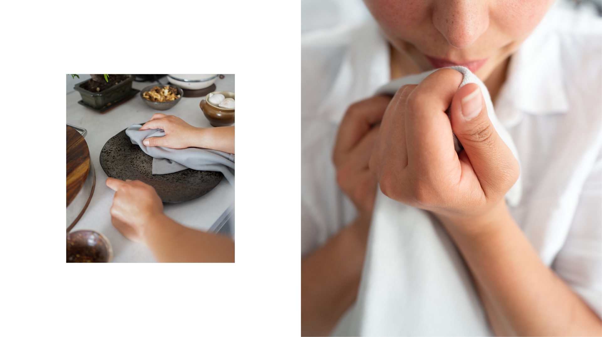
Clean, considered packaging for the kitchen
-
Kohda Living wanted packaging that would clearly communicate the benefits of their new kitchen towel range while maintaining a clean and modern brand aesthetic.
The products are sold primarily through online marketplaces, so the packaging needed to look strong in product photography and clearly present the product’s unique selling points to customers browsing online.
-
Toy Creative developed a simple, modern packaging design built around clean typography and strong product photography.
The design ensures the key product features are easy to understand at a glance while maintaining a premium aesthetic that aligns with the brand’s positioning in the kitchenware market.
-
The packaging highlights several of the product’s key benefits, including silver-lined technology for odour absorption, hand-stitched construction for durability and plastic-free materials for environmentally conscious consumers.
By clearly communicating these features, the packaging helps customers quickly understand the value of the product.
-
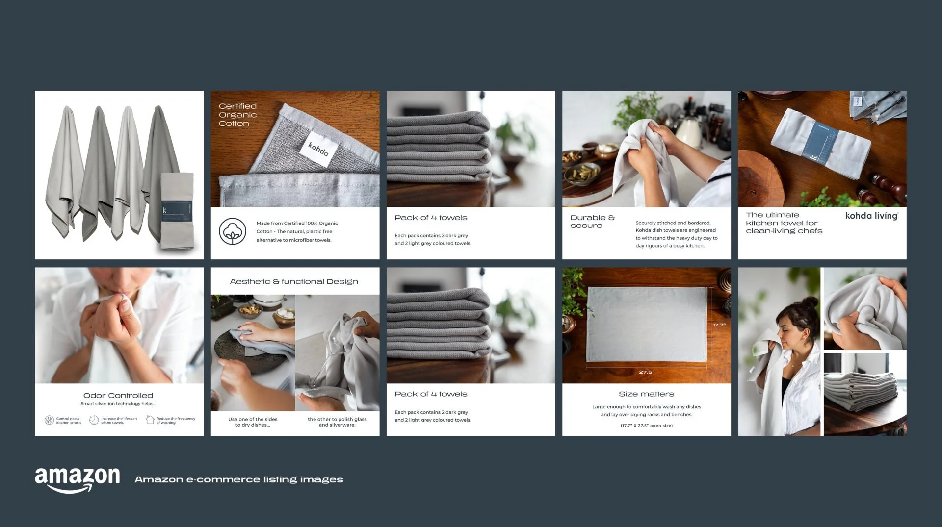
In addition to the packaging design, Toy Creative also created product imagery and advertising tiles used across the brand’s Amazon storefront.
These visuals use the brand’s colour palette, typography and product photography to create a cohesive retail presence that helps improve product discoverability and customer engagement online.
-
The final packaging design delivers a clean and stylish presentation that reflects the quality and functionality of Kohda Living’s products.
Combined with strong product imagery and marketing assets, the packaging helped establish Kohda Living as a credible brand within the competitive kitchenware market.
-
When Kohda Living approached us to develop a packaging design for their new range of kitchen towels, we embraced the challenge. Our goal was to create a visually captivating and informative packaging that would effectively communicate the unique selling points of the product: silver-lined for odour absorption, hand-stitched quality, and environmentally friendly (being plastic-free). Through a structured approach, clean typography and captivating visuals, we crafted a cohesive branding strategy that extended across the towel packaging, product photography and advertising tiles for their Australian Amazon store page.
We began the project by understanding Kohda Living’s brand values and target audience. The essence of simplicity, cleanliness and style became the foundation of our creative direction. We crafted a brand identity that reflected these values while highlighting the product’s standout features: silver-lined technology for odour absorption, hand-stitched craftsmanship and eco-consciousness.
For the kitchen towel packaging, we opted for a minimalist yet striking design. The front panel featured an eye-catching image of the towels alongside a silver-embossed motif, reinforcing the odour-absorbing property. Clean typography presented the product’s name and key benefits in a legible and visually appealing manner. Bold, minimal use of colour evoked a sense of cleanliness, while eco-friendly icons conveyed the plastic-free nature of the product. The back panel provided more in-depth product information, washing instructions and genuine brand tone of voice to forge an emotional connection with consumers.
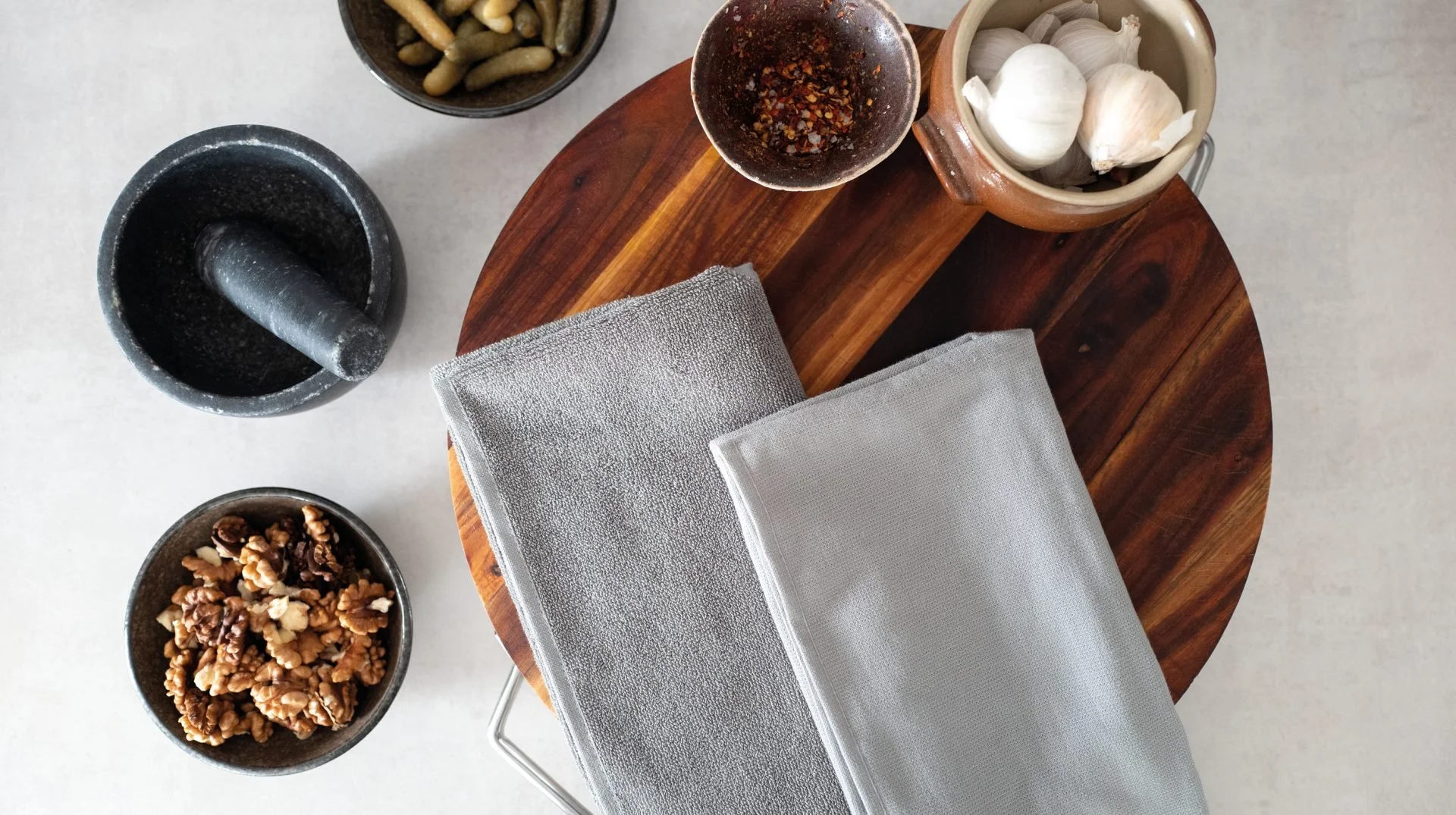
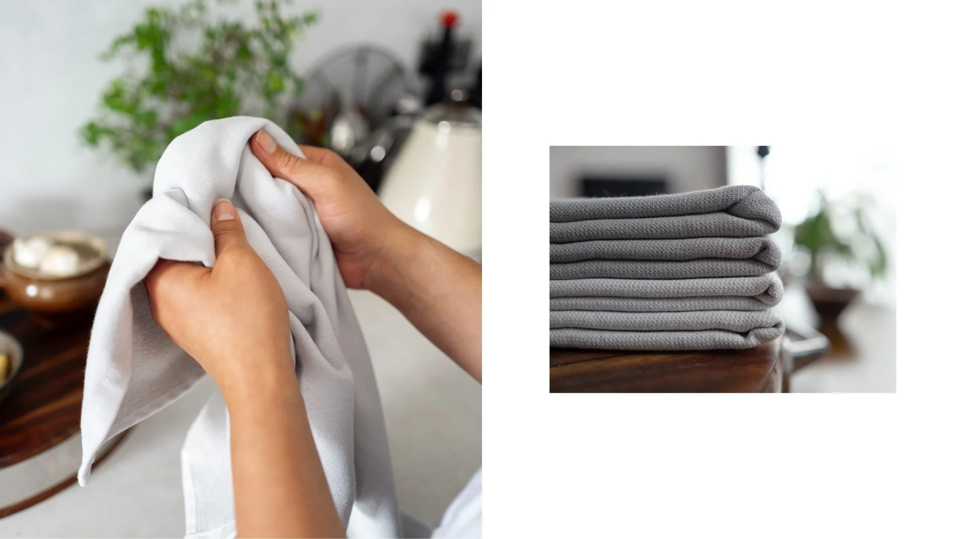
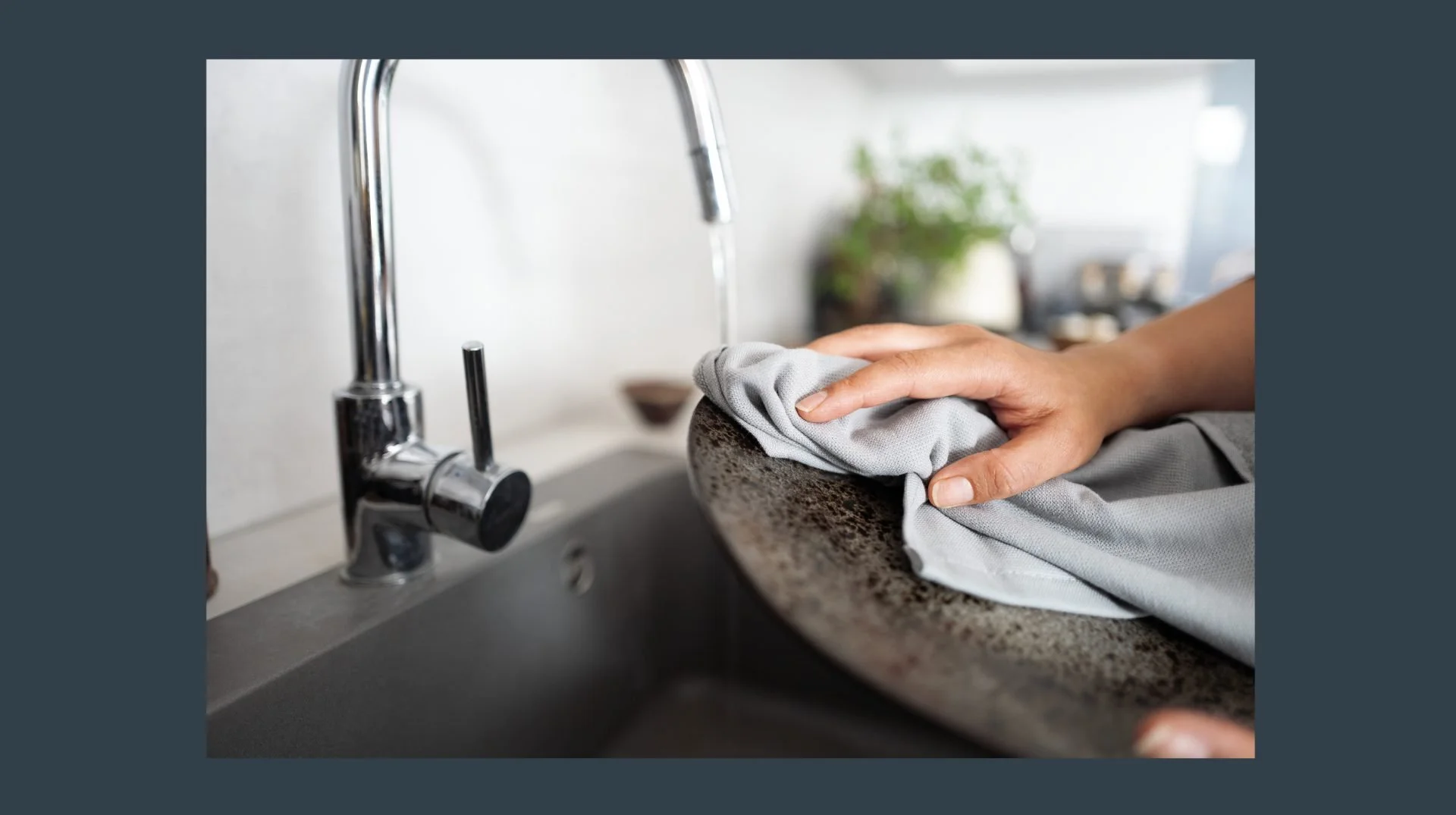
To showcase the kitchen towels, we conducted a professional photoshoot in both product listing and lifestyle formats. Clean and bright backgrounds accentuated the towels’ design, while the lifestyle shots depicted them in real-life kitchen settings, adding relatability and appeal. The images were carefully edited to ensure consistency with the brand’s aesthetic and to maintain a cohesive visual identity across all marketing materials.
To maximise Kohda Living’s visibility on their Australian Amazon store page, we designed engaging advertising tiles. These tiles used the brand’s key colours, typography and visuals to create an attractive and cohesive storefront, each focusing on one of the towels’ selling points. They not only enhanced the brand’s professional image but also improved the product’s discoverability on the online marketplace.
Throughout the design process, we made sure that the branding and messaging consistently communicated the product’s unique selling points. The use of silver-lined technology for odour absorption was highlighted as a practical solution for kitchen hygiene. The mention of hand-stitched quality added a touch of luxury and craftsmanship to the product. Emphasising the plastic-free aspect appealed to environmentally conscious consumers, aligning with the growing demand for sustainable products.
Through a well-structured approach, clean typography and captivating visuals, we successfully created a simple, clean and stylish packaging design for Kohda Living’s new range of kitchen towels. The branding and messaging effectively conveyed the product’s unique selling points, enabling consumers to make informed choices while resonating with the brand’s values. The product listing and lifestyle photography, along with the advertising tiles, contributed to an engaging and consistent brand presence on their Australian Amazon store page. Ultimately, the packaging design became a crucial factor in driving sales and establishing Kohda Living as a reputable brand in the kitchenware market.