
Geans Clinic
Dental Clinic Brand Identity and Logo Design for Geans Clinic
Toy Creative developed a new brand identity for Geans Clinic, a specialist dental practice in Prestwood. The project focused on a refined visual identity that better reflects the high standard of care and modern treatments offered by the clinic.
A cherry orchard, distilled into an emblem
-
Client: Geans Clinic
Industry: Dental / Healthcare
Services: Brand identity design, logo design, signage, print design
Location: Prestwood, Buckinghamshire -
Geans Clinic wanted to modernise their brand and clinic environment to better represent the quality of their specialist dental services.
The existing branding and interior design felt dated and did not reflect the premium level of care provided by the team. The goal was to develop a more sophisticated visual identity that would elevate the perception of the clinic.
-
Toy Creative created a contemporary logo and visual identity that combines elegance with clinical professionalism.
The new brand uses refined typography and a simple emblem that can be applied consistently across print, signage and digital materials.
The design ensures the clinic appears modern and professional while maintaining a welcoming atmosphere for patients.
-
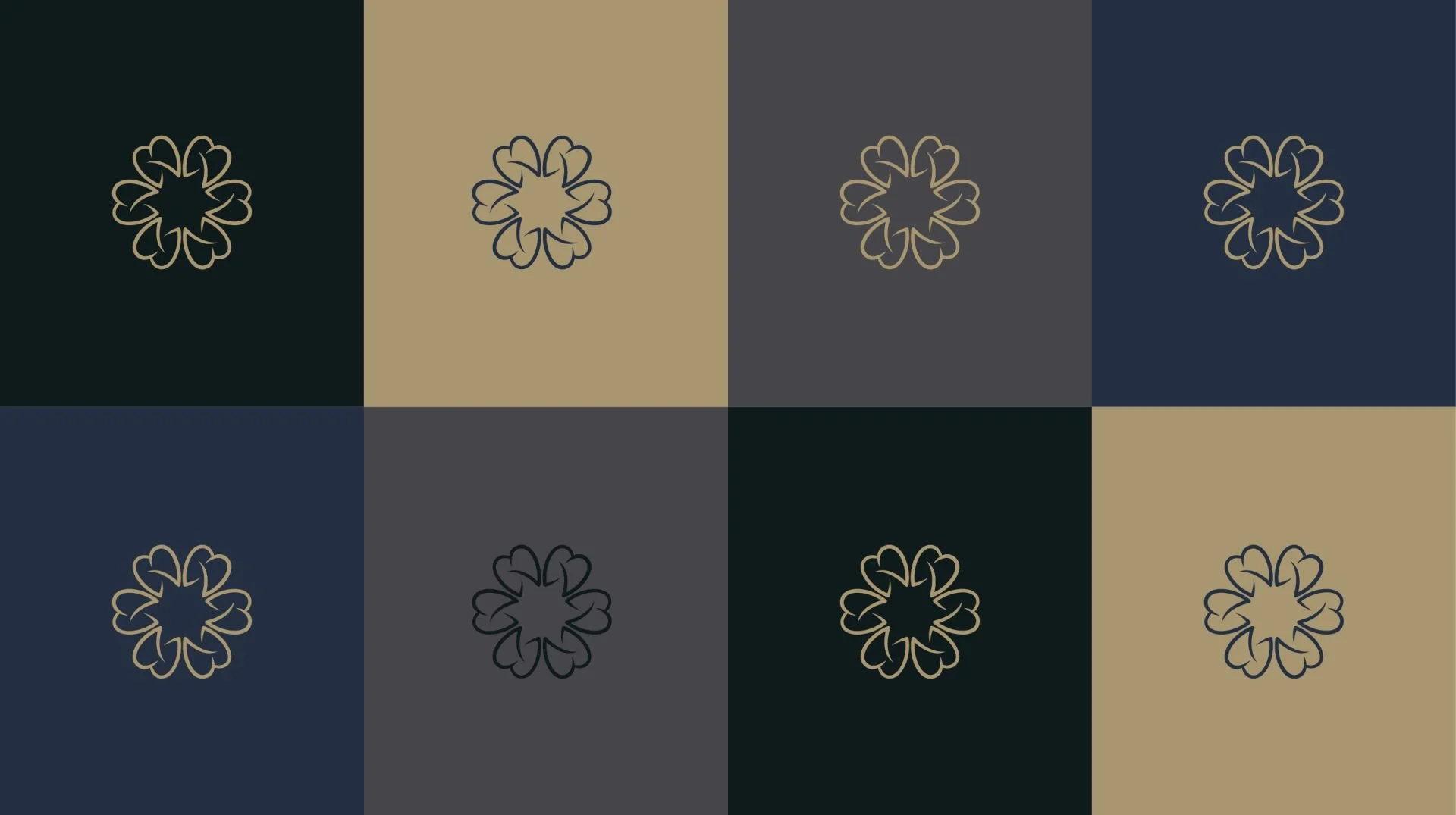
The brand identity is built around a calm and sophisticated colour palette of navy tones, champagne gold accents and dark green highlights.
These colours reinforce the clinic’s premium positioning while creating a sense of trust and reassurance for patients.
-
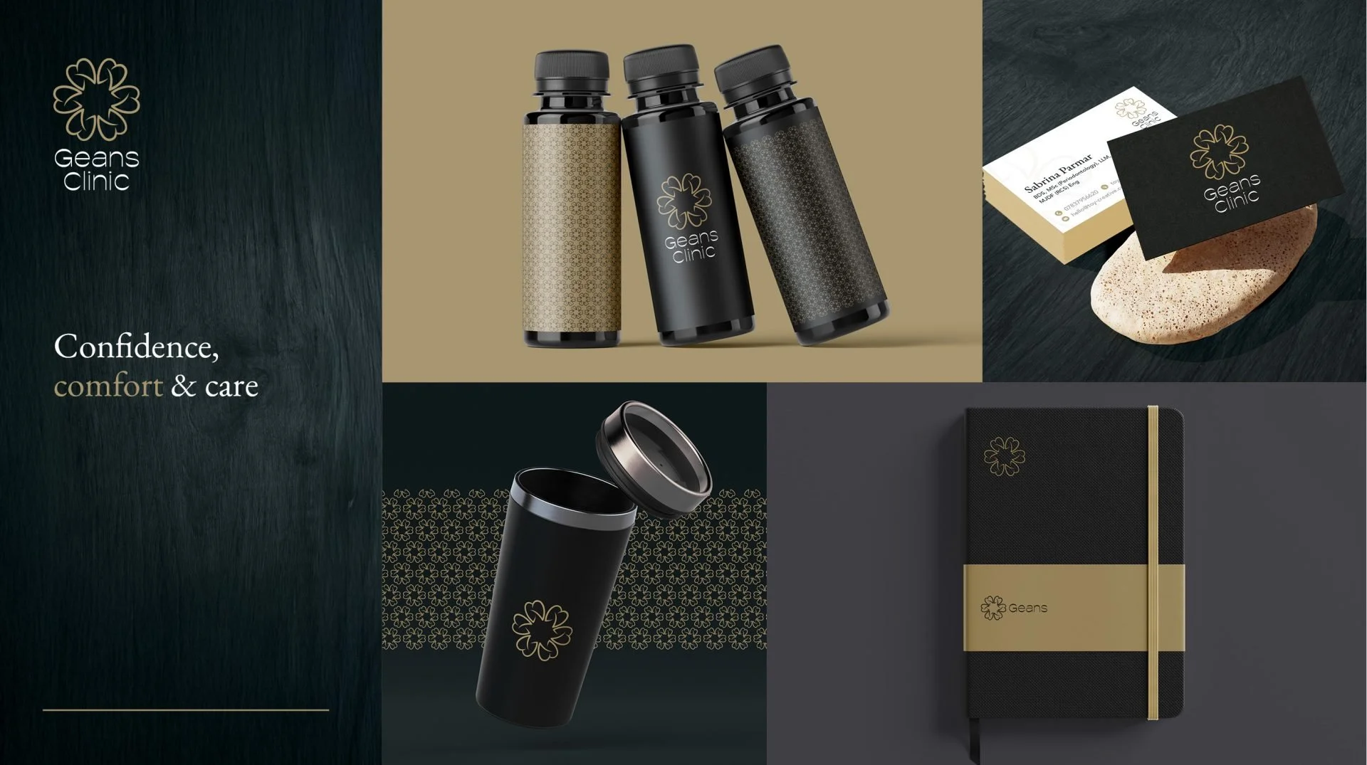
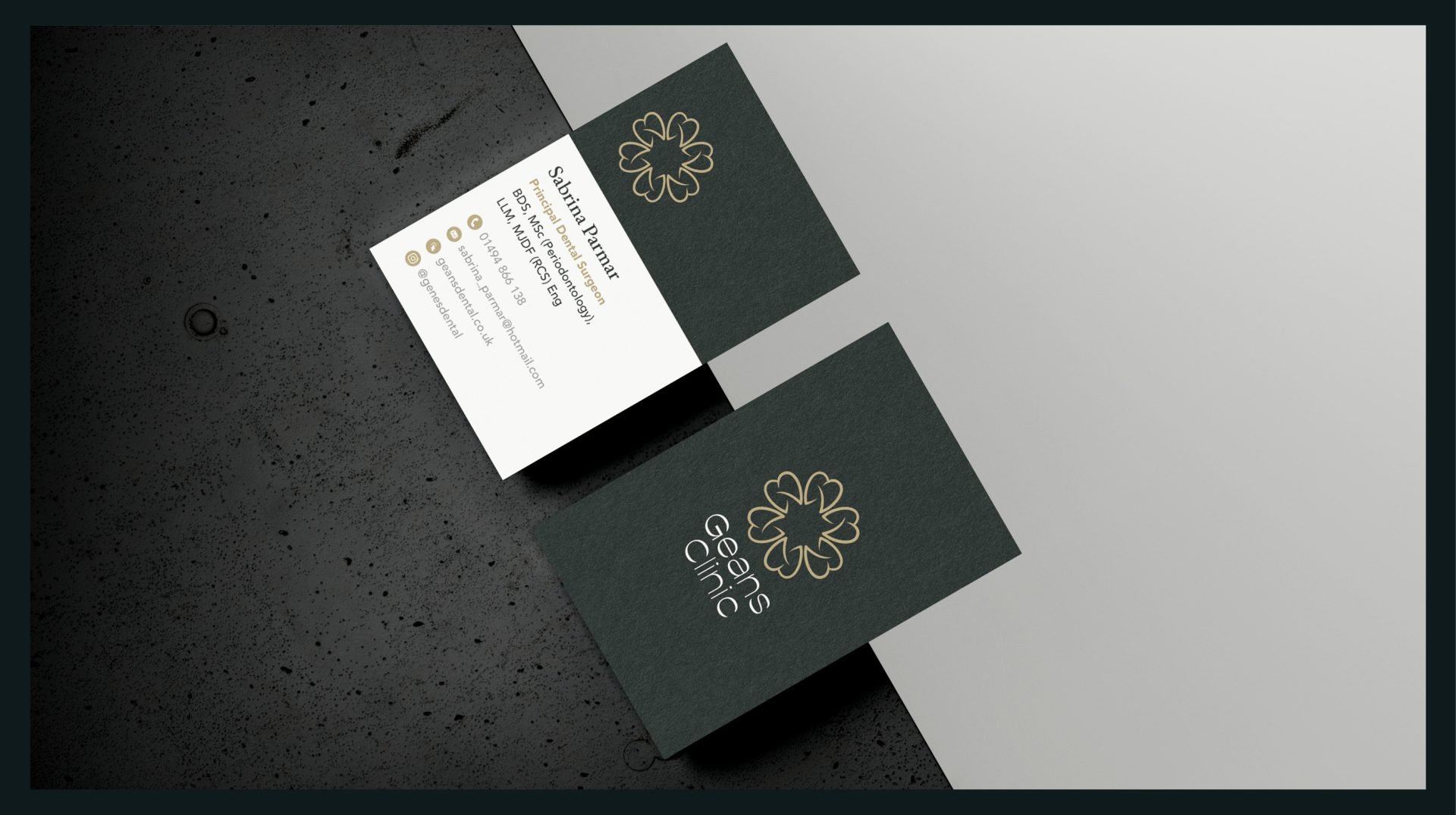
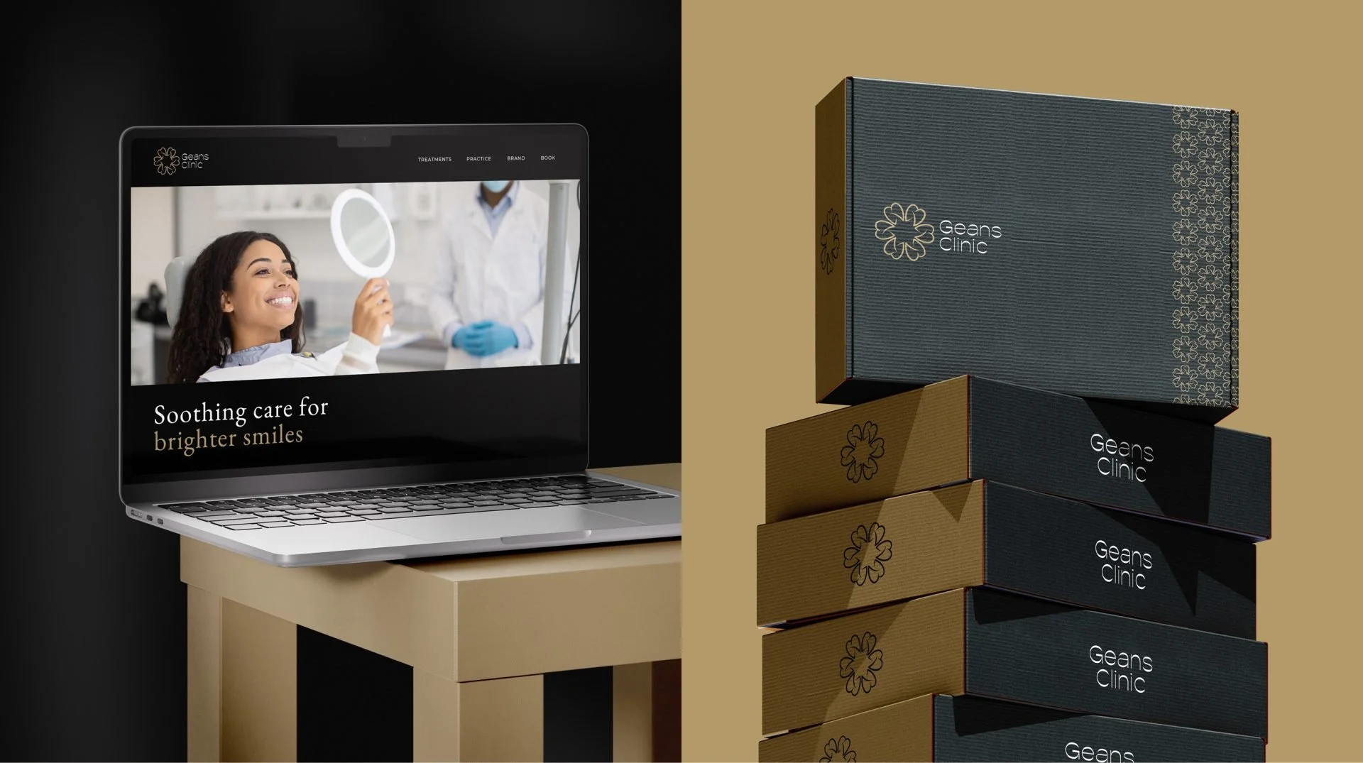
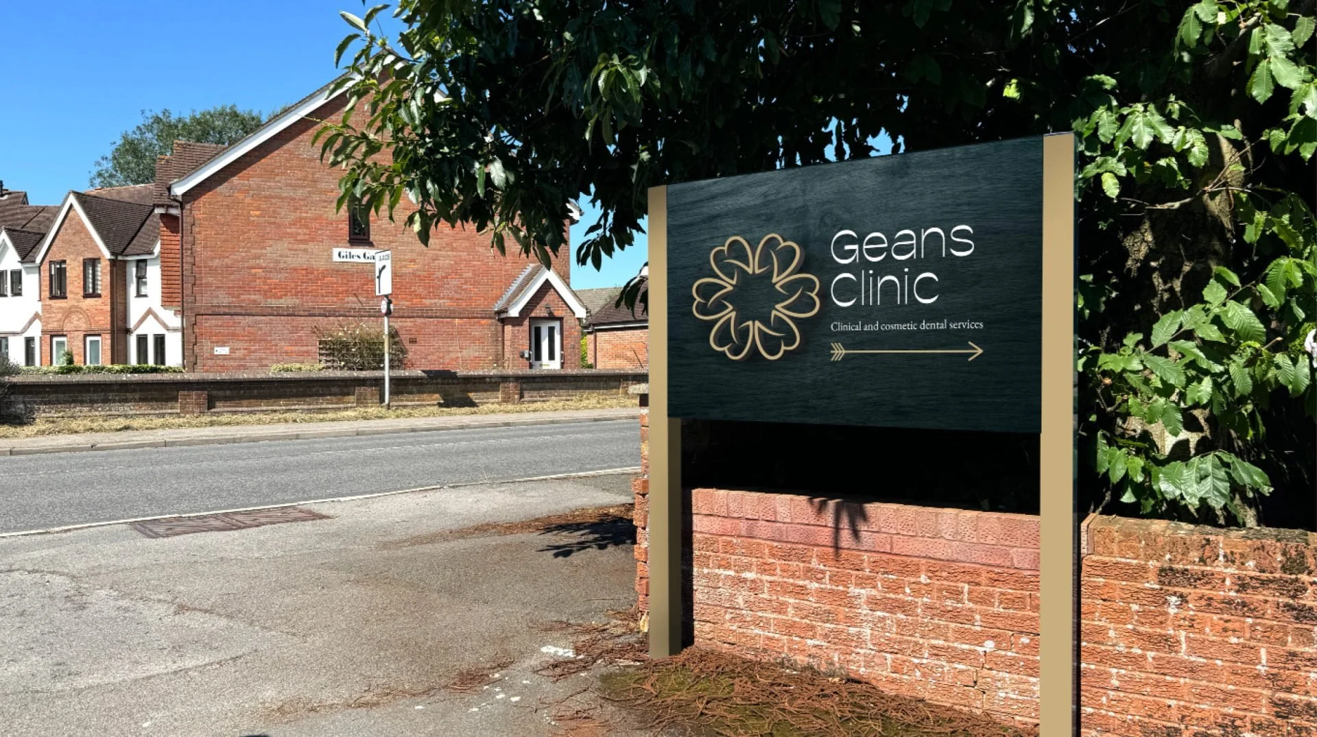
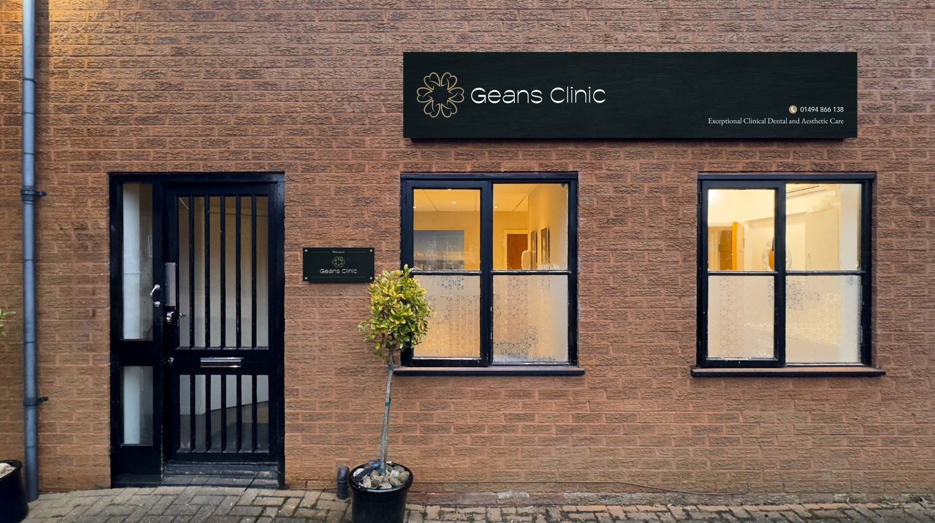
The identity was applied across multiple touchpoints within the clinic, including interior wall signage, external street signage, business cards and stationery, branded merchandise and website visuals.
This ensures patients experience a consistent brand from their first visit through to ongoing treatment.
-
The refreshed brand identity helped reposition Geans Clinic as a modern specialist dental practice.
Through a refined logo, colour palette and cohesive signage system, the clinic now presents a professional and welcoming environment that reflects the quality of its services.
-
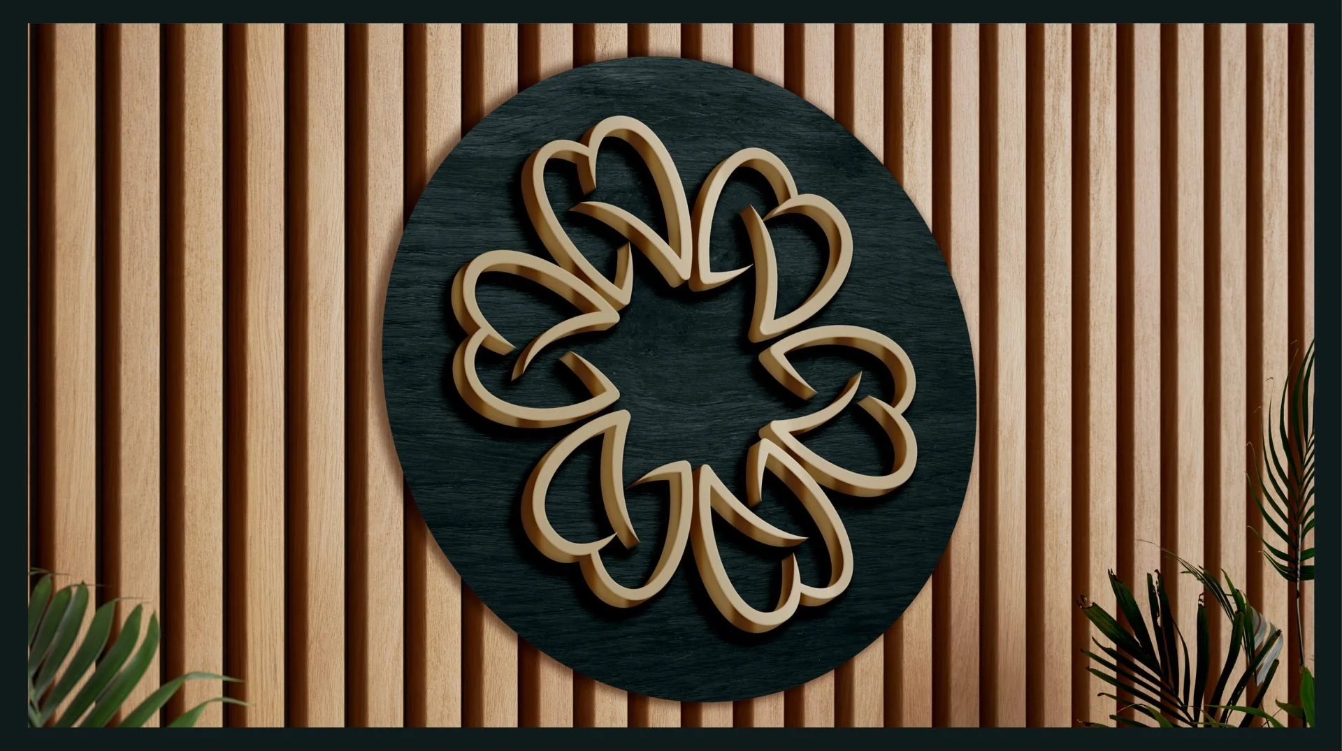
The resulting identity presents refined style, effortless simplicity and quiet integrity — the essence of the Gean brand. At its centre sits a bespoke emblem created with versatility, precision and meaningful intent. It serves as a visual mark, but it also carries a deeper narrative shaped by the clinic’s history: the name “Gean” is taken from the French word for cherry tree, and the clinic once stood within a thriving cherry orchard.
To honour that heritage, we developed a floral-inspired motif that represents the elegance and symbolism of the cherry tree while sitting naturally within modern design. The emblem speaks confidently to the past while expressing a clear commitment to an authentic future.
We selected a rich, darker colour palette with intention. Deep, velvety tones create a sense of quiet luxury, balancing sophistication with approachability. The palette supports a premium atmosphere, communicates confidence, and aligns with the clinic’s values of excellence and integrity.
To bring the identity to life we produced a wide range of materials that elevate every touchpoint: branded leaflets, large tray signs, and careful detailing throughout. The emblem is displayed prominently — etched into frosted glass vinyl and set in raised 3D logos. We also enhanced the reception area with large applications of architectural vinyl in a warm wood-grain finish, creating a contemporary and welcoming environment.
Ultimately, this identity tells a meaningful story. It celebrates origins, expresses values, and guides the clinic confidently into the future.