
The King’s Fund
Brand Design and Print Communications for The King’s Fund
Toy Creative supports The King’s Fund with ongoing brand design and print communications for its staff pension and life assurance plan. From printed newsletters and pension updates to invitations and stationery, we translate the established identity into clear, engaging and professionally produced materials.
Bold communication, consistent delivery
-
Client: The King’s Fund
Industry: Finance / Pensions
Services: Brand application, editorial design, print design, stationery and print production
Location: Cavendish Square, London -
The King’s Fund needed a trusted creative partner to help communicate important scheme activity, organisational updates and upcoming events.
Each piece needed to present detailed information clearly while remaining consistent with the wider brand. The challenge was to keep the communications professional and dependable without allowing them to feel overly corporate or visually flat.
-
Working within the existing visual identity, we developed a flexible design approach that could be applied across a wide range of communications.
The brand’s distinctive colour palette, bold typography and graphic “spotlight” concept bring energy and movement to the layouts while helping key information remain easy to navigate.
This creates a recognisable visual thread across every item, from formal pension documents to more social event invitations.
-
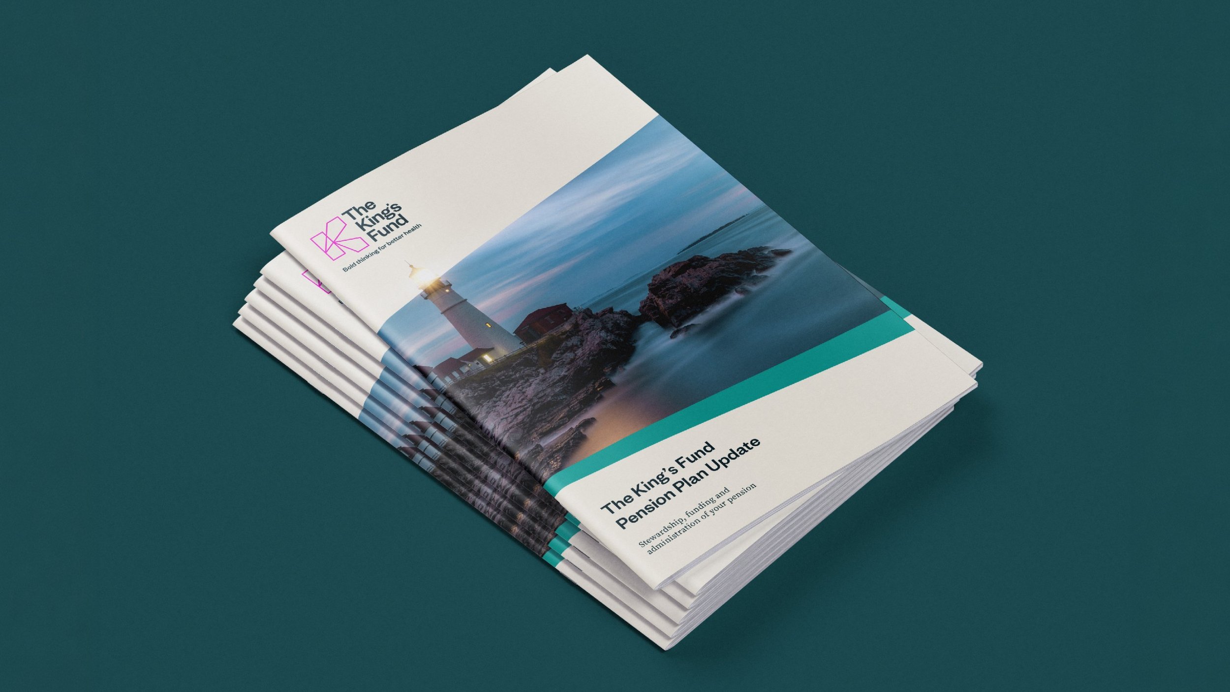
We design and produce printed pension updates as saddle-stitched booklets, combining clear editorial layouts with high-quality materials and finishes.
Substantial outer covers give the publications a more considered feel, while tactile inner stocks help elevate the experience of reading information that could otherwise feel dense or technical.
Alongside the booklets, we have created:
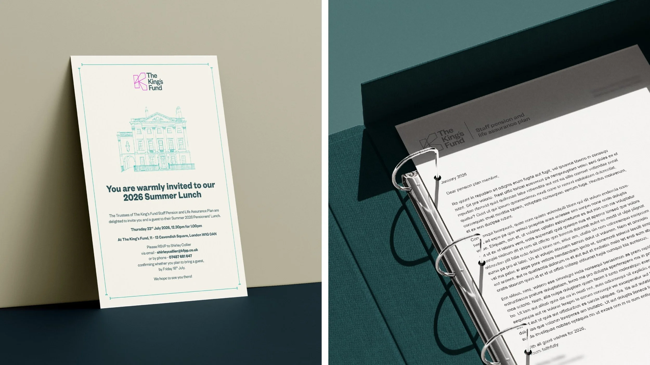
- Event and company invitations
- Letterheads and formal correspondence
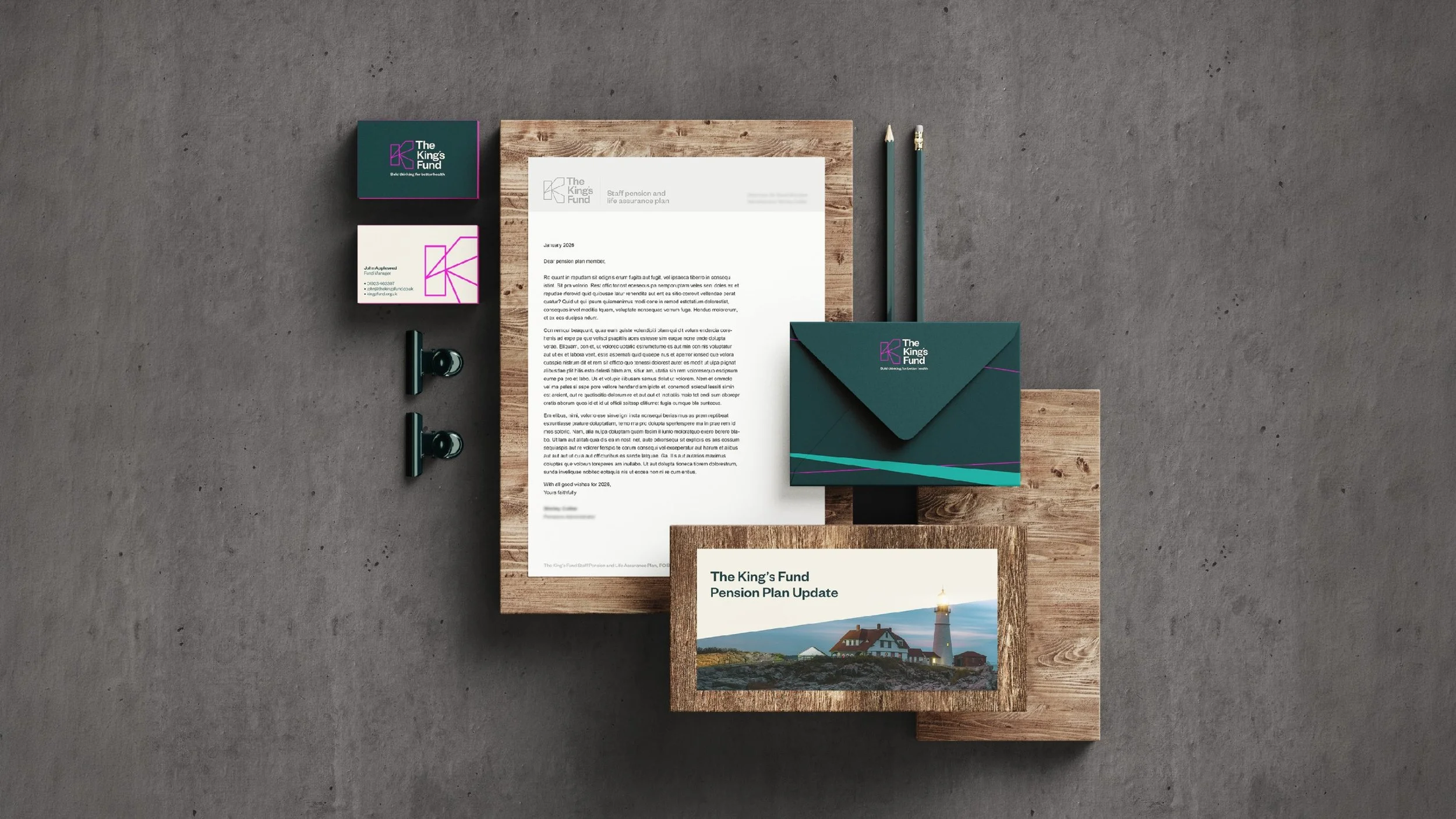
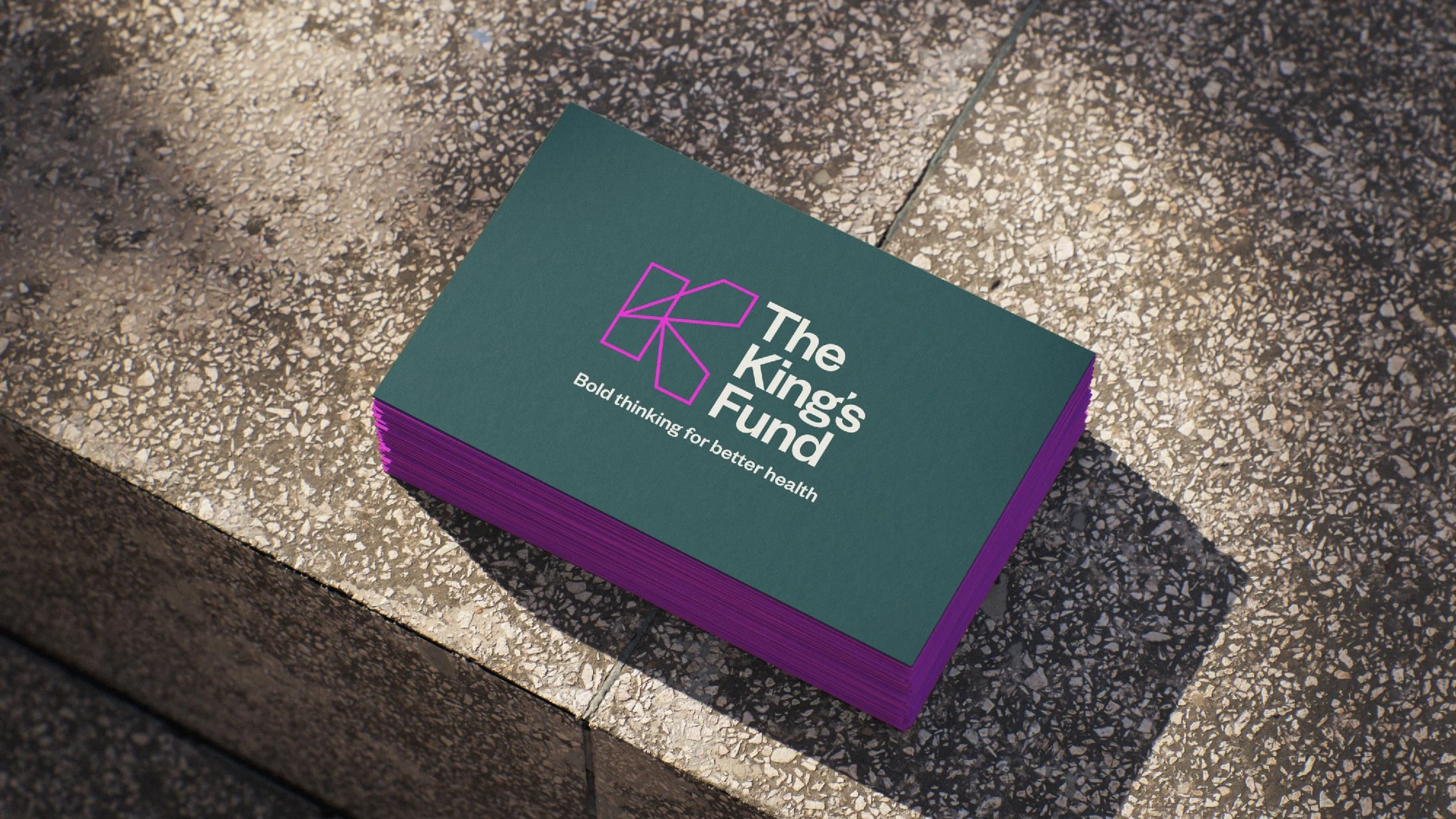
- Business cards and stationery
- Envelopes and supporting printed materials
-
Toy Creative manages the process from finished artwork through to print production and delivery.
Careful attention is given to paper stock, colour consistency, texture and finish so that every piece feels aligned with the brand and appropriate for its purpose.
The completed materials are then delivered directly to The King’s Fund at its Cavendish Square offices in London.
-
This is an ongoing creative relationship that continues to grow as new communication requirements arise.
By building a flexible and consistent visual system, we can respond to different briefs while ensuring each new piece still feels recognisably part of The King’s Fund brand.
-
The King’s Fund is an independent health charity based at Cavendish Square in London. We work with them on the brand design and print communications for their staff pension and life assurance plan — a steady stream of material that has to carry detailed, sometimes technical information without ever feeling cold.
Everything is designed within their existing visual identity. The distinctive palette, bold typography and graphic “spotlight” device give the layouts movement and energy, while a consistent editorial structure keeps dense information easy to navigate. The same visual thread runs from formal pension documentation through to event invitations.
The pension updates are produced as saddle-stitched booklets. Substantial outer covers and tactile inner stocks lift the reading experience considerably — it is the kind of detail that turns a compliance document into something people actually pick up. Around the booklets sit invitations, letterheads, business cards, envelopes and other stationery.
We manage the whole process from artwork through print production to delivery, with close attention to paper stock, colour consistency and finish, delivering the finished work directly to their Cavendish Square offices. It is an ongoing partnership that keeps growing as new communication needs come up.