
The Belgium Arms
Pub Brand Identity and Logo Design for The Belgium Arms
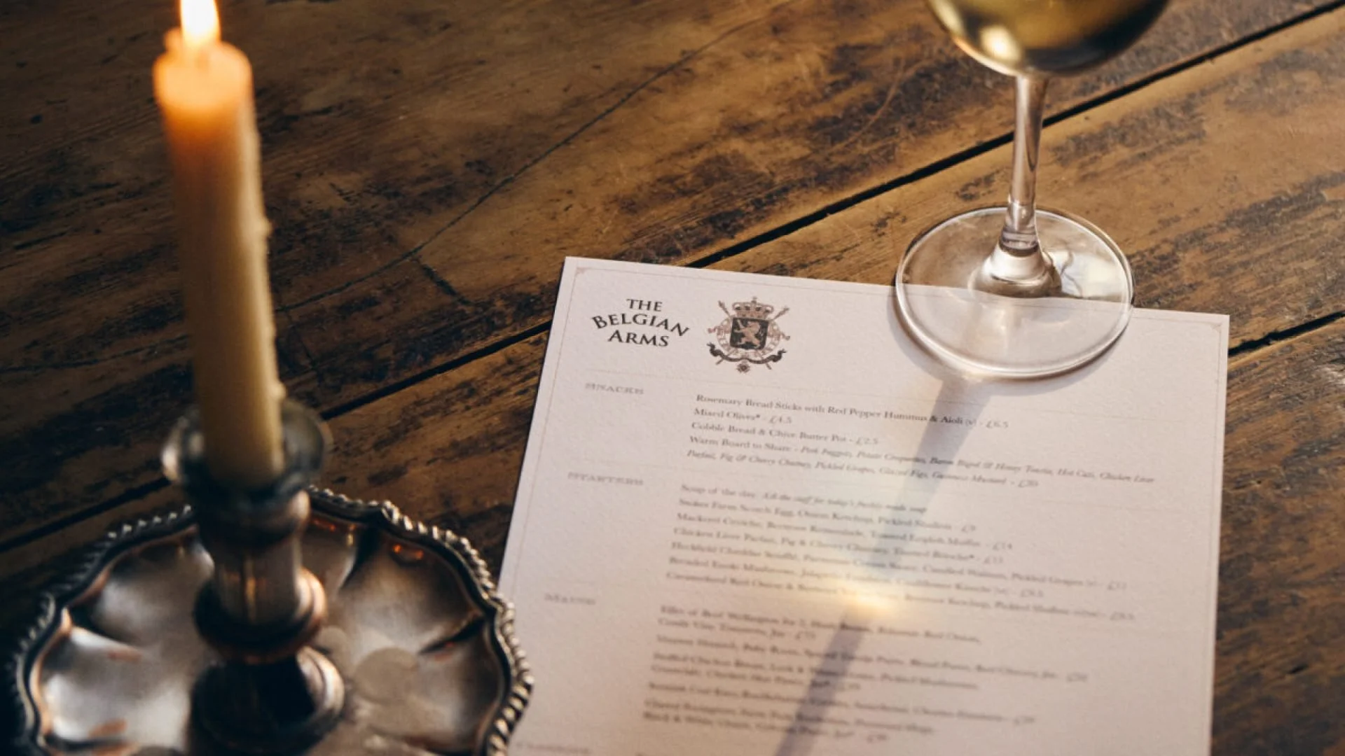
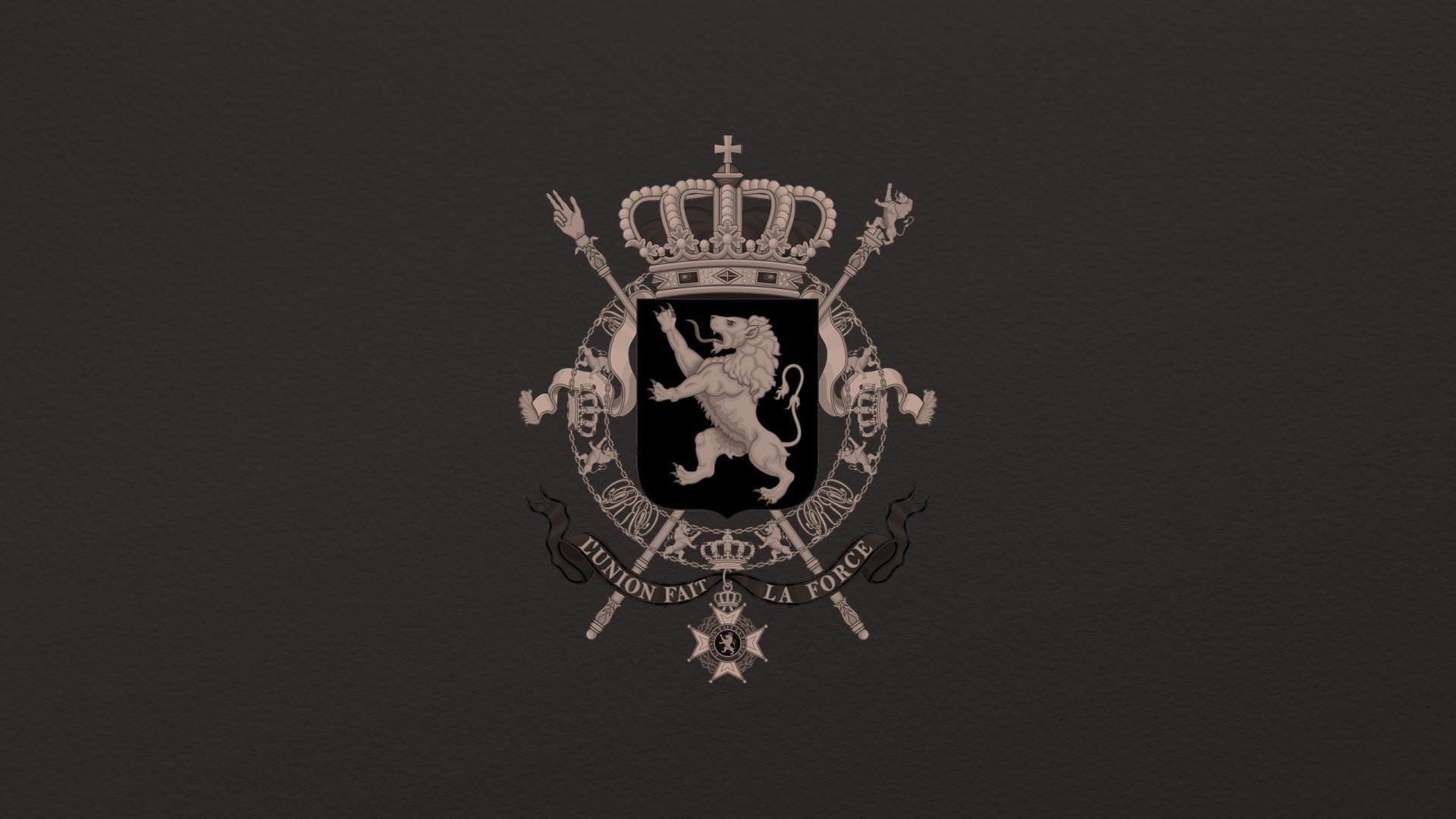
Toy Creative refreshed the brand identity for The Belgium Arms, a historic village pub located in Holyport near Maidenhead. The project focused on refining the pub’s traditional coat-of-arms logo and creating a cohesive design system that could be used across menus, stationery and other brand materials.
Timeless design, gastro focus
-
Client: The Belgium Arms
Industry: Hospitality / Pub
Services: Brand identity design, logo redesign, menu design, print design
Location: Holyport, Berkshire -
The Belgium Arms required a refreshed brand identity that would celebrate the pub’s long history while elevating its visual presentation for modern diners.
As a well-established village pub with a strong local following, the challenge was to preserve the heritage of the brand while introducing a cleaner and more versatile design system.
-
Our approach began by revisiting the pub’s traditional coat-of-arms logo.
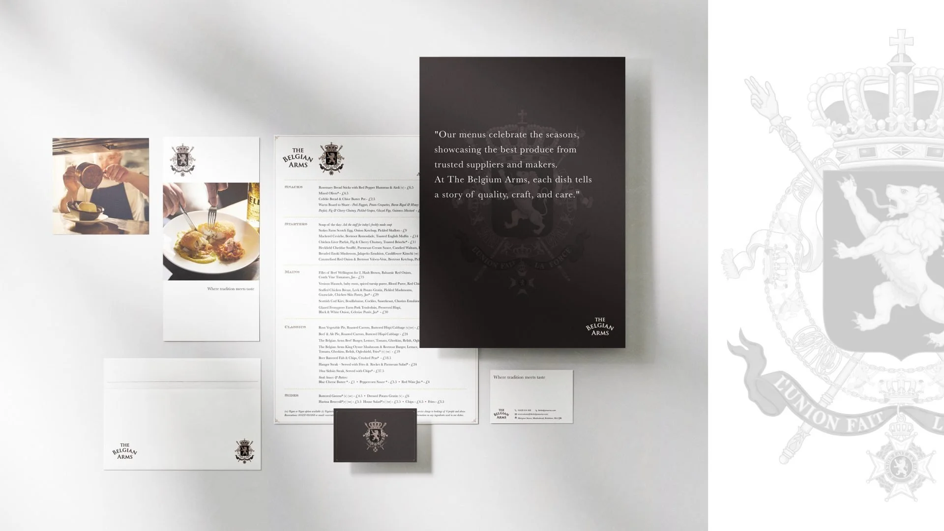
Rather than replacing the historic mark, we carefully redrew and refined the emblem, simplifying the lines and improving the proportions so the logo could work effectively across both print and digital formats.
This refreshed logo became the foundation of the broader visual identity.
-
The new identity was applied across a range of brand materials including:
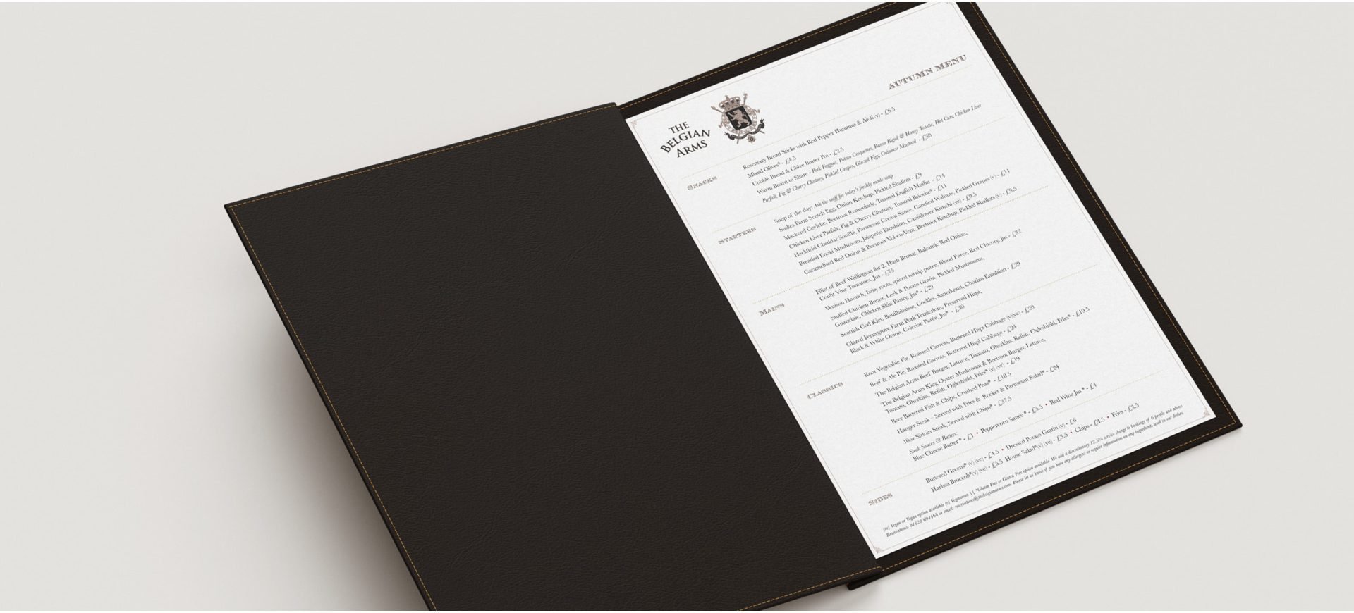
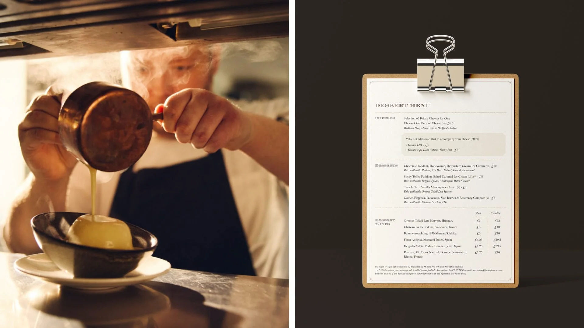
- menus
- coasters
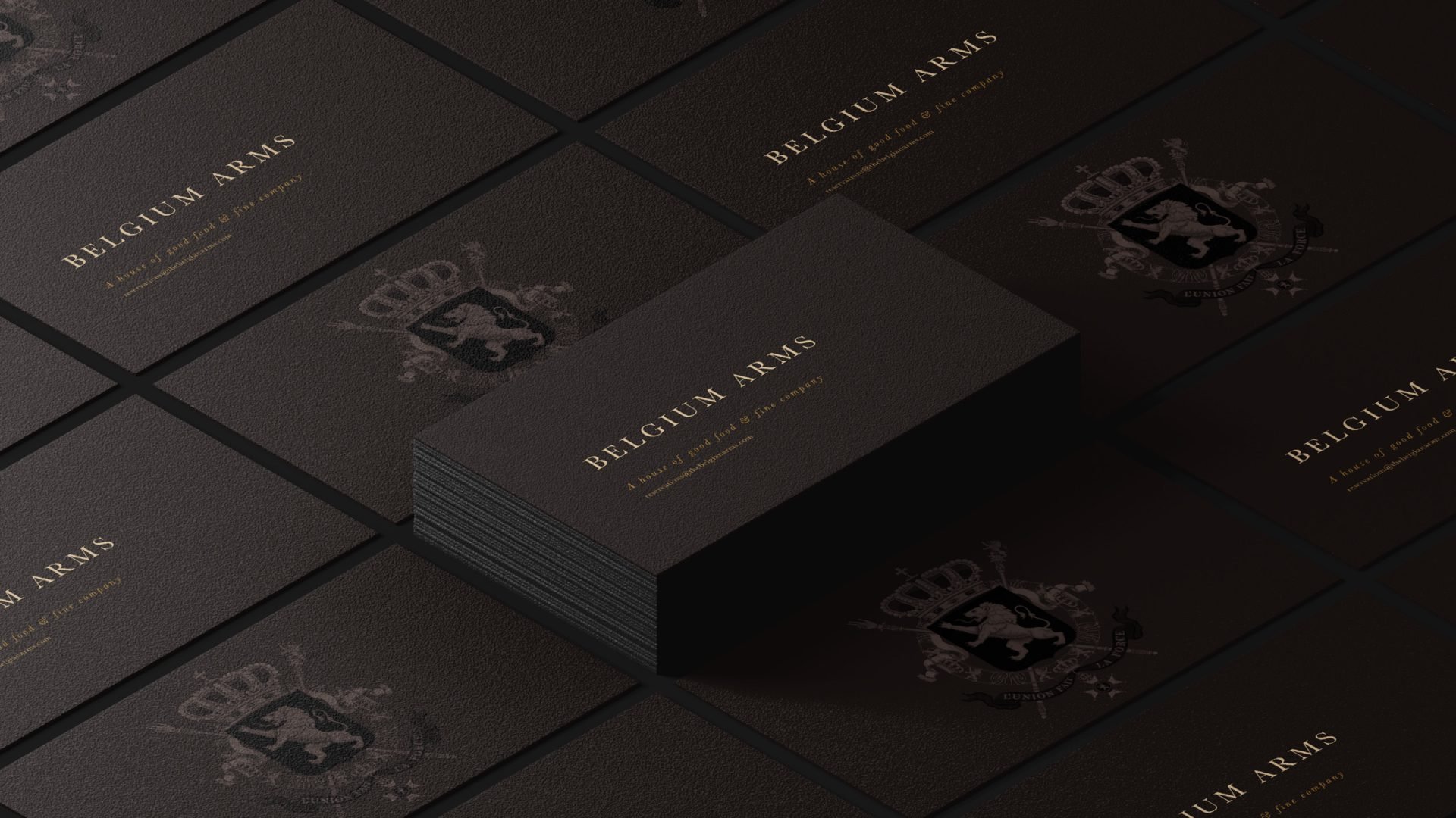
- business cards
- stationery
- printed collateral
These elements help create a consistent and recognisable brand presence throughout the pub experience.
-
Typography choices leaned into heritage without nostalgia, combining a timeless serif with a subtle modern touch to maintain readability and elegance.
Warm brown tones and rich cream paper stocks grounded the identity in classic British pub culture while ensuring every printed piece felt refined and consistent.
-
The refreshed identity honours the heritage of The Belgium Arms while presenting the pub with a stronger and more cohesive visual identity.
By refining the historic coat-of-arms logo and introducing a consistent design system, the brand now reflects both the tradition and quality associated with this much-loved village pub.
-
Located in Holyport, Maidenhead, The Belgium Arms is a beloved local pub known for its traditional menu and welcoming atmosphere. Our challenge was to bring their heritage to life through thoughtful, cohesive design — creating a look and feel that felt as timeless as their recipes.
We began by reimagining the classic logo, carefully retaining the historical coat of arms that has long symbolised the pub’s roots. The design was redrawn with cleaner lines and subtle detail, providing flexibility for both print and digital use. This foundation informed a broader visual system that extended across menus, stationery, coasters, business cards and other branded materials.
Typography choices leaned into heritage without nostalgia, combining a timeless serif with a subtle modern touch to maintain readability and elegance. Warm brown tones and rich cream paper stocks grounded the identity in classic British pub culture while ensuring every printed piece felt refined and consistent.
Our goal was to celebrate the authenticity of The Belgium Arms while elevating its presentation for today’s guests. The result is a brand identity that embodies the pub’s motto: tradition meets taste.