
The Coach House
Restaurant Brand Identity Design for The Coach House
Toy Creative developed a refined brand identity for The Coach House, a contemporary restaurant located in Beaconsfield. The project involved creating a distinctive logo and visual identity designed to reflect the venue’s relaxed atmosphere while maintaining a modern and elegant hospitality brand.
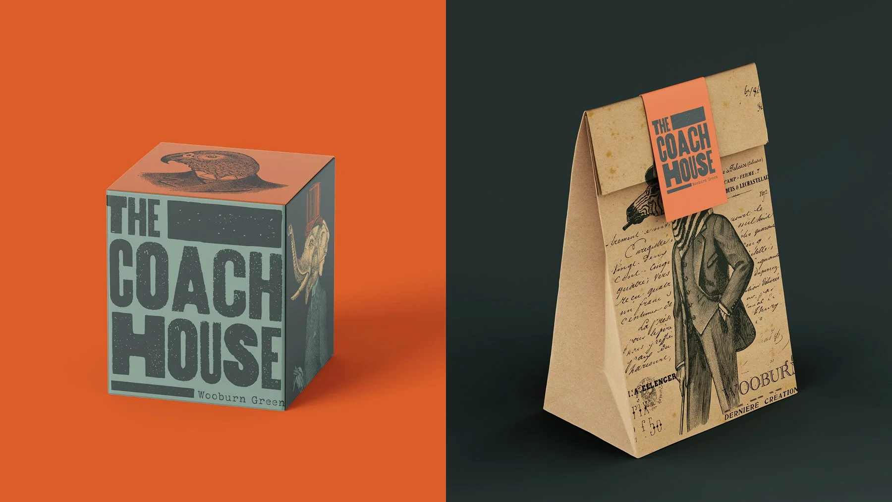
Pub brand identity, from first sketch to signage
-
Client: The Coach House
Industry: Hospitality / Restaurant
Services: Brand identity design, logo design, typography
Location: Beaconsfield, Buckinghamshire -
The Coach House required a brand identity that would reflect the restaurant’s welcoming atmosphere while communicating a sense of quality and modern hospitality.
The goal was to create a visual identity that felt relaxed and contemporary while still maintaining a refined and recognisable brand presence.
-
Our approach focused on developing a clean and confident logo that would work across a wide range of restaurant touchpoints.
The typography and graphic elements were designed to balance elegance with simplicity, helping the brand feel both approachable and distinctive.
-
The identity was built around a restrained design language that allows the brand to feel timeless while remaining adaptable across different applications.
Carefully considered typography and graphic elements create a cohesive visual system that works across menus, signage and marketing materials.
-
The identity was designed to be flexible and effective across a range of brand applications including:
- restaurant signage
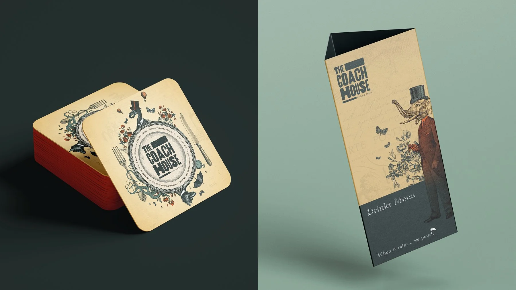
- menus and printed materials
- digital marketing
- promotional content
This ensures the brand remains consistent across every customer interaction.
-
The final identity provides The Coach House with a modern and recognisable brand that reflects the restaurant’s welcoming character.
The refined typography and clean design create a confident visual presence that supports the venue’s contemporary dining experience.
-
The Coach House is owned and run by Ben and Krystel, owners and head chef of the Home Roots brand. We worked closely with them recently to relaunch this brand, which meant the brand identity for their pub in Wooburn Green needed to feel part of this overarching brand. Exciting colour-contrasting paved the way for the colour theory in this project, but we wanted to explore the idea that the Home Roots brand represents. Their vision is to create British classics with their unique and exciting twists. We started by exploring how this twist could come to life with pub aesthetics.
The area of Wooburn Green is very much idyllic. It has a big community and any introduction of new brand identities would need to be considerate. The pub itself, however, is full of character. Low ceilings, crackling fireplaces, and a vintage-meets-modern feel make you feel at home. What we love most about the Home Roots brand is that they offer food that is anything but mild and subdued. They offer zingy flavours and a fantastic range of food options that feel both modern and very different. This became the area we wanted to explore most for the brand’s visual style.
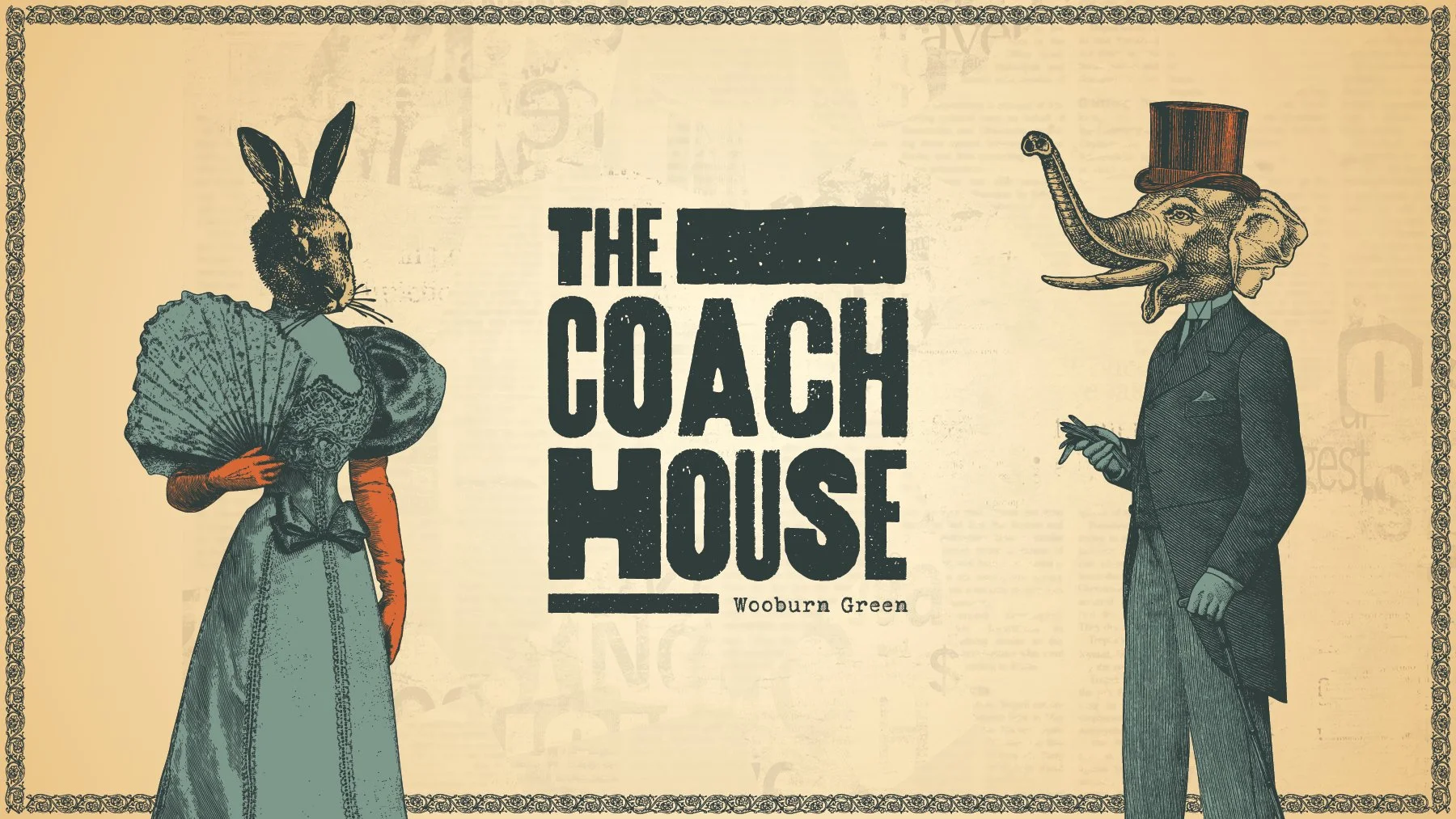
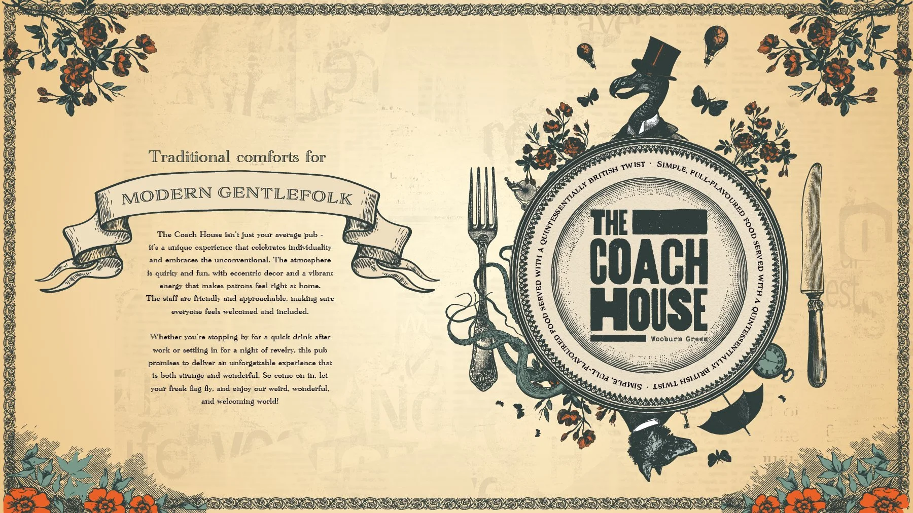
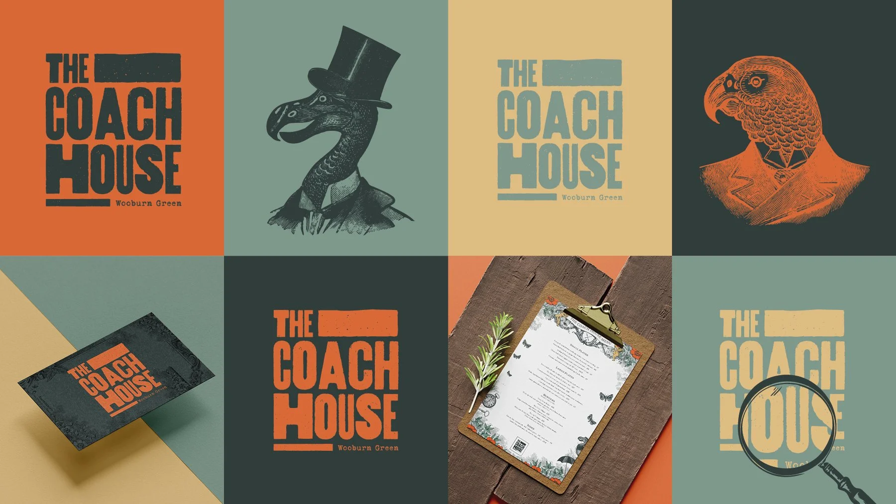
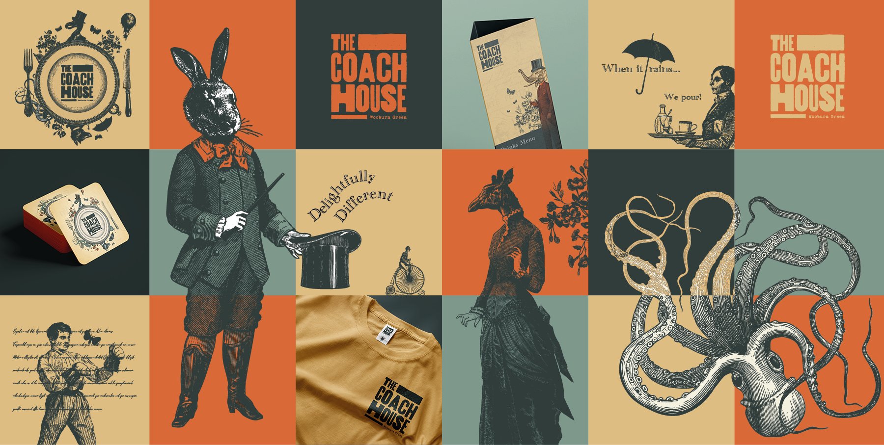
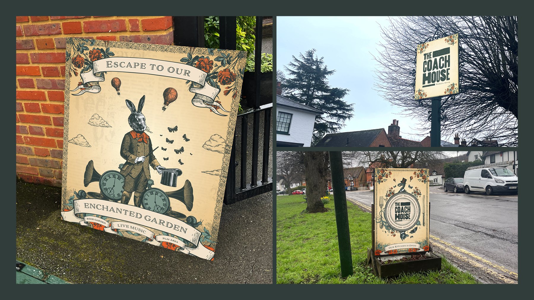
The idea behind this branding is Victorian gentlefolk meeting all calibre of eccentric patrons. The artistic style of creative, quirky animal characters mixed with their Victorian counterparts creates a curious combination, and establishes the brand immediately as somewhere exciting to visit. We combined the traditional stylings of a serif, engraved font with the exciting colour combinations of the brand’s existing palette to create layouts that feel balanced and interesting. To help layouts come to life we introduced a real newspaper texture from the local paper and collected a large library of unique illustrations that the brand can use to define itself going forward.
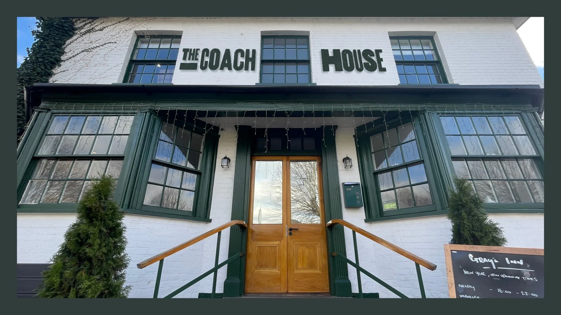
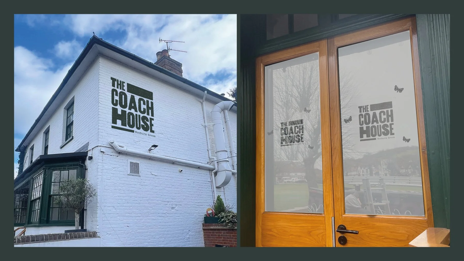
Once the creative had been embraced, it was time to bring the branding to life with an entire suite of signage and installations. The signage installed at this pub was wonderfully varied — everything from raised lettering on the front of the pub to long-lasting brick wraps adorning the side. Carefully installed frosted graphics brought the window spaces to life and rounded everything off, and we created them a website that feels like no other.