
BASTE
Restaurant Brand Identity and Logo Design for BASTE
Toy Creative evolved the brand identity for Baste by transforming the original wordmark into a distinctive badge-style logo. The new identity reflects the brand’s commitment to quality ingredients and sustainable cooking while creating a stronger and more recognisable visual presence.
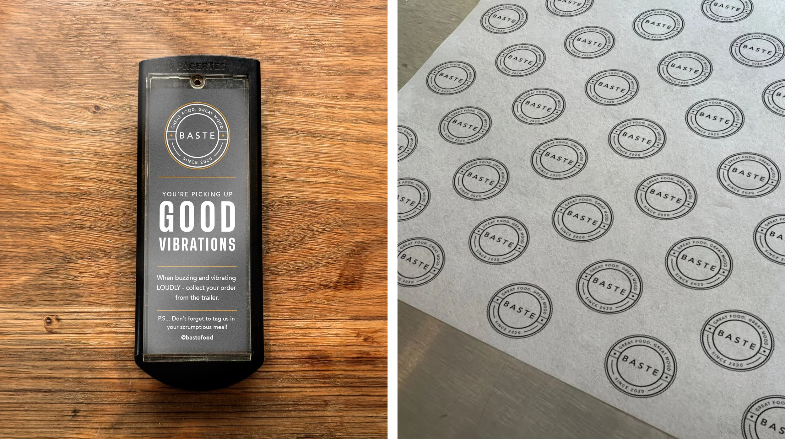
Evolving a food brand into a mark of excellence
-
Client: BASTE
Industry: Hospitality / Restaurant
Services: Brand identity design, logo design, brand evolution
Location: Cotswolds, UK -
Baste required a refined visual identity that would better communicate the brand’s values and strengthen its presence across different brand touchpoints.
The goal was to evolve the existing logo into a more distinctive mark while maintaining the character and personality that customers already associated with the brand.
-
Our approach focused on transforming the original wordmark into a badge-style logo that could function as a recognisable symbol across the brand.
By introducing simple graphic elements and a structured composition, the new mark creates a stronger visual identity while remaining clear and versatile.
-
The badge design represents Baste’s dedication to quality cooking and sustainable food practices.
This evolution helps align the visual identity with the brand’s ethos, reinforcing the values that define the restaurant.
-
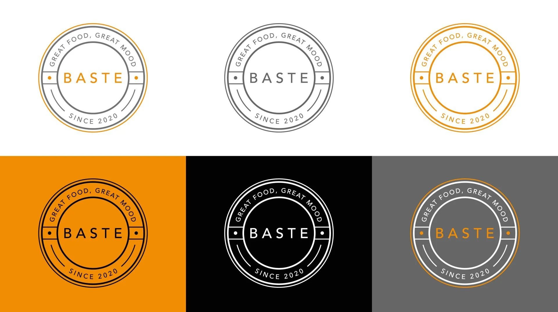
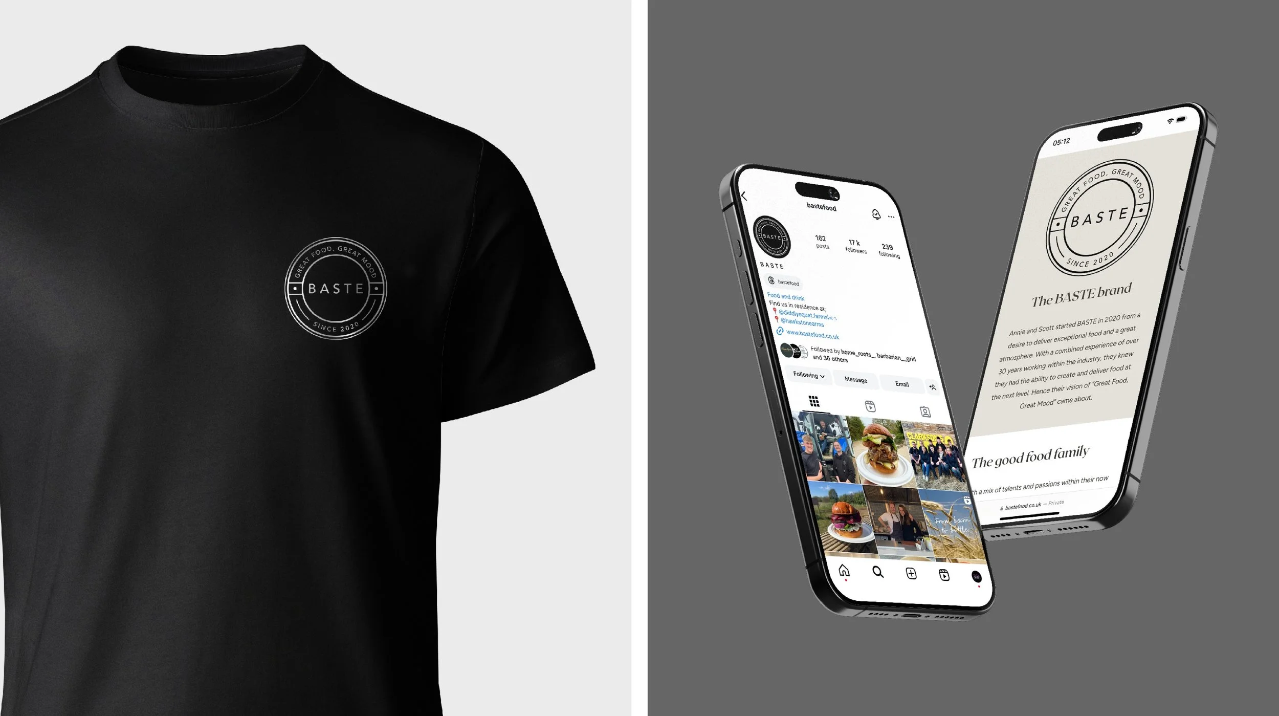
The updated identity was designed to work effectively across a variety of applications including:
- menus and printed materials
- packaging
- digital marketing
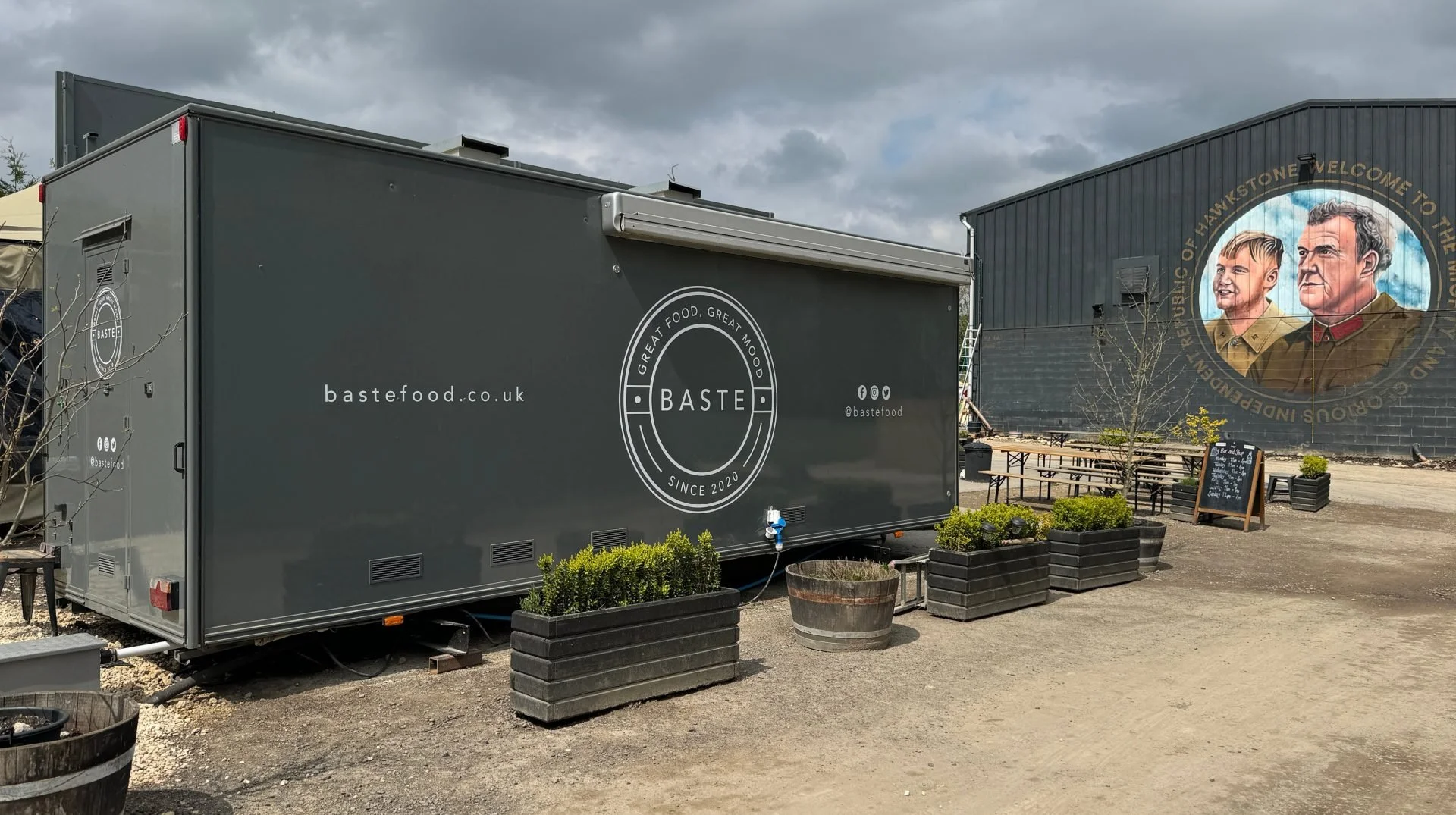
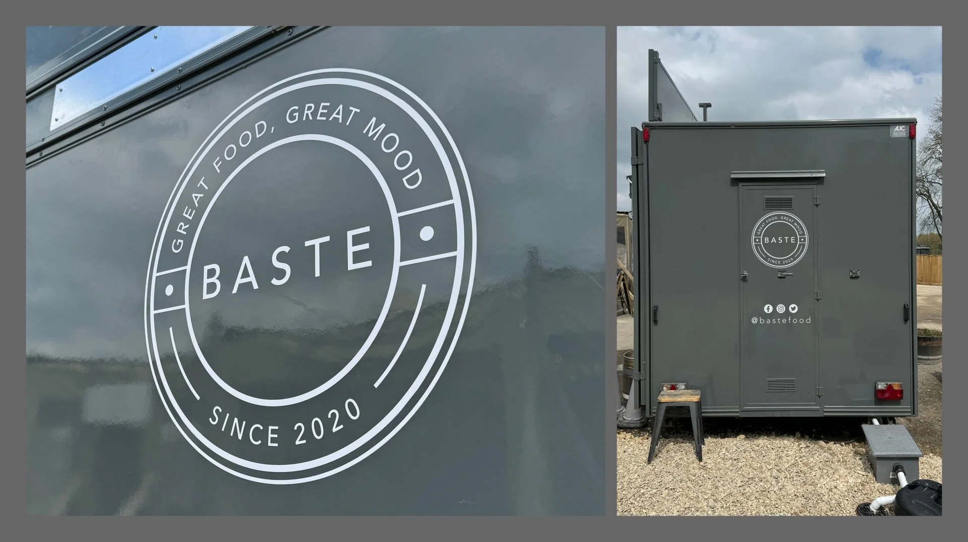
- signage and promotional assets
The badge format ensures the mark remains clear and recognisable across different formats.
-
The refreshed identity gives Baste a stronger and more cohesive brand presence.
By evolving the logo into a distinctive badge, the brand now has a visual mark that reflects its commitment to quality, sustainability and thoughtful cooking.
-
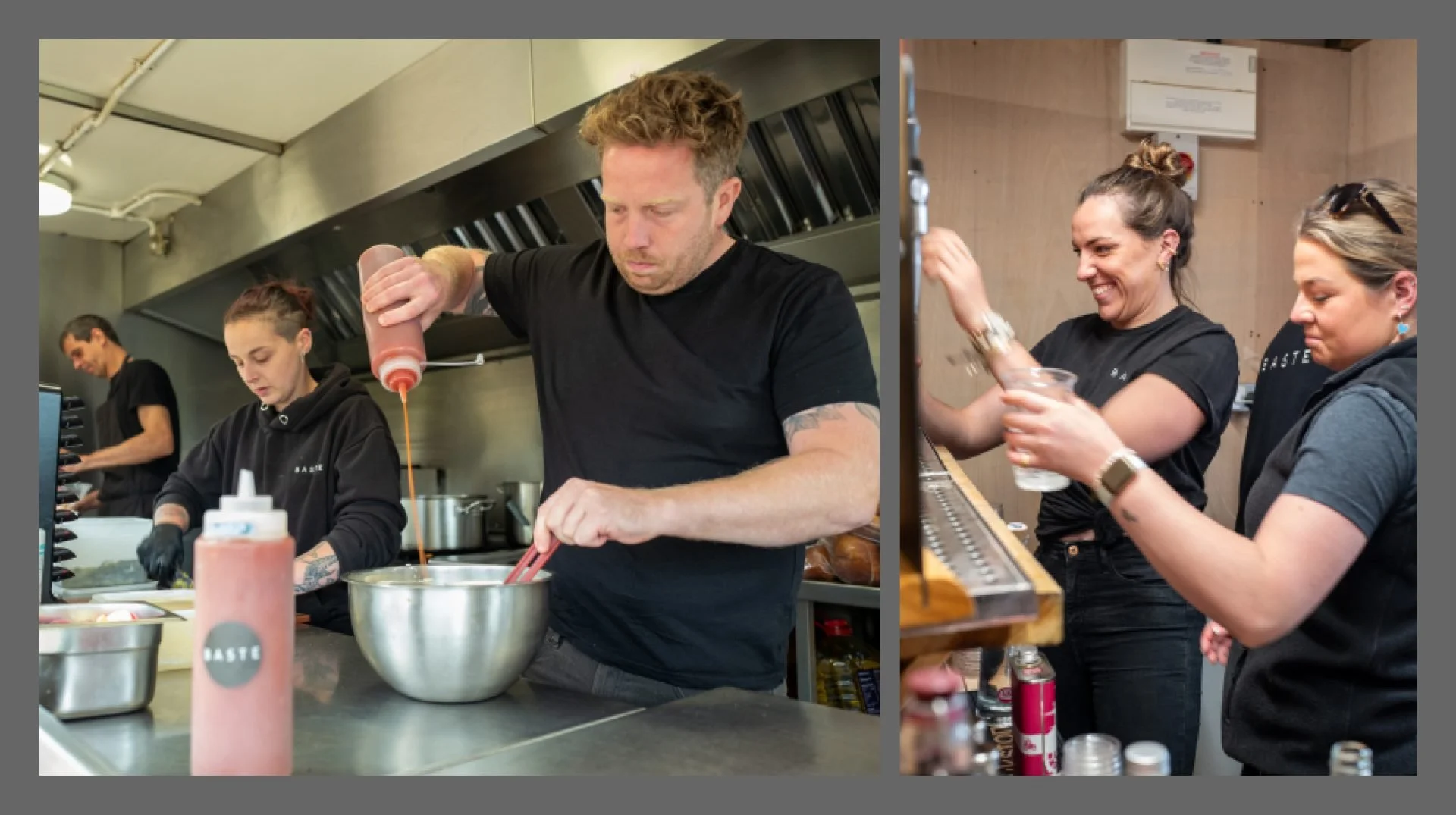
Annie and Scott kicked off BASTE back in 2020 because they really wanted to bring amazing food and a fantastic vibe to the table. With a whopping 30 years of experience between them in the industry, they were super confident they could whip up something special. And that’s how their motto “Great Food, Great Mood” was born. Their logo and branding is based on a combination of simplicity and quality. We helped them refine their logo into a mark of excellence: a badge that contains the brand’s hallmark achievements. It includes their name, their mantra of “Great Food, Great Mood”, and the milestone of when they started their journey. It represents everything they stand for, with honesty and passion at the core.
You’ll find simplicity in their efforts behind responsible ingredients in their food, but nothing simple about the flavours they achieve. Their menu is as fresh and inspiring as the seasons, so their menu evolves but their belief is consistent at all times. Serving up heaps of great food, with the energy and passion that they bring to the table.
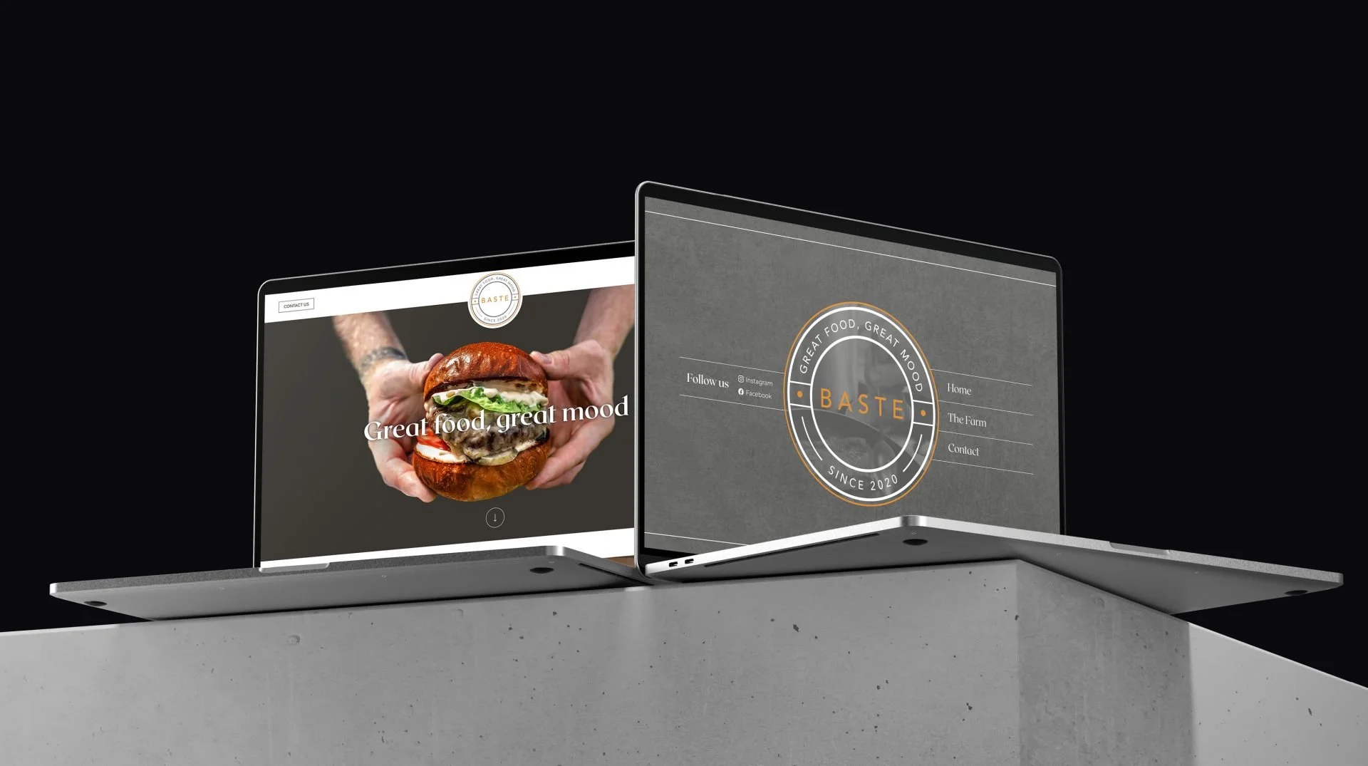
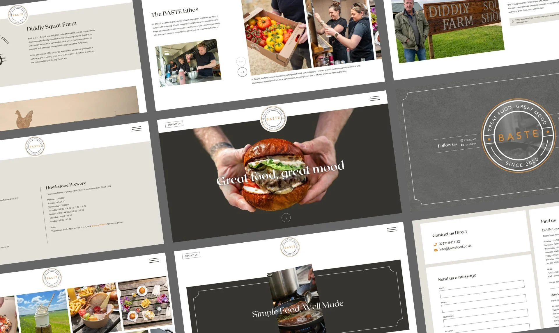
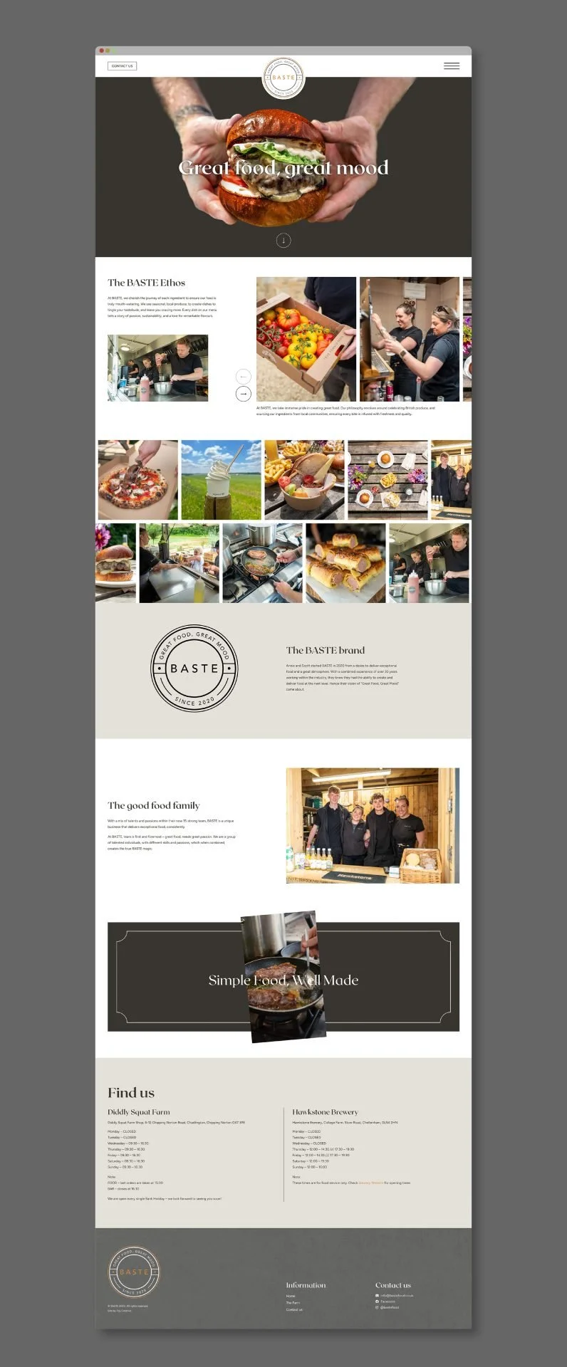
At Toy, we’ve found this common benchmark of quality to be an ideal space to work. We’ve helped the team by supplying them a huge range of bespoke items — greaseproof papers, branded beer cups, trailer signage and a bespoke website to name just a few.
They’re based in the Cotswolds, currently at Diddly Squat Farm. You can find all their latest updates and more details about the brand at www.baste-food.co.uk, and catch them in the latest season of “Clarkson’s Farm”.