
Rouse Farm
Farm Brand Identity Design for Rouse Farm
Toy Creative developed a distinctive brand identity for Rouse Farm, creating a visual language that reflects the heritage, landscape and character of the farm. The project focused on combining traditional agricultural references with a clean and contemporary design approach.
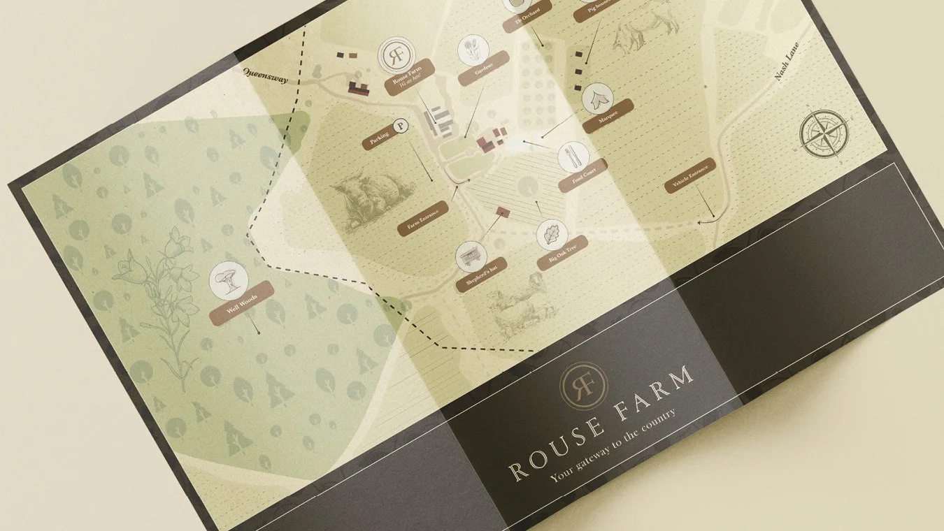
Two sides of a farm, back to back
-
Rouse Farm required a brand identity that would represent the farm’s values while creating a recognisable visual presence.
The identity needed to communicate authenticity, quality and connection to the land while remaining flexible enough to be used across signage, packaging and promotional materials.
-
Toy Creative developed a logo and visual identity inspired by the agricultural environment surrounding the farm.
The design balances heritage references with contemporary typography to create a brand that feels both established and modern.
-
The visual identity draws inspiration from the natural landscape and farming environment.
Key elements include earthy colour palettes, clean typography and graphic elements inspired by rural forms and fields.
These elements help reinforce the authenticity of the brand while maintaining a refined and professional appearance.
-
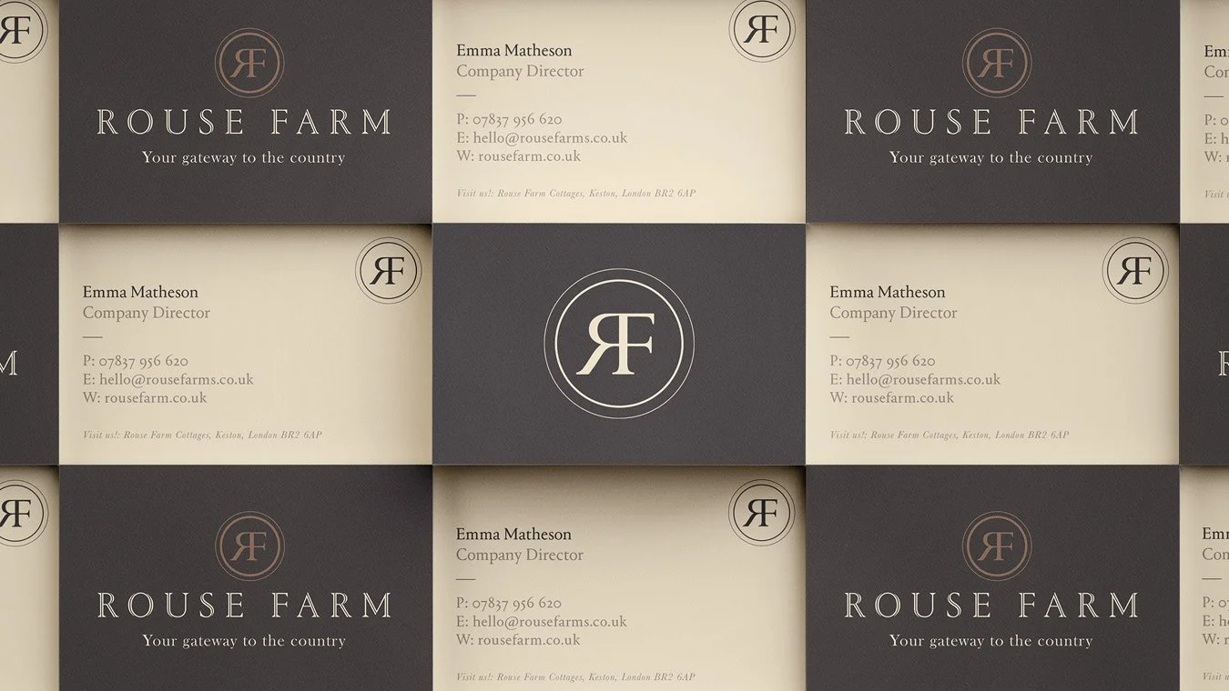
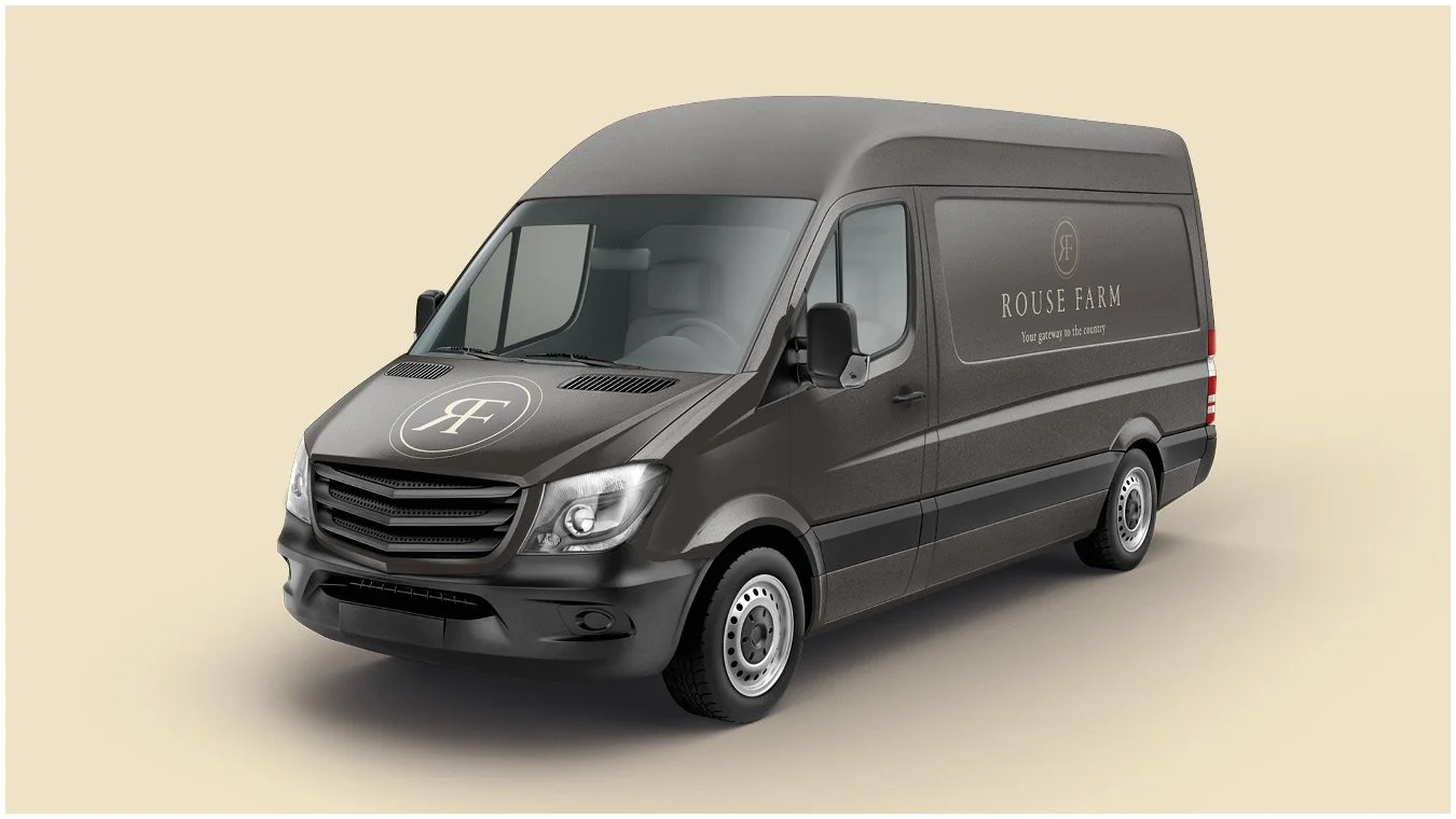
The identity was designed to work across a range of applications including farm signage, packaging and product labels, marketing materials and digital communications.
This ensures the brand remains consistent wherever the Rouse Farm identity appears.
-
The finished brand identity gives Rouse Farm a clear and recognisable visual presence.
By combining agricultural heritage with contemporary design, the brand reflects the farm’s values while presenting the business in a confident and modern way.
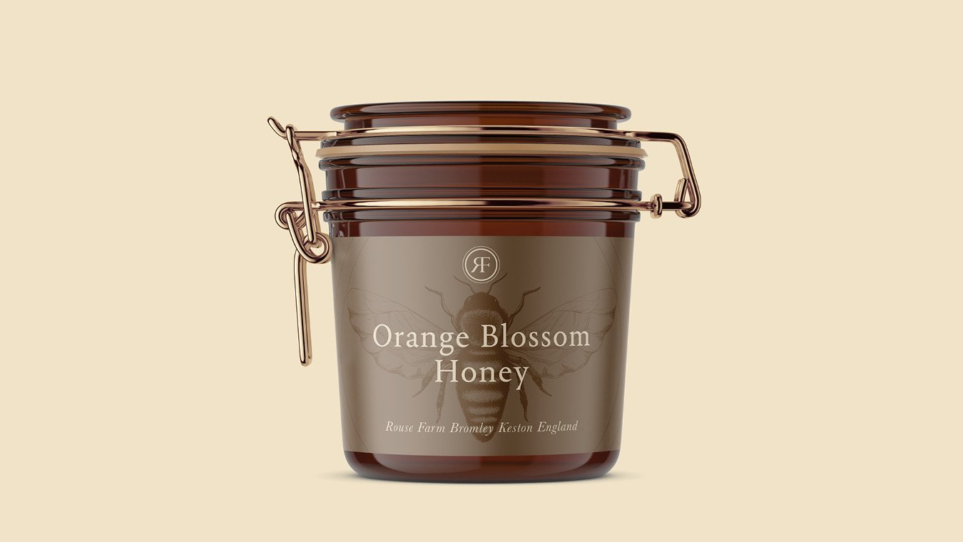
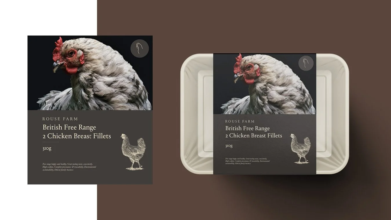
-
Toy Creative worked with the team at Rouse Farm to create a bold, chic new logo and visual approach. The identity needed to represent their quality throughout all their assets, but there were a few things to consider.
The farm is an agricultural marvel. It hosts a range of well-bred pedigree livestock, incredible farmland and a main resort boasting breathtaking views. Toy Creative worked with the team to discover their emotional advantage. The team work tirelessly to uphold the two elements of the company: a strategically placed wedding-ready location, and the food production side.
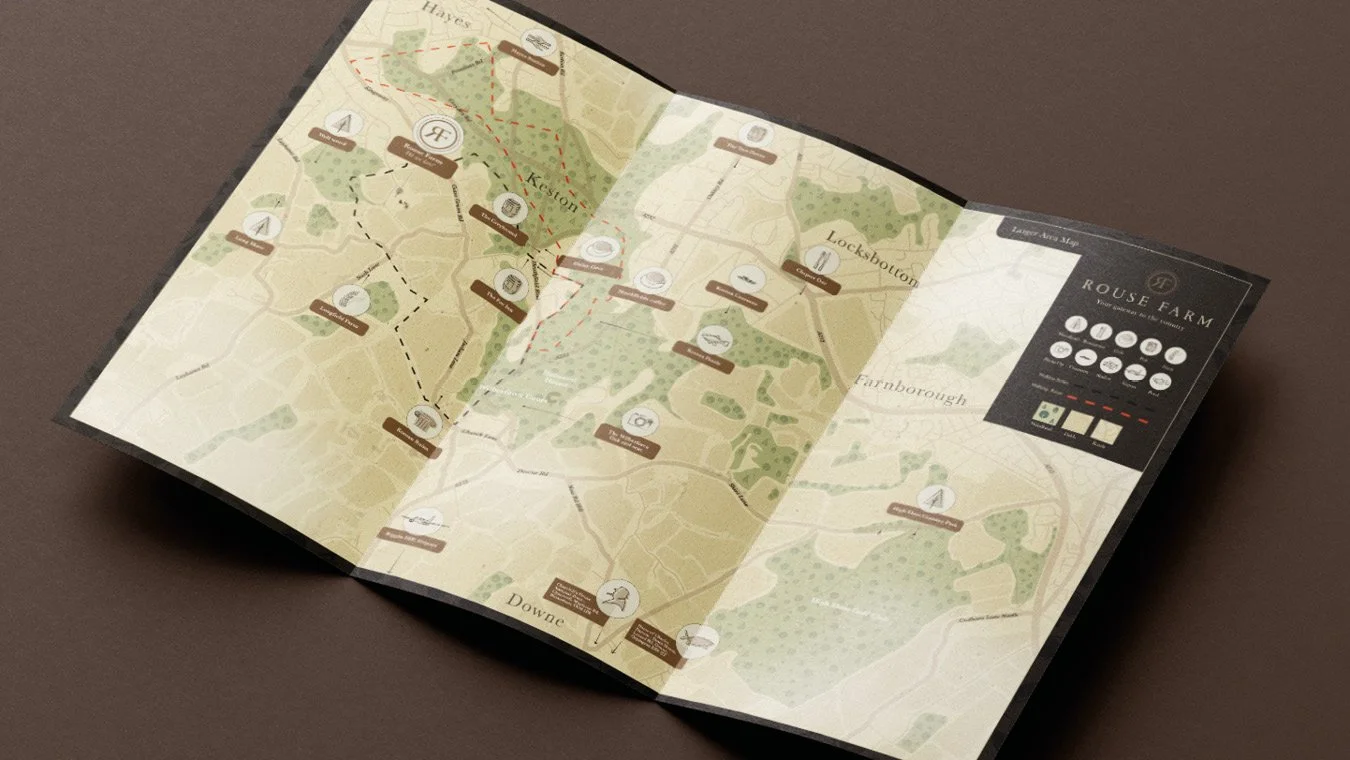
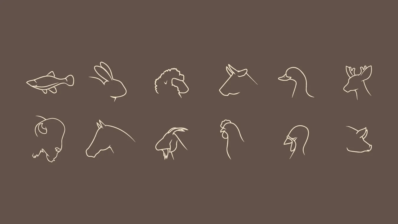
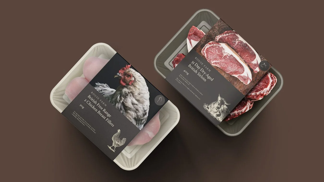
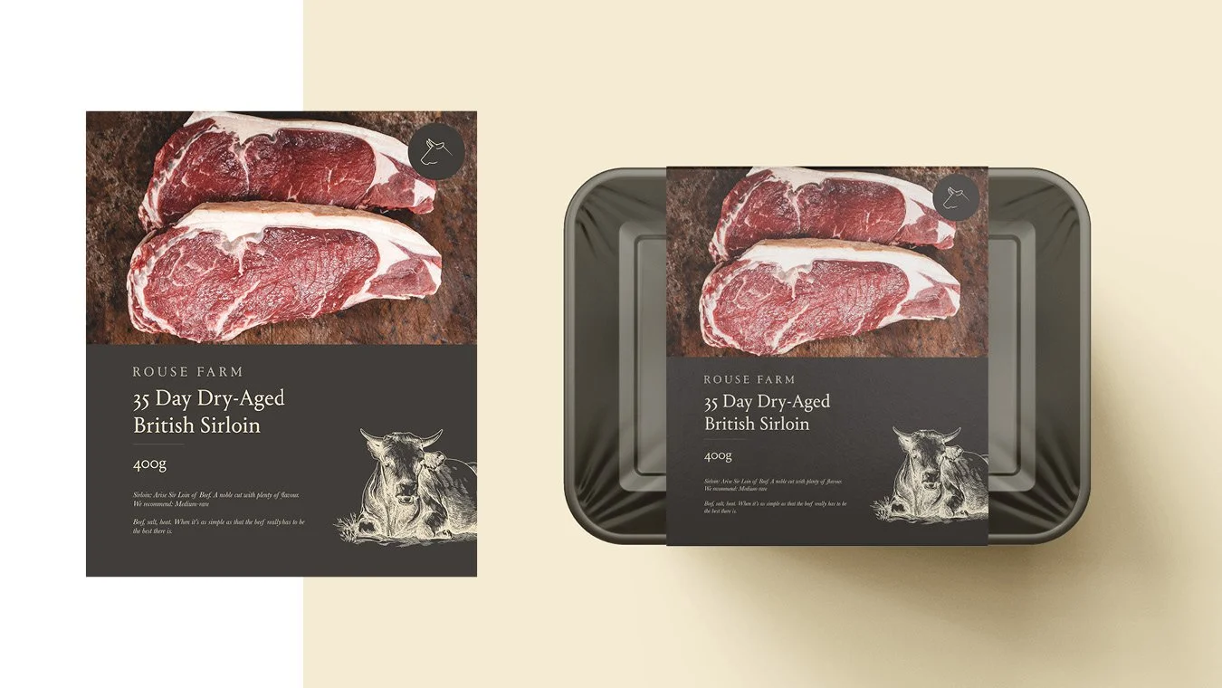
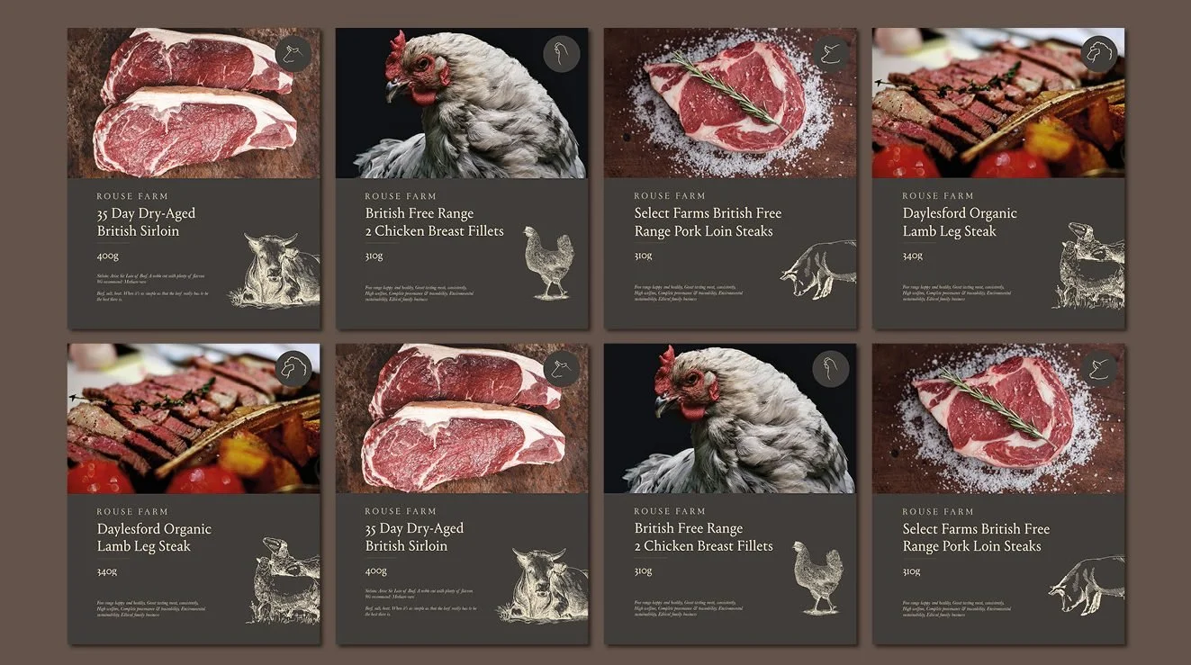
The location side was maintained through clear, simple use of signage. Single-line animal icons keep wayfinding fun and add an extra layer of chic to the designs. For food packaging we kept the visual direction simple, with a focus on photography from their on-site kitchens and a consistent British tone of voice.
The logomark is a visual representation of the two sides of the business, back-to-back. The two-toned colour hues keep layouts consistent and elegant, while the use of Portrait Inline continued the idea of two elements working together in every use of the typography.