
OREA
Beauty Salon Branding and Clinical Signage for OREA
Toy Creative developed a new brand identity and signage system for OREA, a stylish salon in Bicester, Oxfordshire. The project combined pastel-inspired branding with contemporary signage and interior graphics to create a welcoming environment that reflects the salon’s commitment to modern beauty and style.
Pastel tones, applied end to end
-
Client: OREA Salon
Industry: Beauty / Hair and Aesthetics
Services: Brand identity design, logo design, signage, interior graphics
Location: Bicester, Oxfordshire -
OREA wanted to transform its salon into a distinctive beauty destination with a stronger brand presence.
The goal was to create a fresh visual identity that would feel modern, stylish and welcoming while communicating the salon’s focus on quality treatments and personalised client experiences.
-
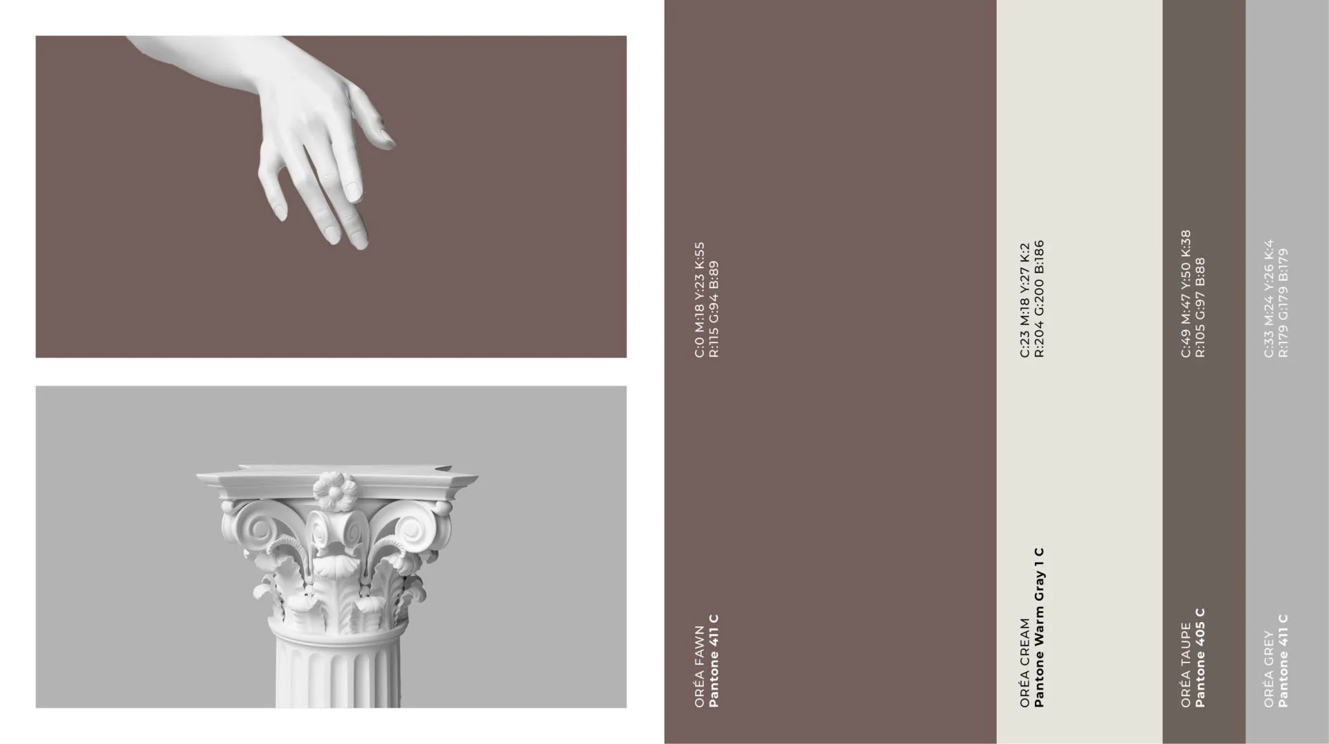
The new brand identity was inspired by a palette of soft pastel colours, chosen to evoke warmth, creativity and approachability.
The refreshed logo combines geometric shapes with fluid lines, balancing elegance with contemporary flair while reflecting the personality of the salon.
-
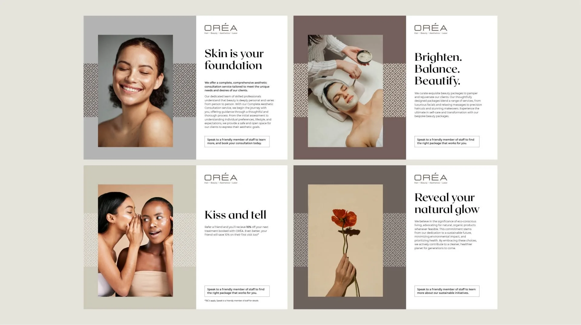
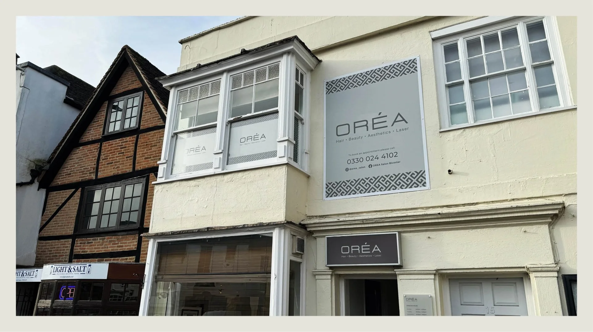
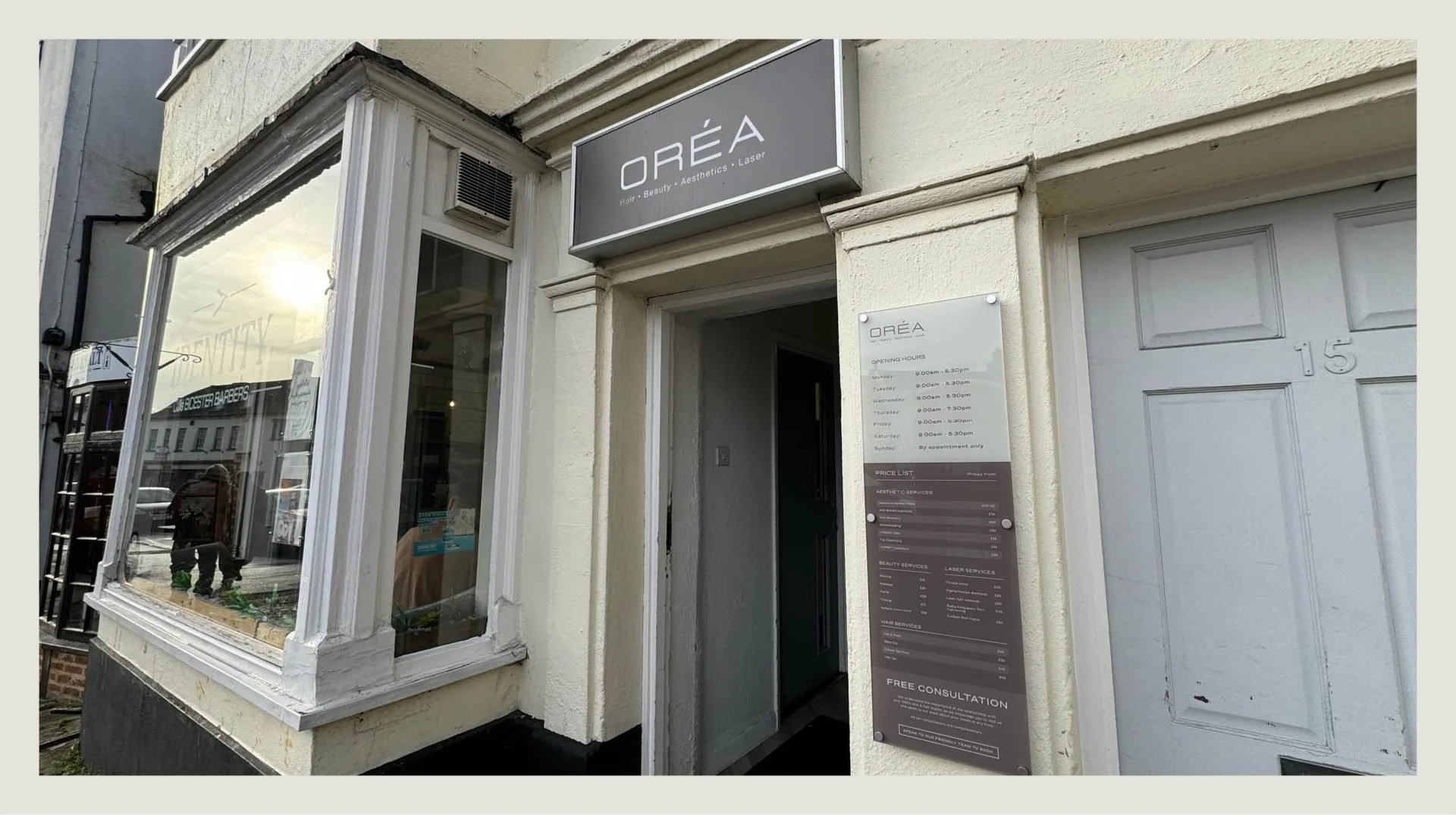
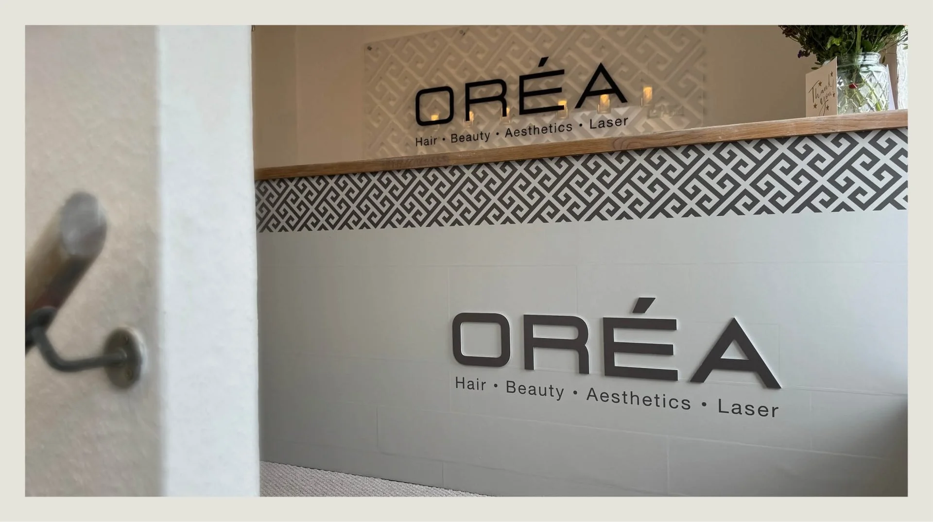
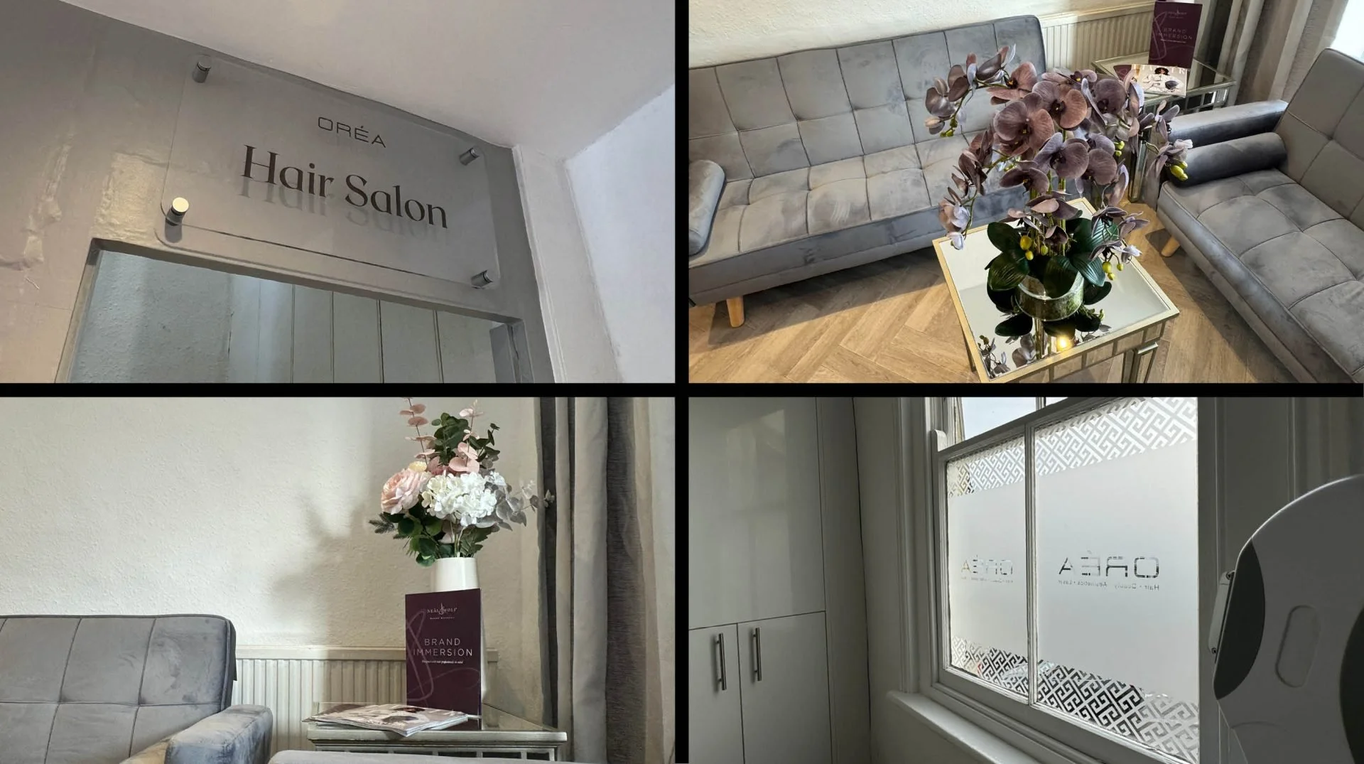
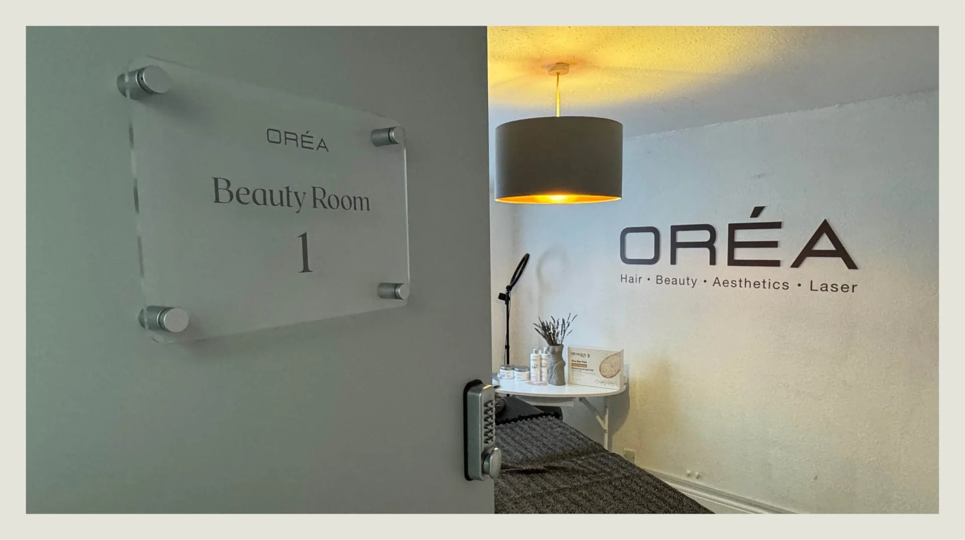
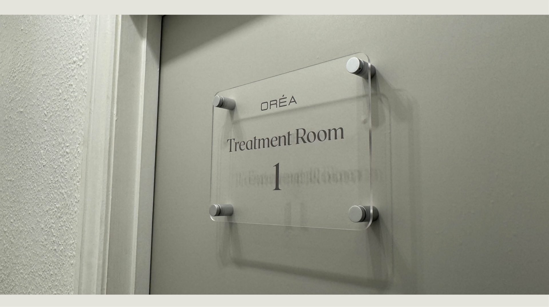
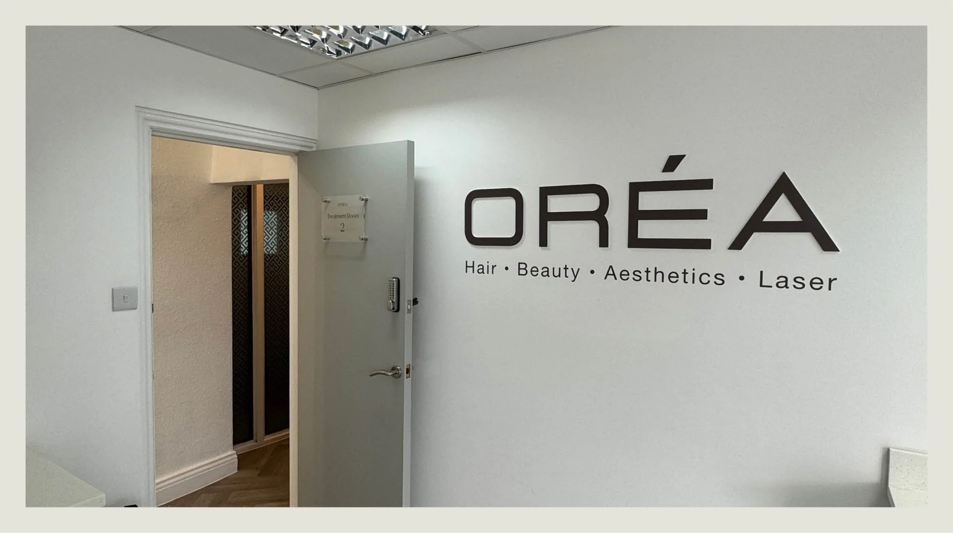
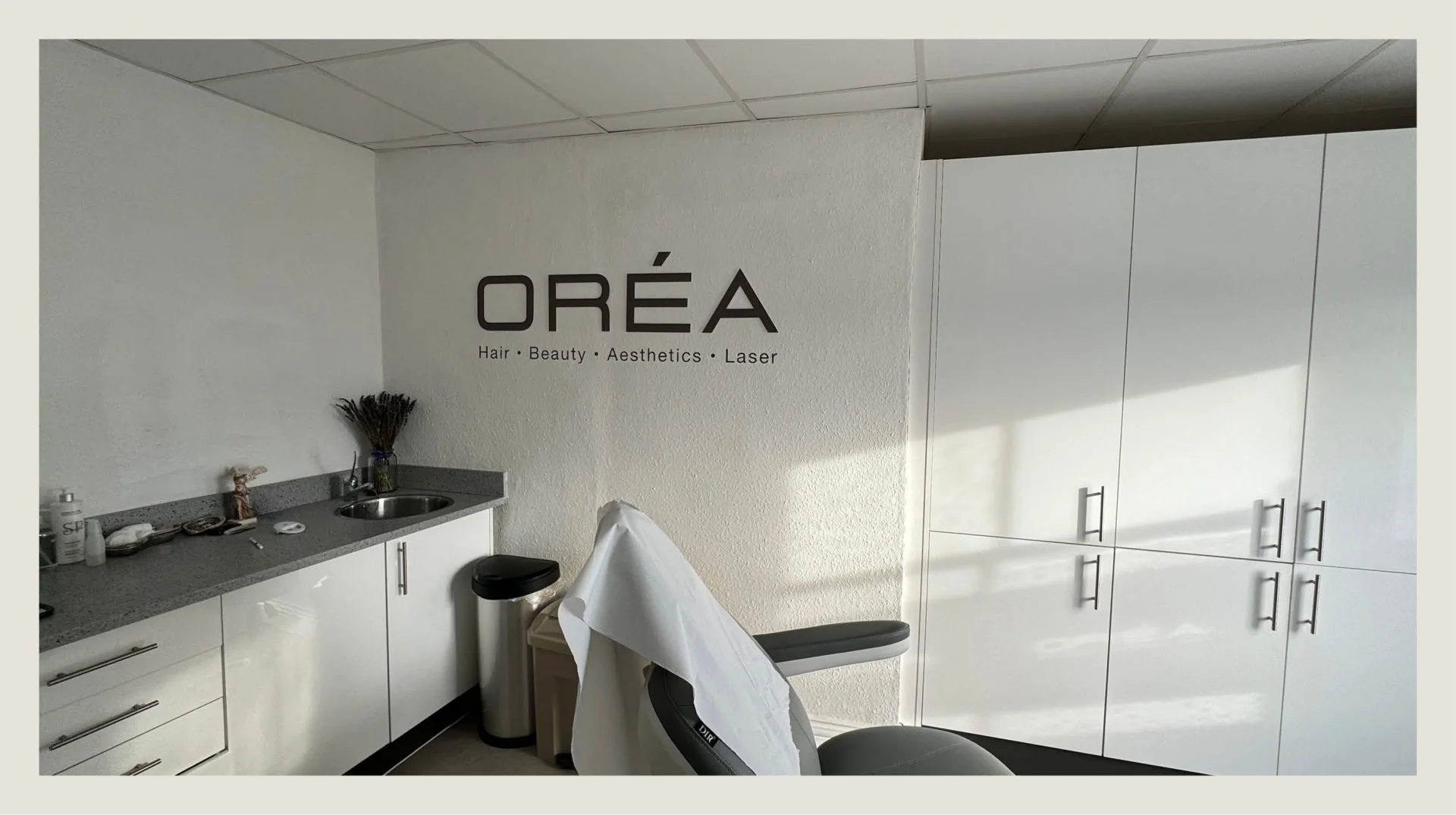
To bring the new brand to life, Toy Creative designed a range of signage and interior graphics for the salon — illuminated exterior signage, interior wall graphics, stylist station signage and promotional displays.
Each element incorporates the pastel colour palette and design language, ensuring the brand remains consistent throughout the space.
-
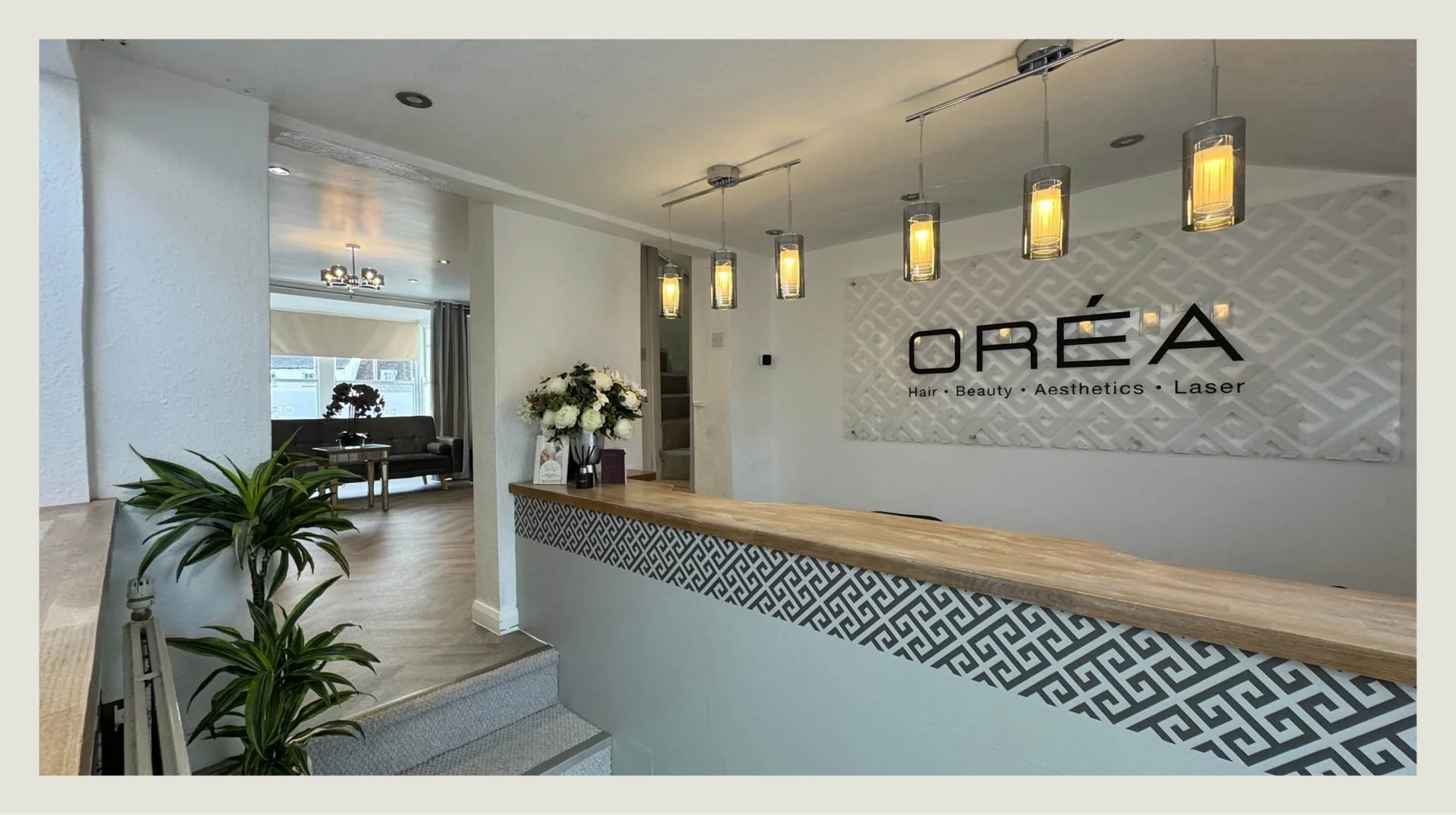
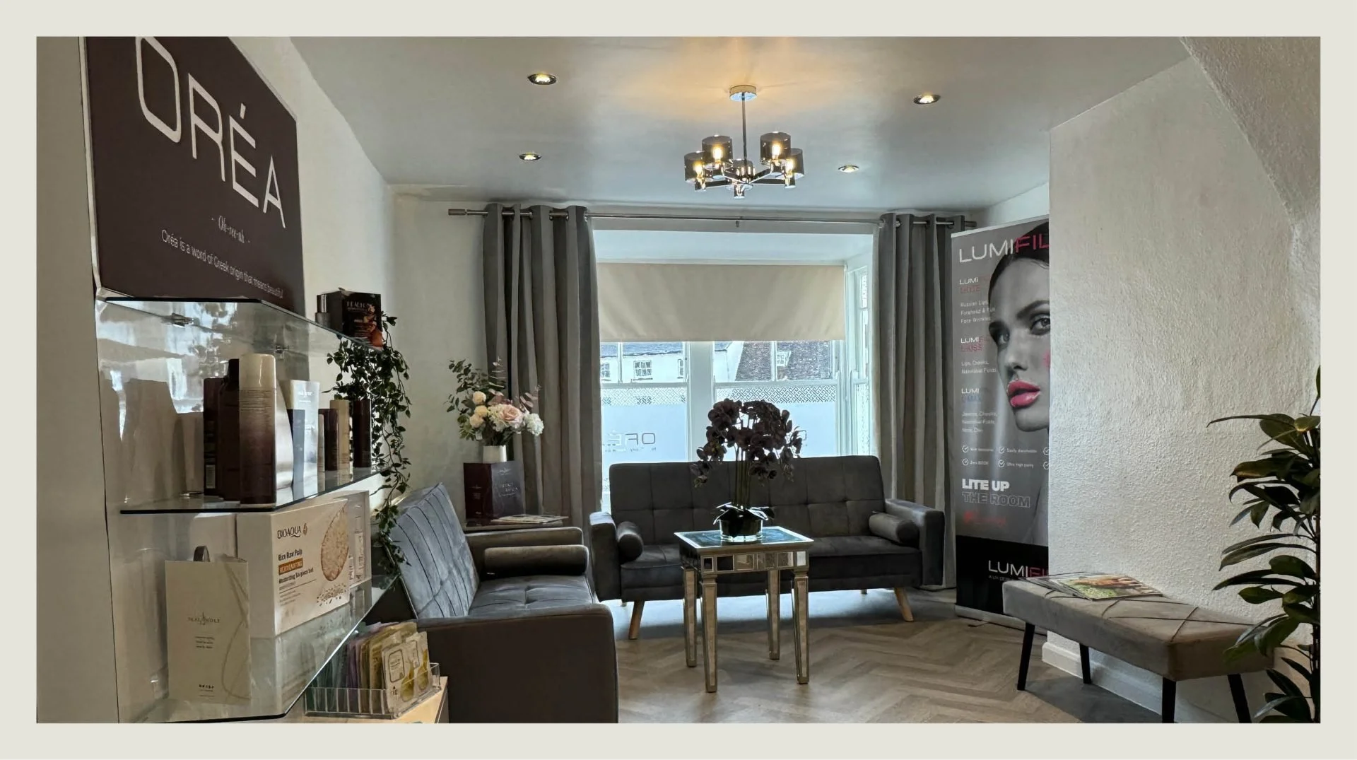
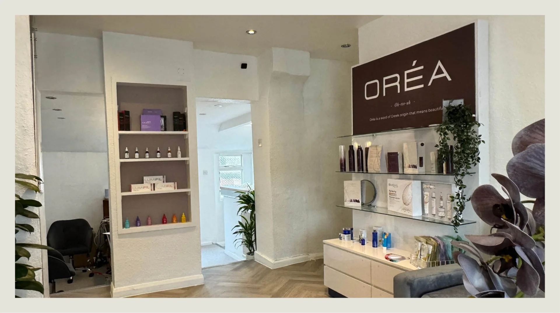
The new identity was integrated across the entire salon environment.
From the reception area to the styling stations, every visual element reinforces the OREA brand while helping create a stylish and memorable experience for clients.
-
The rebrand transformed OREA into a modern and visually distinctive salon.
Through a cohesive combination of branding, signage and interior graphics, the space now reflects the creativity and style that define the OREA experience while helping the salon stand out in the Bicester beauty market.
-
In the heart of Bicester, the transformation of OREA was not just a rebranding exercise; it was a careful process of reinvention aimed at creating an unforgettable identity. Our mission was to blend sophistication with modernity, capturing the essence of OREA’s commitment to timeless beauty. The work began with a comprehensive review of the salon’s existing brand, identifying key strengths and areas to build on.
Understanding the need for a fresh and vibrant visual identity, we explored a direction inspired by pastels. Their soft, harmonious tones bring warmth, approachability and modernity to the brand — a good match for OREA’s vision of providing not just a service but a holistic experience.
The logo underwent a significant evolution. We set out to create a symbol that captured the spirit of OREA: a fusion of elegance and contemporary flair. The result harmonises geometric shapes with fluid lines in a soothing pastel palette, and became the cornerstone of the new identity.
To bring the vision into the physical space we used a comprehensive range of signage solutions. Exterior signage was designed to catch the eye so OREA stands out on a busy street, with backlit signs in the signature pastel hues creating a warm and inviting glow.
Inside, the pastel palette carries through the decor. From the reception area to the styling stations, every element supports a chic and welcoming environment, with large-scale wall graphics adding a touch of whimsy while keeping an air of sophistication.
Custom signage runs throughout the space. Each stylist station carries a personalised sign with the stylist’s name and a matching pastel colour, building a connection between client and stylist, while further signage highlights promotions and featured treatments.
The rebrand was a comprehensive experience redesign rather than a visual overhaul. From logo to interior decor and custom signage, the pastel-influenced branding has positioned OREA as a distinctive presence in the local beauty market.