
ChaChaCha
Restaurant Branding and Identity Design for ChaChaCha
Toy Creative created a vibrant brand identity for ChaChaCha, a lively Latin-inspired tapas restaurant in the heart of Beaconsfield. The project involved developing a bespoke logo and visual identity designed to capture the rhythm, colour and energy that define the restaurant’s atmosphere.
Latin rhythm, translated into a brand
-
Client: ChaChaCha
Industry: Hospitality / Restaurant
Services: Brand identity design, logo design, typography
Location: Beaconsfield, Buckinghamshire -
The team behind ChaChaCha approached Toy Creative because their existing logo wasn’t capturing the energy and personality of the restaurant.
While the food and atmosphere were vibrant and full of life, the branding felt flat and lacked the Latin flair that defines the ChaChaCha experience.
The goal was to create a new identity that would reflect the rhythm, colour and movement associated with Latin culture while remaining clear and versatile across signage, menus and digital platforms.
-
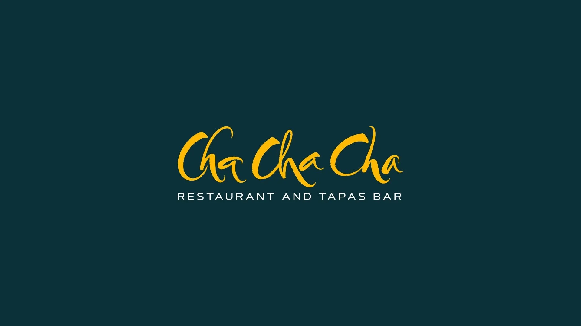
Our approach focused on creating a hand-crafted typographic logo that feels expressive and full of movement.
The calligraphic lettering gives each letter its own personality, helping the logo feel lively and energetic while still maintaining clarity and balance.
The result is a mark that feels warm, playful and full of character — reflecting the same energy that guests experience when they step into the restaurant.
-
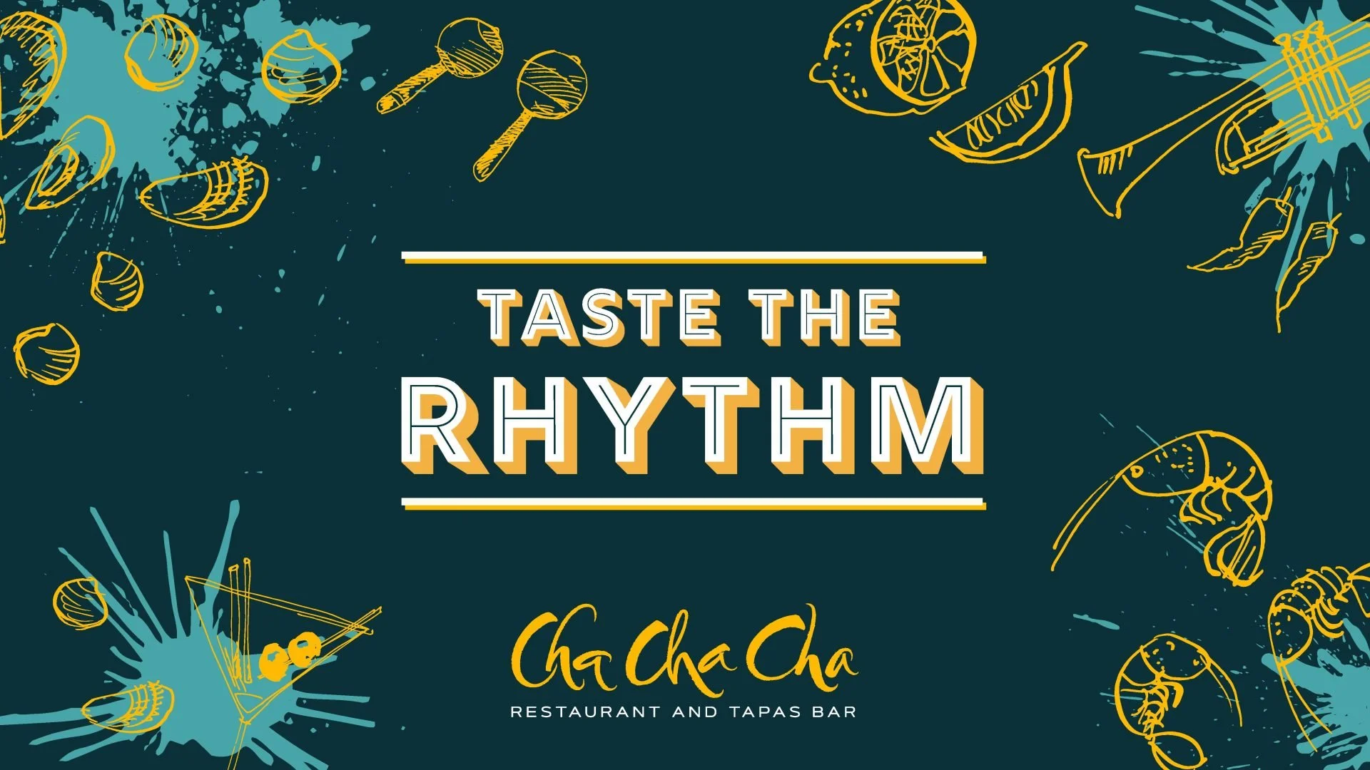
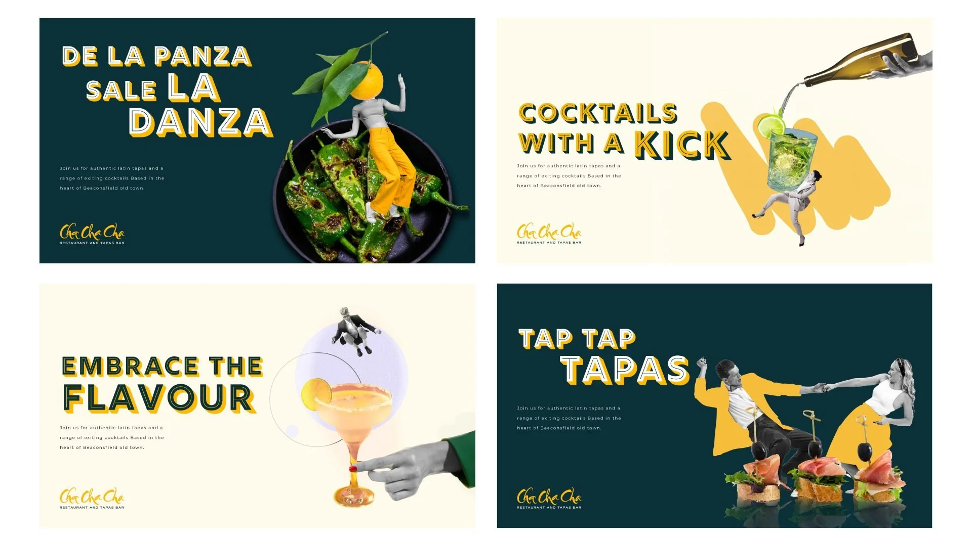
The identity was designed to capture the rhythm and vibrancy associated with Latin music and culture.
Expressive typography and bold graphic elements create a distinctive visual language that reflects the restaurant’s lively atmosphere while maintaining a strong and recognisable brand presence.
-
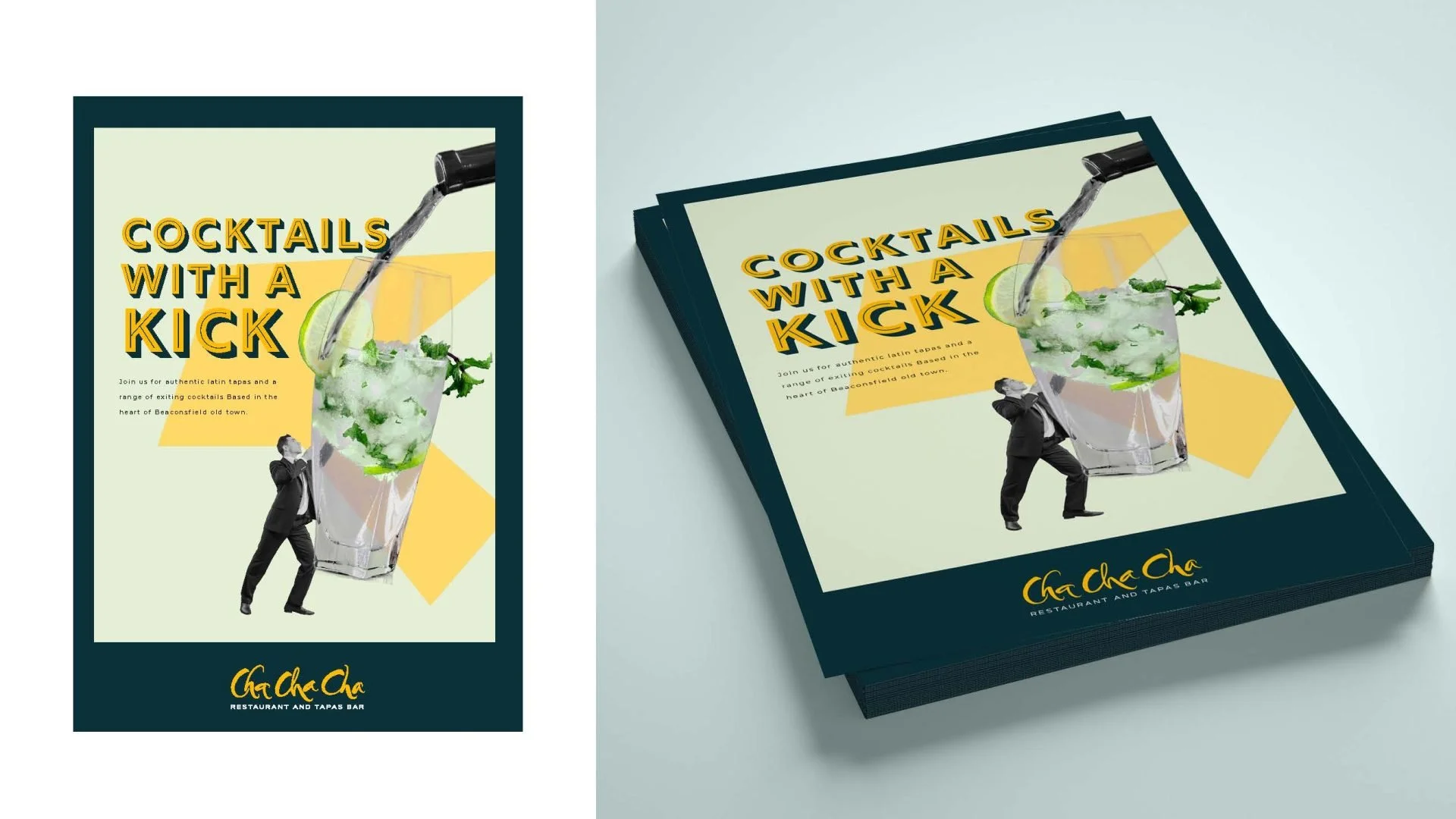
The identity was developed to work across a wide range of applications including:
restaurant signage
menus
digital platforms
marketing materials
The flexible design ensures the brand remains recognisable and impactful across every customer touchpoint.
-
The finished identity gives ChaChaCha a brand that reflects the warmth, rhythm and personality of the restaurant.
The expressive typography and energetic visual style help the restaurant stand out in Beaconsfield while capturing the spirit of the Latin-inspired dining experience.


-
Working with ChaChaCha on their rebrand was one of those projects that makes you smile from the very first meeting. Based in the lovely town of Beaconsfield in Buckinghamshire, this independent tapas restaurant is a true local gem. Full of charm, character, and seriously good food. But their original branding wasn’t quite telling that story. It felt static, a little too safe, and didn’t reflect the Latin warmth and spontaneity at the heart of the restaurant.
Our mission was to breathe new life into their visual identity and give the brand a voice that truly matched their personality. From the start, it was clear that the logo needed to lead the charge. It had to feel like ChaChaCha sounds: musical, full of rhythm, and bursting with energy. We explored a variety of calligraphic and hand-drawn styles, eventually landing on a design where every letter feels like it’s dancing across the page. No two characters are quite the same (much like the dishes on their menu).
The new branding rolled out across multiple touchpoints. We designed elegant but playful signage that now welcomes diners at the door, echoing the swirl and movement of the logo itself. We also crafted a fresh website design that highlights their seasonal menus, vibrant interiors, and love for all things tapas. From mobile experience to desktop, every screen now feels like a taste of ChaChaCha.
The work didn’t stop there. We’re continuing to support the team with ongoing design and content updates, making sure the brand stays as fresh and flavourful as their dishes. This kind of project is what we love most: bringing a business to life visually, especially one with so much heart. ChaChaCha’s rebrand isn’t just a new look. It’s an invitation to come in, grab a glass of wine, and stay a while.