
ACE Solutions
Cleaning Company Brand Identity and Logo Design for ACE Solutions
Toy Creative created a refreshed brand identity for ACE Solutions, a Hertfordshire-based cleaning company expanding into commercial cleaning services. The project focused on a professional logo and visual identity that reflects the company’s growing reputation and wider service offering.
A local service, rebuilt as a commercial brand
-
Client: ACE Solutions
Industry: Commercial Cleaning / Facilities Services
Services: Brand identity design, logo design, marketing materials
Location: Hertfordshire -
ACE Solutions approached Toy Creative as the company began expanding beyond its original driveway cleaning services.
With new offerings including corporate office cleaning, large-scale site work and specialist exterior cleaning, the business required a stronger brand identity that would communicate professionalism and reliability to commercial clients.
-
The goal of the project was to create a visual identity that reflected the company’s transition into a broader professional cleaning service.
The logo and brand system were designed to feel modern, clean and confident — reinforcing the idea of efficiency, precision and high standards.
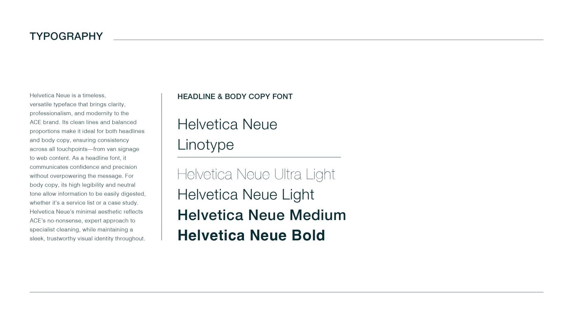
Clear typography and simple graphic elements help ensure the brand works effectively across a variety of applications.
-
The visual identity focuses on clarity and simplicity, reflecting the nature of the cleaning industry where professionalism and trust are key factors.
The design system allows the brand to be used consistently across both digital and physical communications, helping ACE Solutions build recognition as it expands into larger commercial projects.
-
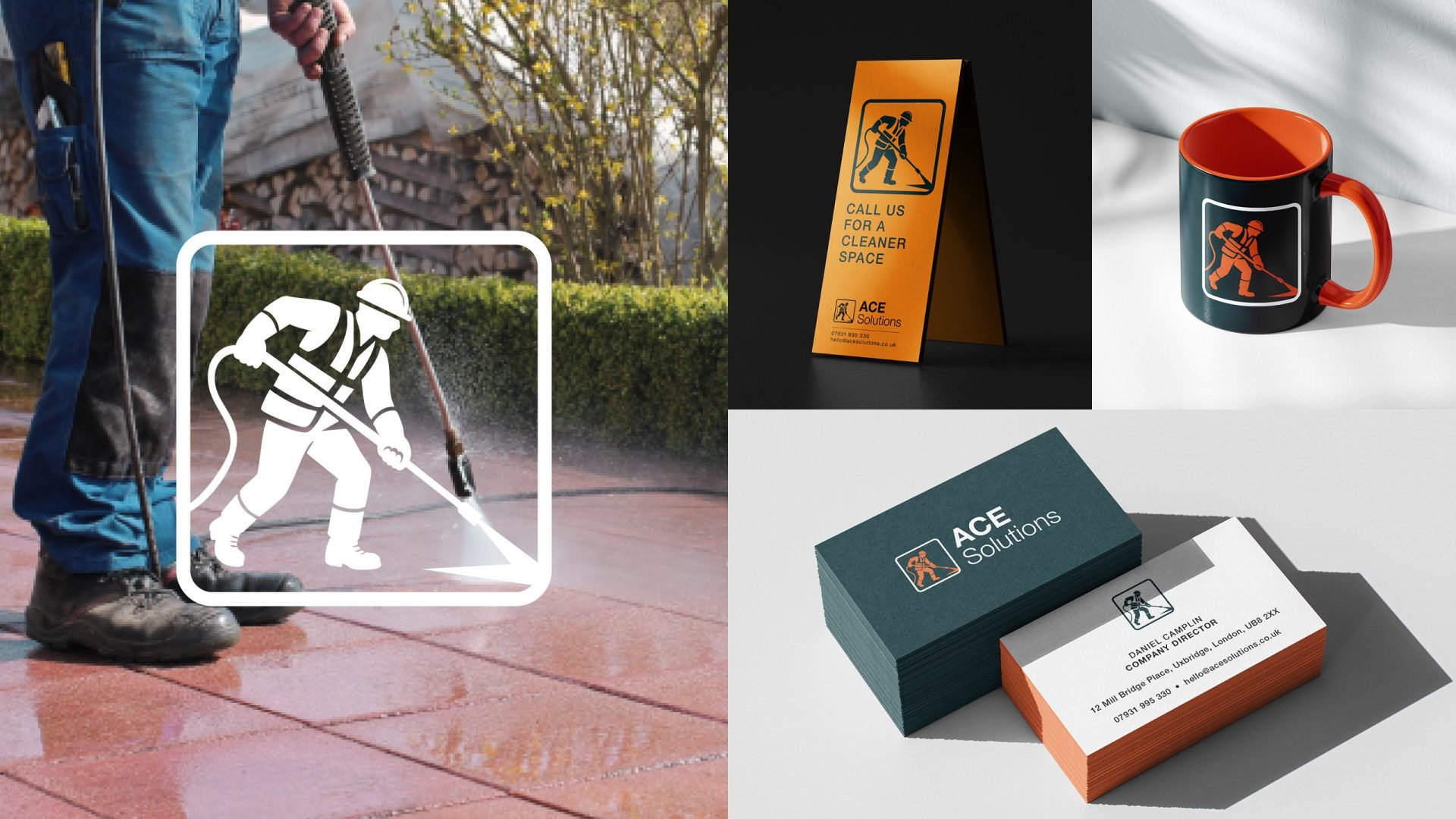
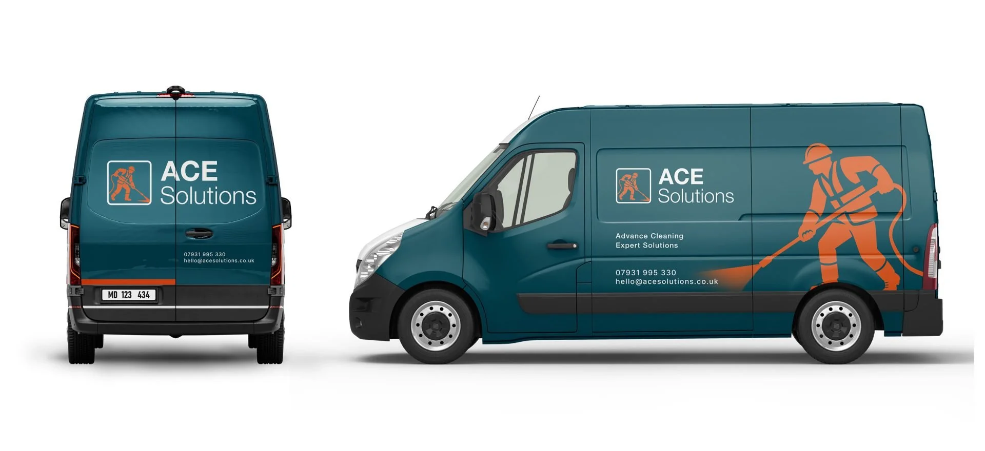
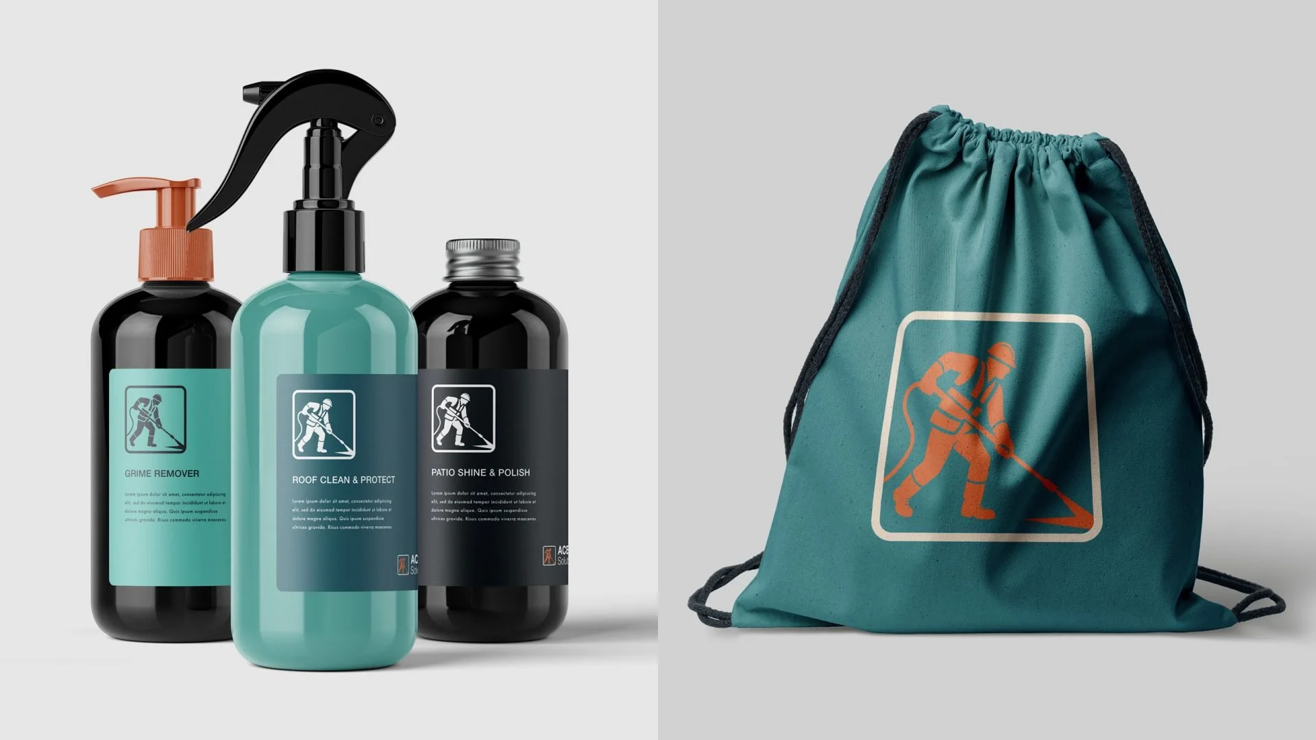
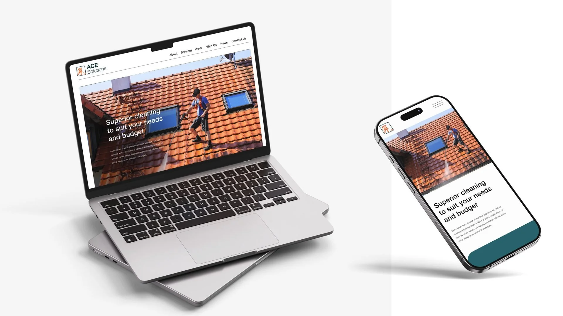
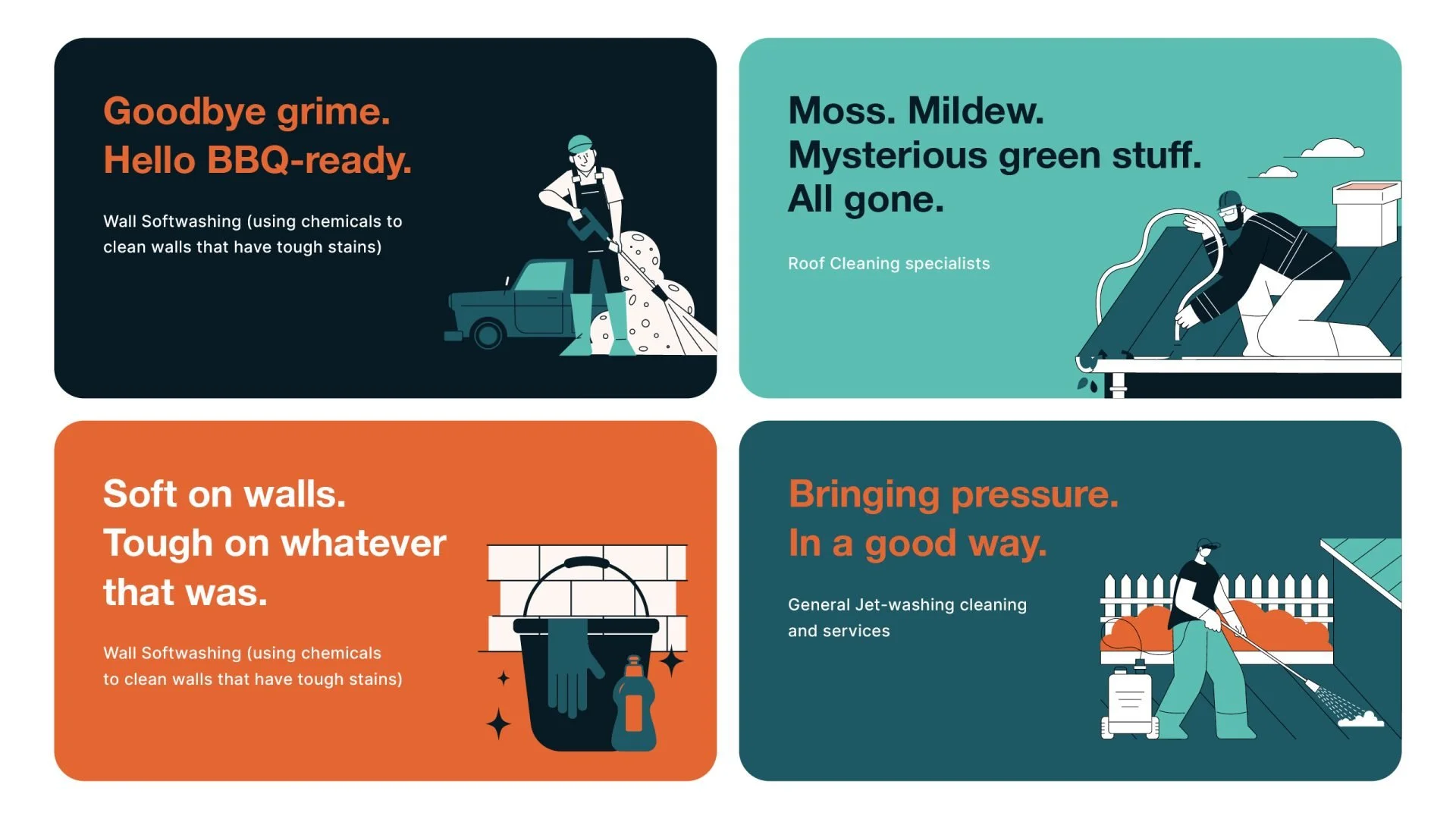
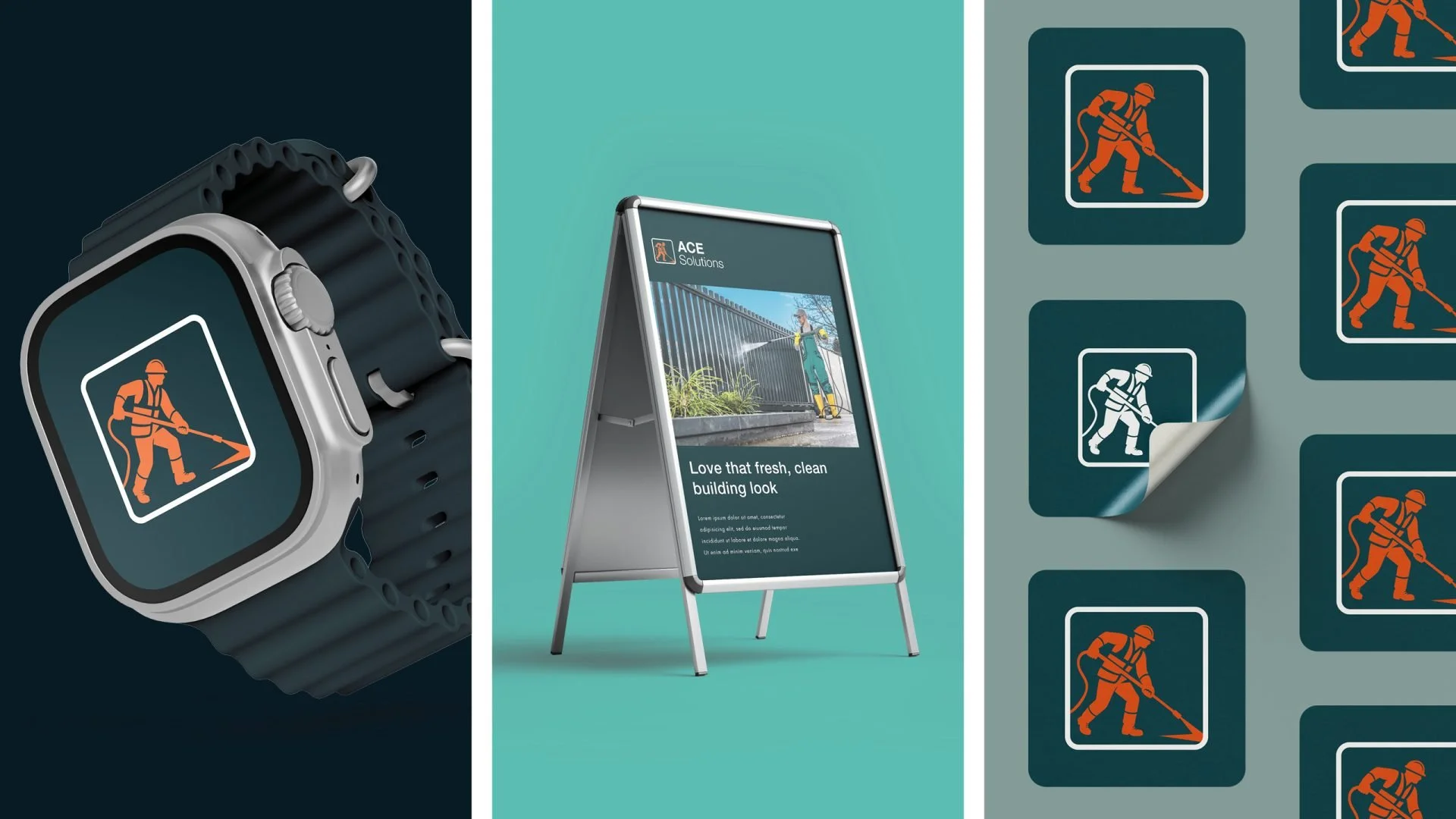
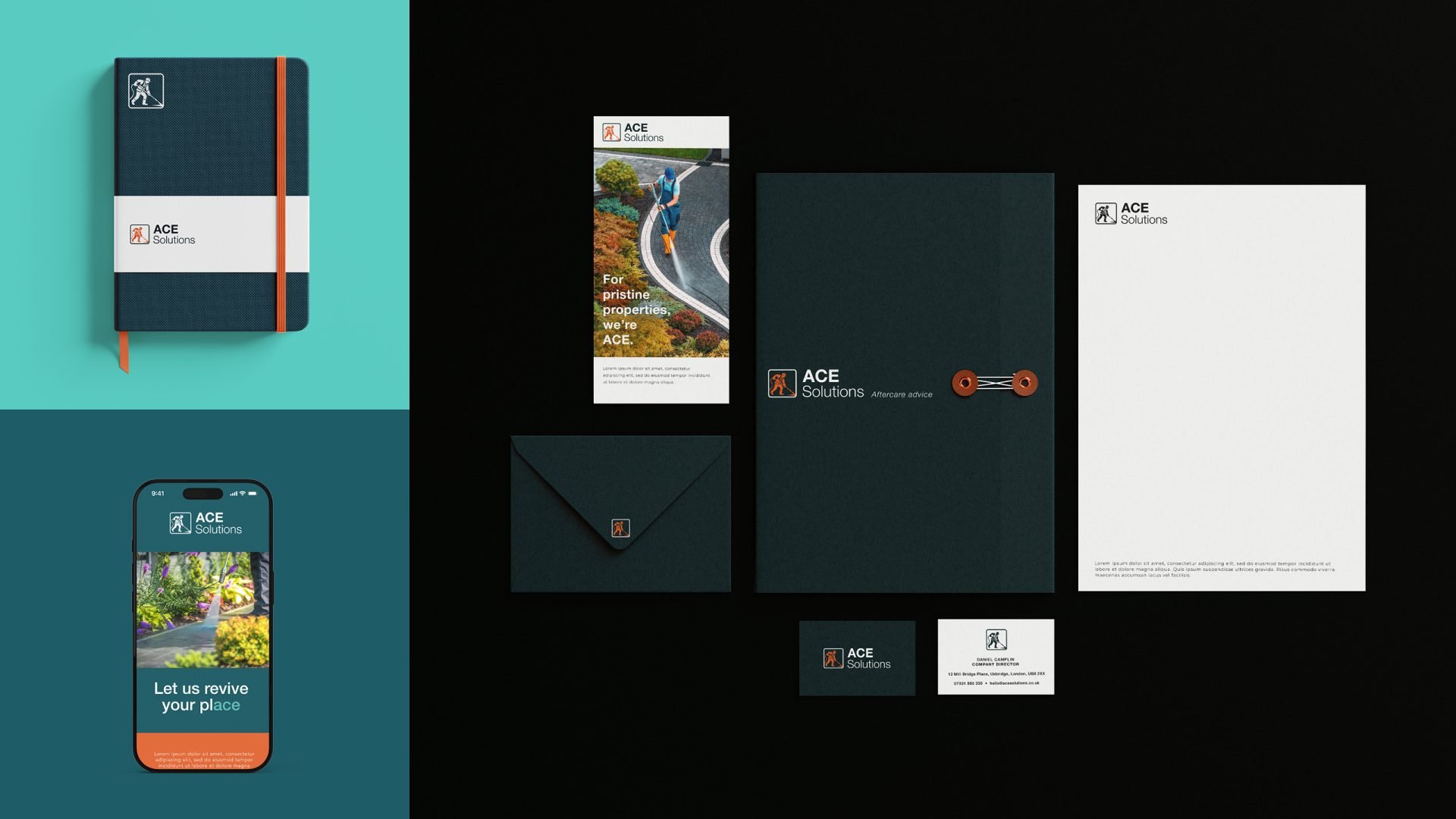
The identity was developed to work across multiple brand touchpoints including vehicles and workwear, marketing materials, digital communications and printed collateral.
These applications ensure the brand remains recognisable wherever the business operates.
-
The refreshed identity positions ACE Solutions as a professional commercial cleaning brand rather than a small local service.
By evolving the logo and brand system, the company now has a visual identity that reflects its growing reputation and expanding service offering.
-
ACE Solutions, based in Hertfordshire, came to us with a challenge: evolve from a local driveway cleaning service into a recognised name in professional commercial cleaning. Their growing service offering — corporate office cleans, large-scale site work and specialist exterior services — needed to be reflected in a refreshed, strategic brand identity.
Our approach began with research into the wider cleaning and facilities management sector, identifying opportunities for a more professional yet approachable aesthetic. We designed a clean, modern logo using Helvetica Grotesque, paired with an illustrated figure using the brand’s signature power cleaning equipment. This human touch gives personality while reinforcing what they do best: delivering real, visible results.
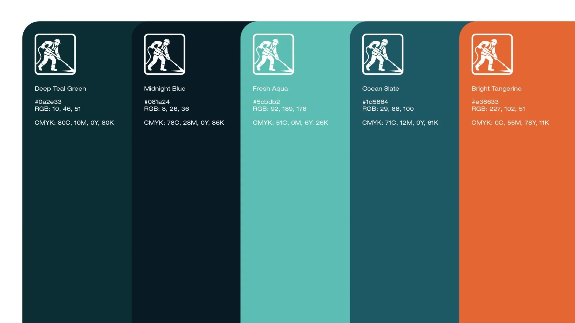
The visual identity uses a bold turquoise and orange palette — an energetic combination that stands out on vehicles, uniforms and signage. The overall look is simple, confident and direct, reflecting the brand’s commitment to quality service and nationwide capability.
We supported ACE Solutions with brand rollout across marketing collateral and local SEO strategy, positioning them as a go-to provider in the Hertfordshire area and beyond. The result: a cohesive, scalable identity that communicates professionalism and trust at every touchpoint.