
Zephyr Toys
Toy packaging design for Zephyr’s MECHANIX range
A handful of metal parts. A few nuts and bolts. A very proud “look what I made”.
MECHANIX is all about the satisfaction of building something yourself. We worked with Zephyr Toymakers to bring that feeling to its toy packaging, developing a fresh design direction for the UK and European markets.
The result brings together engineering sketches, notebook textures and bold product imagery. Clear enough to understand at a glance. Interesting enough to invite a closer look.
Making the outside as inventive as what’s inside.
-
Client: Zephyr Toymakers
Brand: MECHANIX
Services: Toy packaging design, creative direction, brand development, packaging illustration and range design
Sector: Toys, construction kits and educational play
Project focus: Packaging for UK and European retail -
Zephyr had the product. The packaging needed to tell its story more clearly.
As the India-based toy manufacturer prepared to expand into the UK and Europe, the brief was to give MECHANIX a stronger presence without losing the character of an established brand.
That meant more than a tidy-up. We needed to explain what the kits offered, make the building experience feel exciting and create a consistent approach across different products.
For us, the central question was simple: how do you show the fun of making something, rather than just the thing you make?
-
The strongest direction came from the world of invention itself.
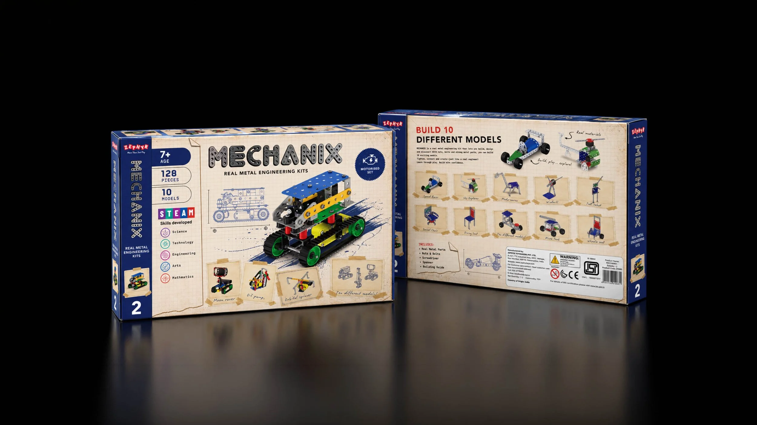
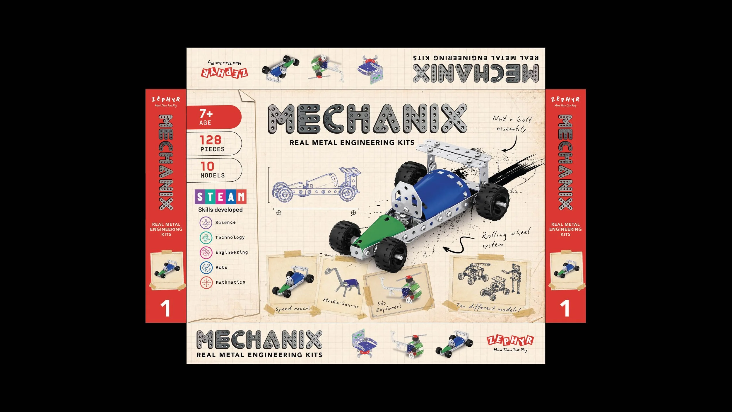
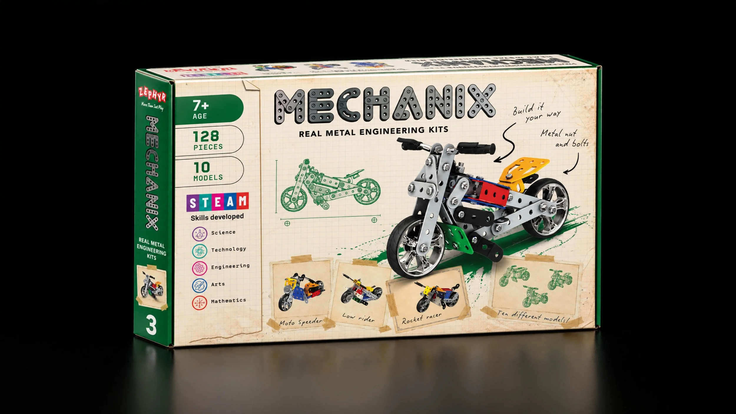
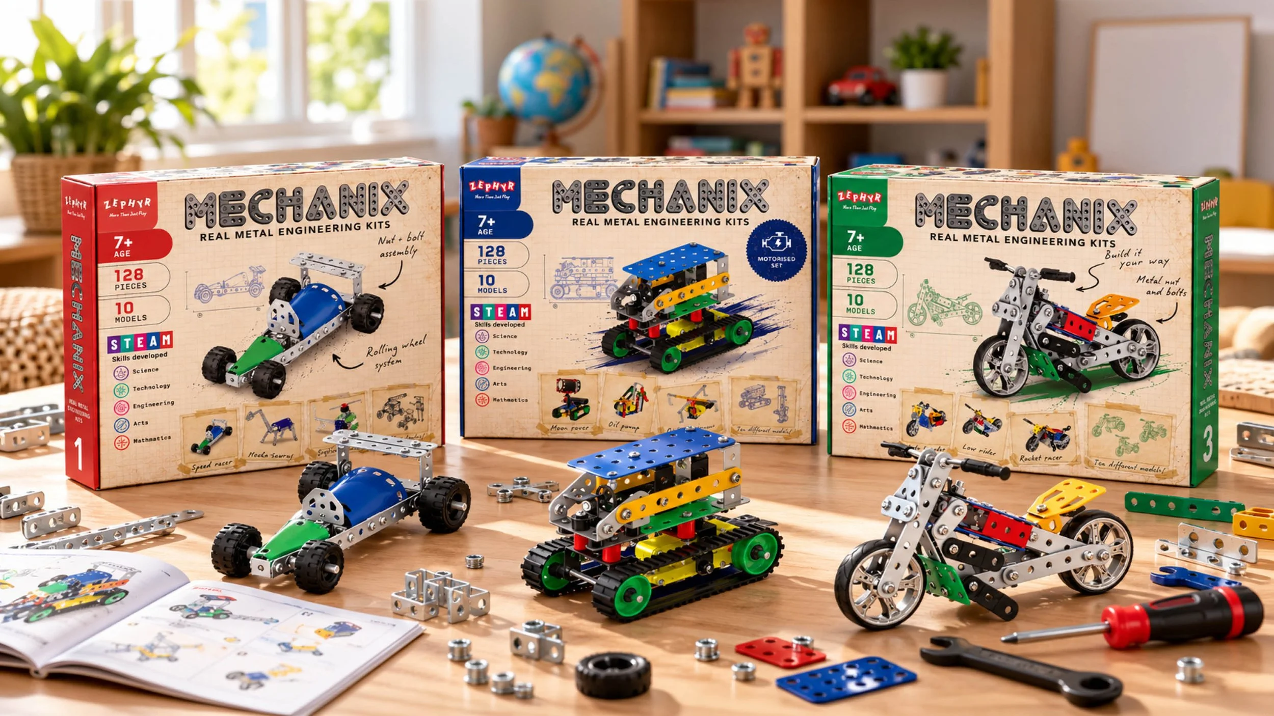
Squared paper, pen-style drawings and handwritten notes give the packaging the feel of an engineer’s working notebook. Finished models sit alongside sketches and smaller builds, connecting an idea on the page with something a child can put together.
The notebook treatment also gives useful information a natural home. An arrow can point to a wheel assembly. A note can explain how parts connect. A taped-in picture can introduce another build.
It is not decoration for decoration’s sake. The design helps explain the product.
-
A fresh look should not mean starting from scratch.
We kept the recognisable MECHANIX lettering and its metal construction character, using a steel-coloured treatment that connects the name to the parts inside the box. Bold colour adds impact, while the lighter notebook background gives the product more breathing room.
The balance mattered. Too much change, and the brand could lose its familiarity. Too little, and the packaging would still have the same problems.
Our approach was to keep the distinctive bits and make the rest work harder. Nuts, bolts and all.
-
We designed the packaging to answer two questions: “What can I build?” and “Is this the right set?”
For children, large model images and alternative builds make the possibilities visible. For parents and gift buyers, age guidance, piece counts and model numbers provide a clear starting point.
STEAM information supports the learning story without turning the whole pack into a lesson. The emphasis stays on doing: connecting parts, making models and trying something different.
That was the aim for this educational toy packaging. Show the value of hands-on play, without forgetting the play.
-
A little engineering. A lot of imagination.
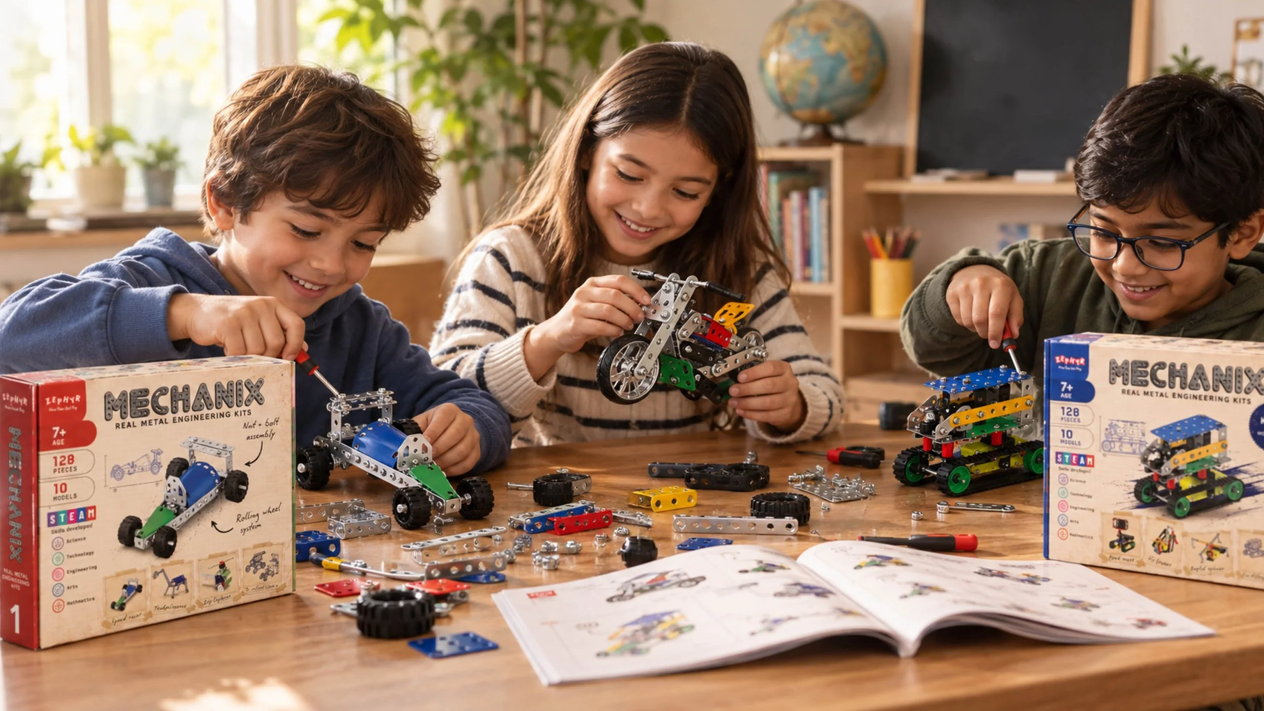
One of the things we love about MECHANIX is that the fun doesn't stop once you've built something. Take it apart, try something different, see what happens. It's all part of the experience.
We wanted the packaging to capture that same curiosity.
By combining colourful product renders with hand-drawn technical illustrations, we've brought the building process into the design itself. The finished model grabs your attention, while the sketches, handwritten notes and little engineering details encourage a closer look.
It's part toy box, part inventor's notebook. Without the homework.
Looking good from every angle.
Of course, toy packaging has to do more than look nice in a design presentation.
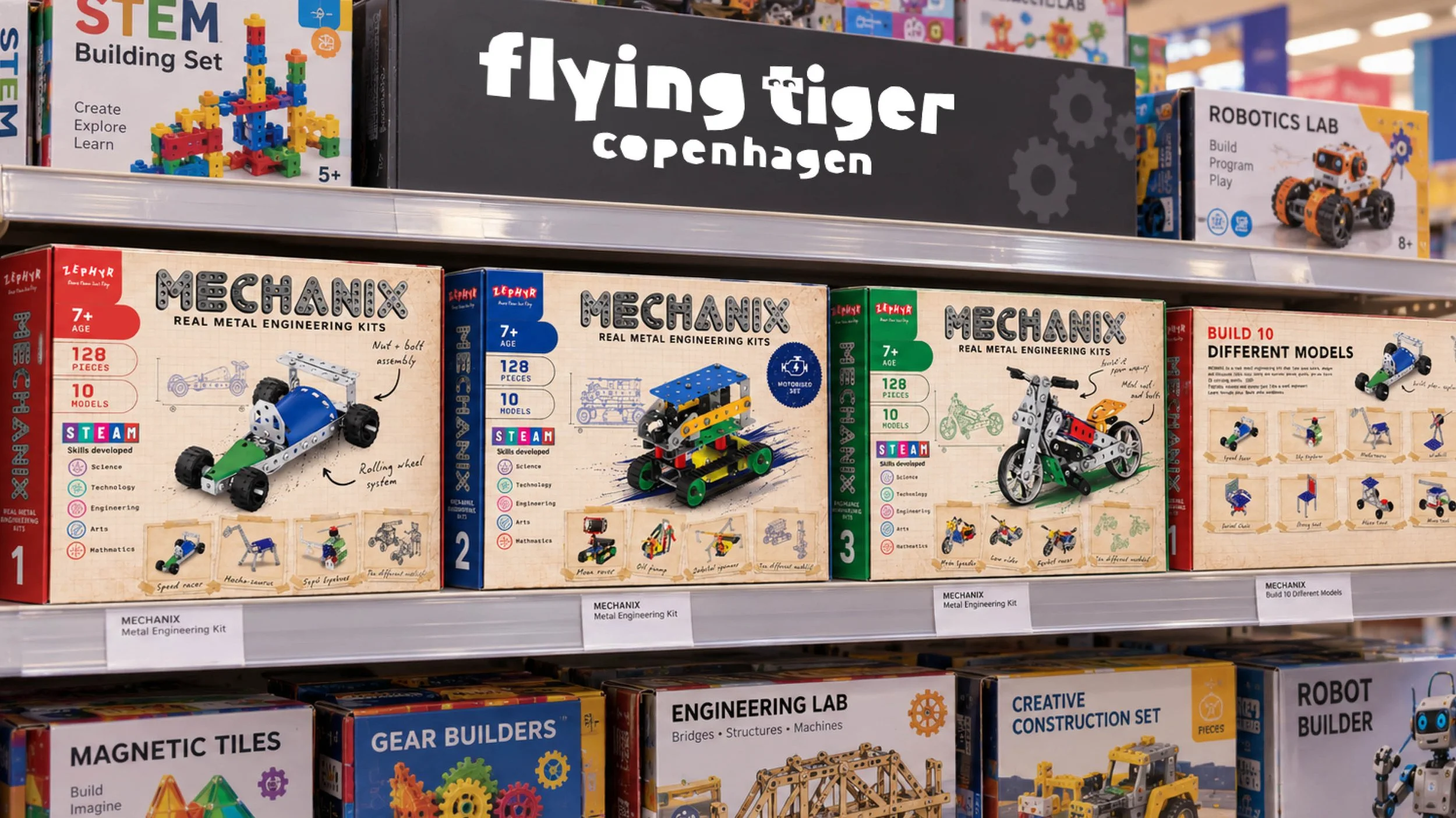
Products get stacked sideways, displayed on busy shelves and squeezed into tiny online thumbnails. So we thought carefully about how the design works beyond the front of the box.
The side panels carry useful product information and clear branding, helping MECHANIX stand out even when the front isn't visible. Small details, but important ones when you're competing for attention in a busy toy shop.
One big, happy family.
We also wanted to create something that could grow with MECHANIX.
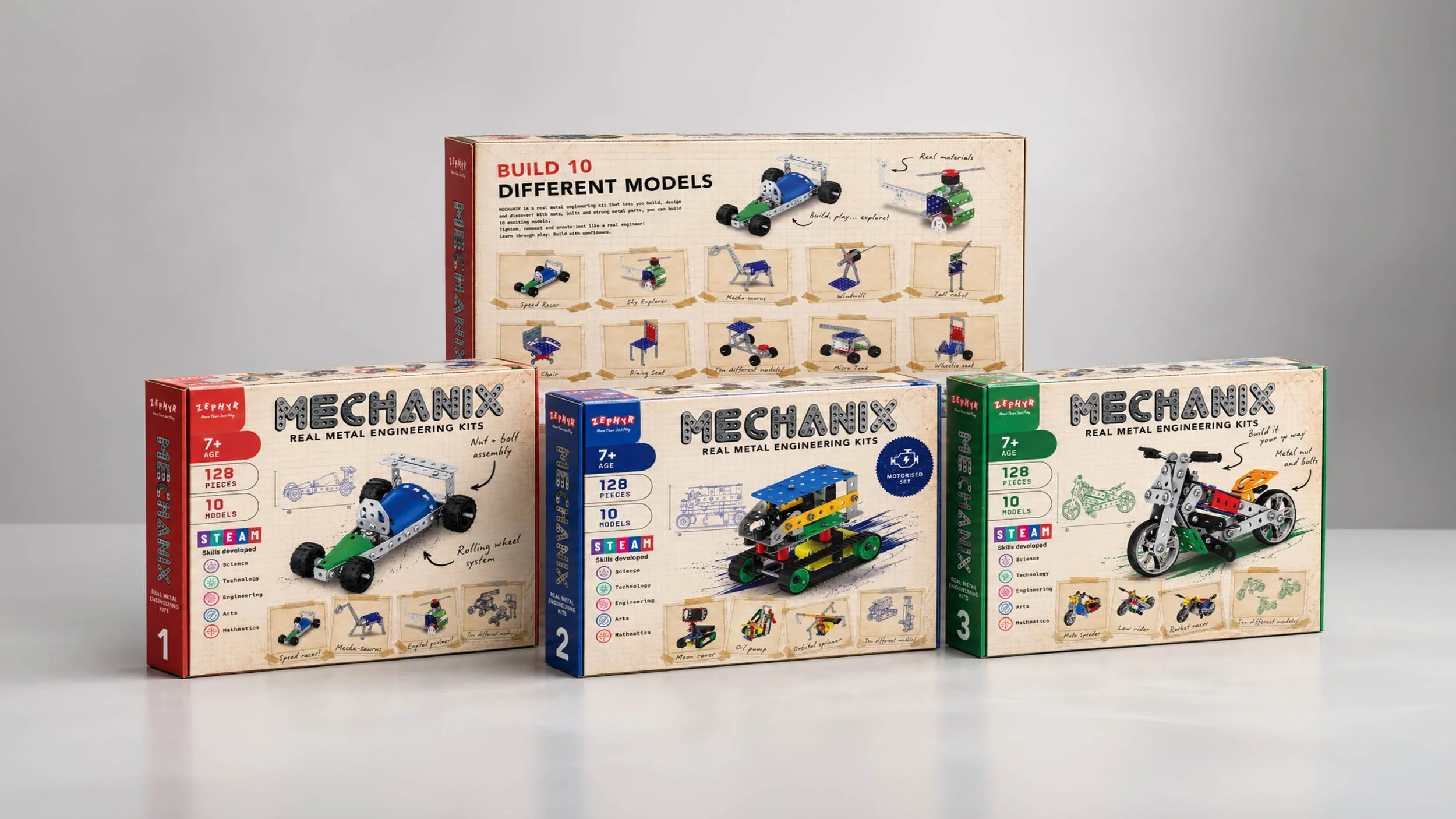
The notebook styling, engineering illustrations and recognisable logo give the range a consistent identity. Different colours and product imagery can then help distinguish Starter Sets, Robotix, Motor Bikes and future additions.
The result is a flexible packaging design that feels like MECHANIX, celebrates the joy of making things and gives the brand a fresh look for UK and European retail.
Proper engineering. Proper fun. And a box that gets the idea across before you've even picked up a screwdriver.