
Sushi Boom
Restaurant Shopfront Signage Design for Sushi Boom
Toy Creative designed and installed shopfront signage and window graphics for Sushi Boom, a Japanese restaurant looking to create a bold and inviting street presence. The project focused on transforming the restaurant frontage into a striking visual landmark that attracts attention and communicates the energy of the brand.
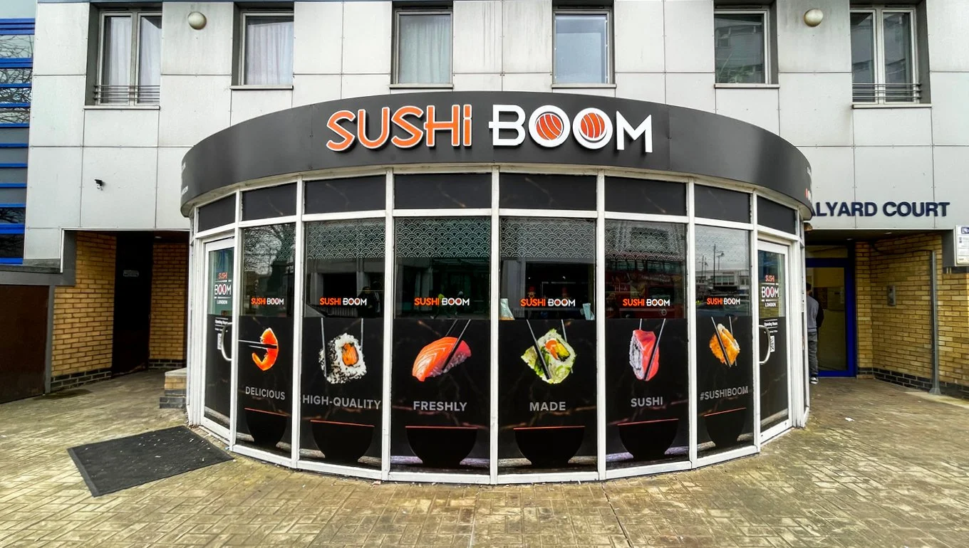
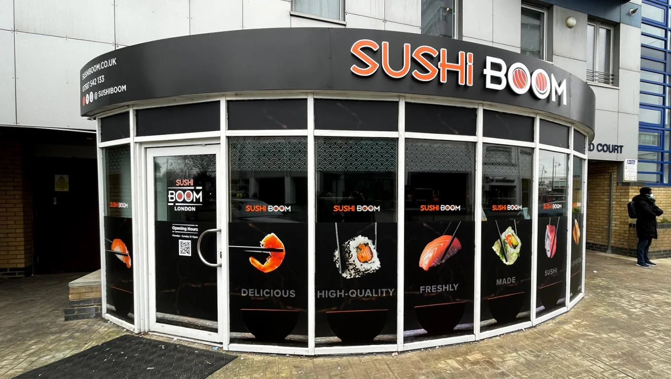
A bold frontage on a busy high street
-
Sushi Boom required a distinctive shopfront that would help the restaurant stand out in a busy high street environment.
The goal was to create signage that clearly communicates the restaurant’s identity while attracting attention from passing pedestrians and customers exploring the area.
-
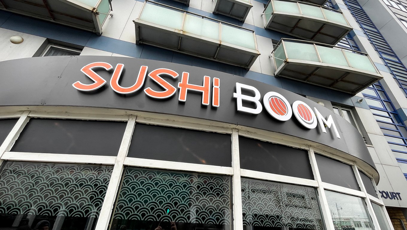
Toy Creative developed a bold signage concept built around strong typography and clear brand visibility.
The design ensures the restaurant name is easily readable from a distance while reflecting the vibrant personality of the Sushi Boom brand.
-
To complement the main signage, a set of window graphics was created to enhance the overall storefront design.
These graphics help reinforce the brand identity while providing additional visual interest along the street frontage.
-
The project included the production and installation of the signage and window graphics.
Careful attention was given to materials and finishes to ensure the signage remains durable, weather resistant and visually striking throughout the day and night.
-
The finished storefront transforms Sushi Boom’s restaurant frontage into a bold and recognisable presence on the street.
Through clear signage, strong typography and integrated window graphics, the restaurant now attracts attention and communicates its brand identity more effectively.
-
Sushi Boom found their roots in Uxbridge, London and quickly grew their brand into recognised sushi gurus. The team make huge efforts to keep their brand consistent, and represent their high-energy, food-focused vibe in their restaurants. They tasked Toy Creative with creating signage and new graphics for their latest store opening in Romford.
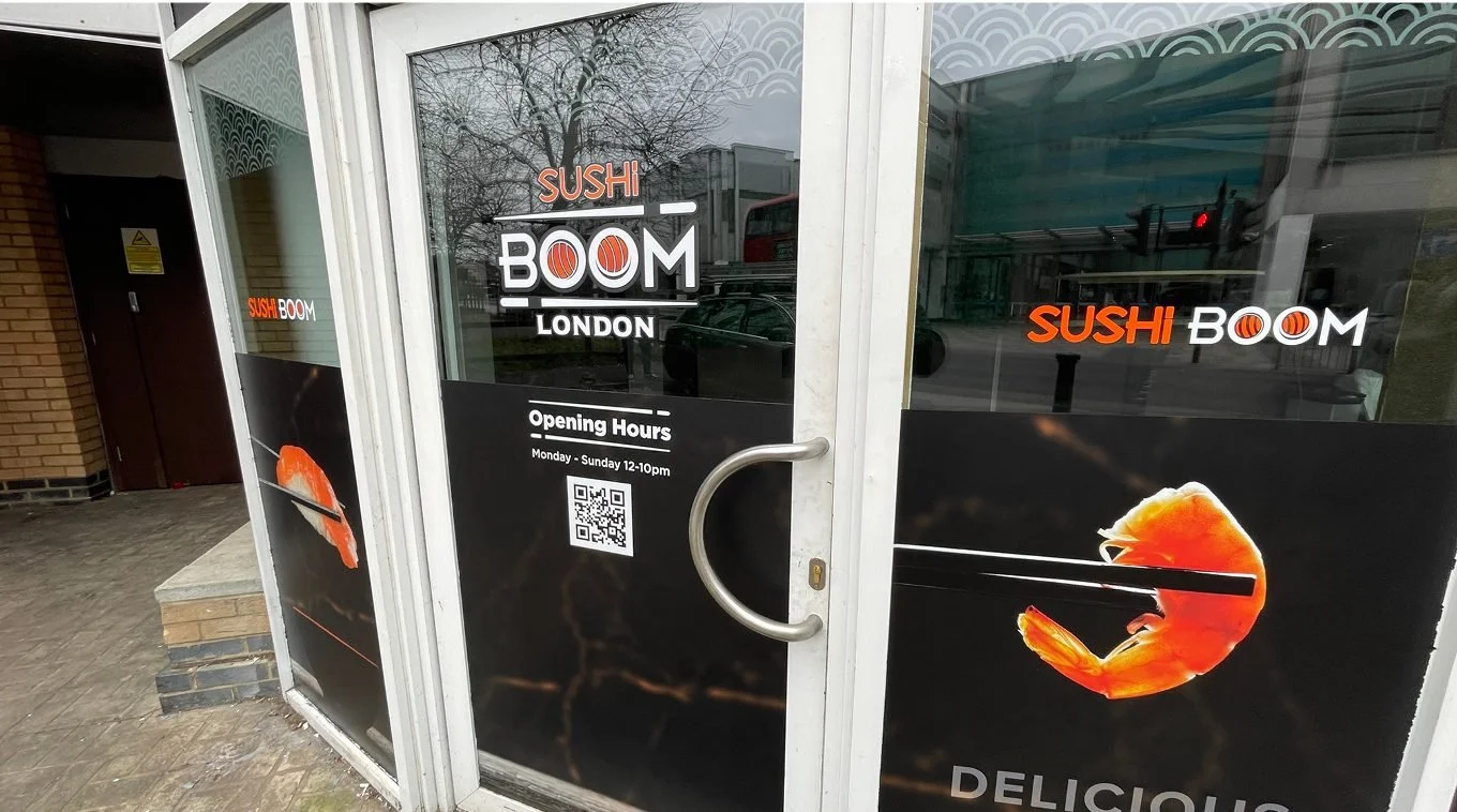
The project involved creating a set of designs first, each approaching the challenge in a different way. Illustrations, typography and simple graphics all lost out to the end result: simple, striking photography of their delicious sushi. Once we had the visual style, we adapted it across the available touchpoints of the shop.
We printed ten main SAV vinyl graphics with photography on the bottom half of each window space to add privacy for diners. Next we installed a thinner vinyl to the top windows to reduce direct sunlight and align the visuals with the rest of the shop. We then added frosted decals to the insides of the windows to continue the style into the store — form cut using a lightly frosted vinyl, cut to shape and installed. Finally, we replaced the top sign with black Foamex panels and affixed raised letters of the brand’s landscape logo, giving it real stand-out and making a huge difference compared to printing directly onto it.
The store looks incredible both up close and from a distance. They have a superb location just off the high street, so receive great traffic from the shopping centre and footfall from the street. The designs have been a huge hit, and put the team on the map in an even bigger way.