
Milton Hues
Brand Identity Design for Milton Hues in Harrow
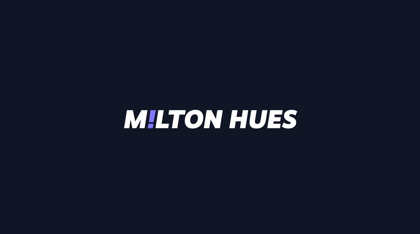
Toy Creative developed the brand identity for Milton Hues, a creative brand based in Harrow, West London. The project focused on creating a bold and expressive visual identity that reflects the personality of the brand while establishing a strong and recognisable presence across digital and printed materials.
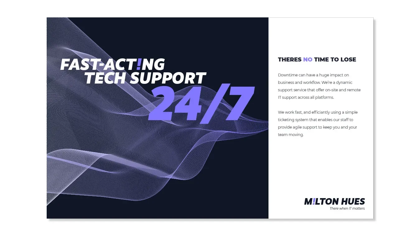
Responsive design
-
Client: Milton Hues
Industry: IT Support
Services: Brand identity design, logo design, visual identity
Location: Harrow, West London -
Milton Hues required a brand identity that would stand out while reflecting the creative and expressive nature of the brand.
The aim was to create a visual identity that feels contemporary and distinctive while remaining flexible enough to work across digital platforms and marketing materials.
-
Toy Creative developed a logo and visual identity built around bold colour and strong typography.
The design approach focuses on creating a confident and memorable brand that communicates creativity while remaining clean and adaptable.
-
The visual identity combines:
expressive colour palettes
modern typography
flexible graphic layouts
These elements create a brand system that works effectively across different formats and applications.
-
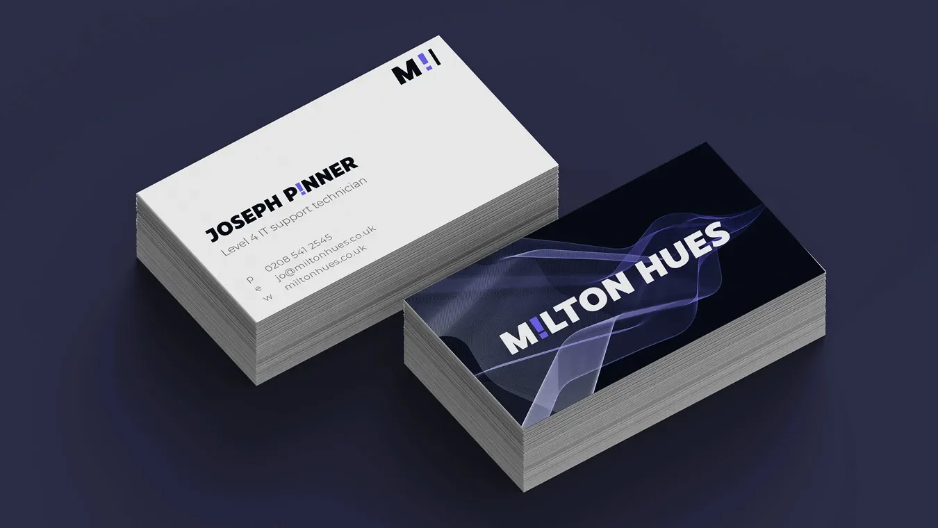
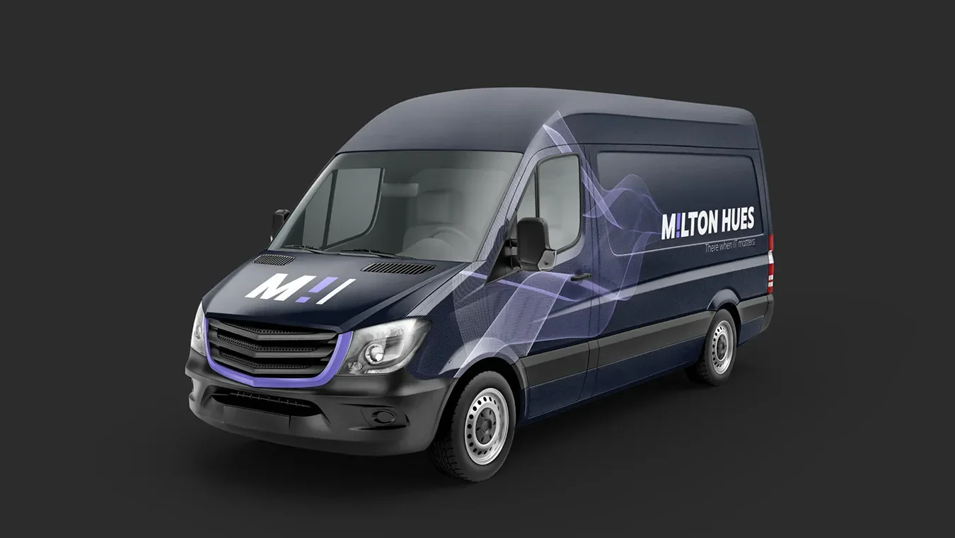
The identity was designed to work across multiple brand touchpoints including:
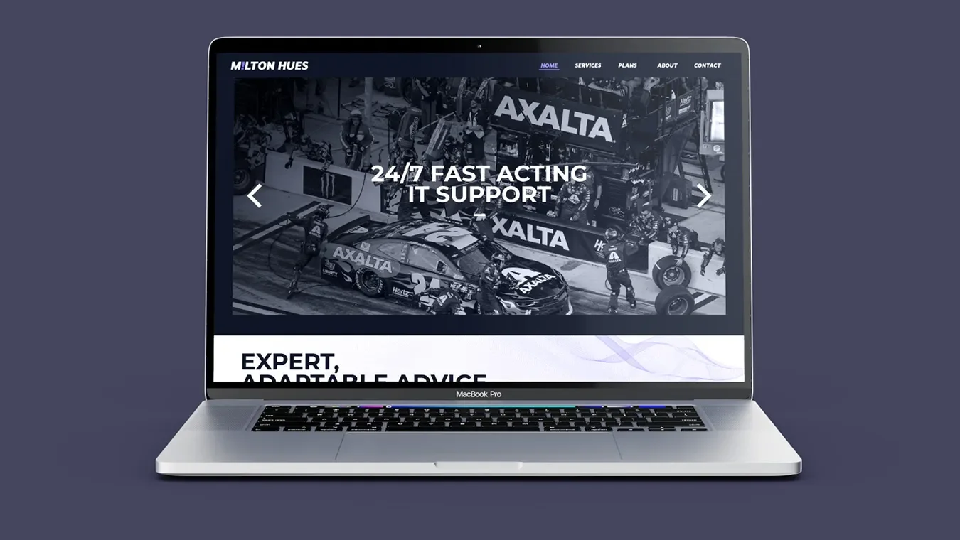
website and digital platforms
marketing materials
social media content
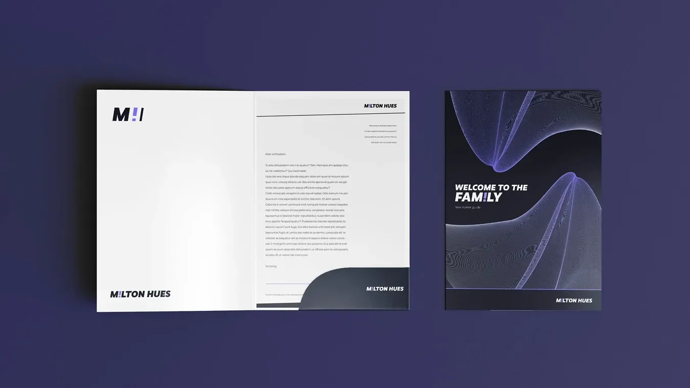
printed brand collateral
This ensures the Milton Hues brand remains consistent across all communications.
-
The final identity gives Milton Hues a distinctive and vibrant brand presence.
The project also highlights Toy Creative’s experience delivering branding projects for creative businesses across Harrow, Watford and the wider West London area.
-
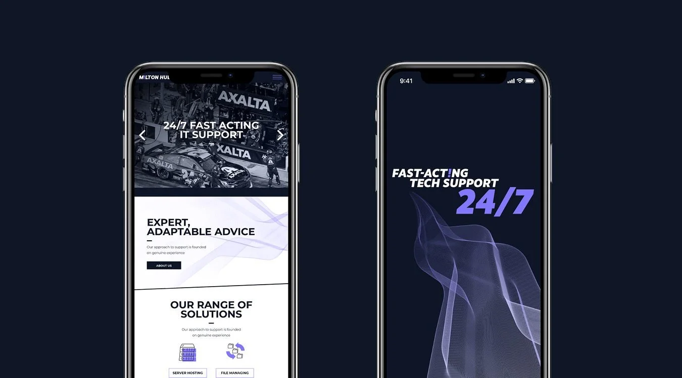
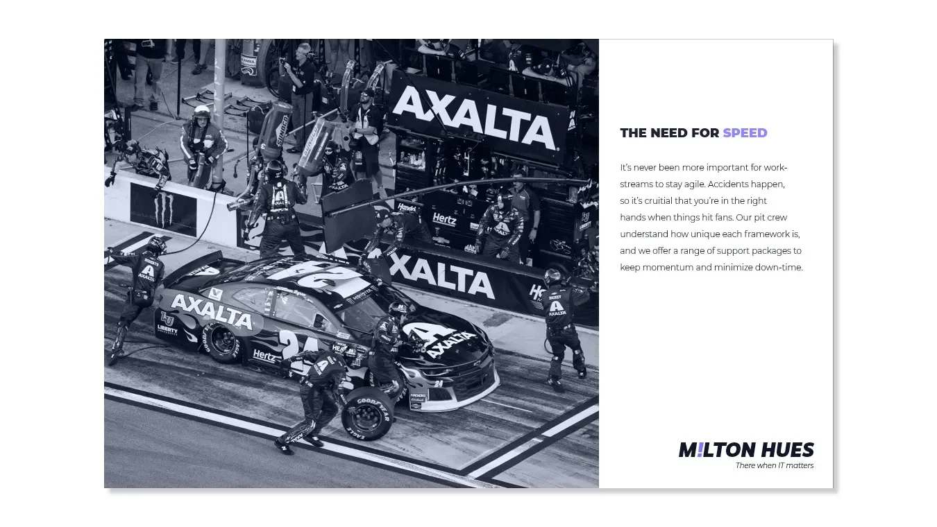
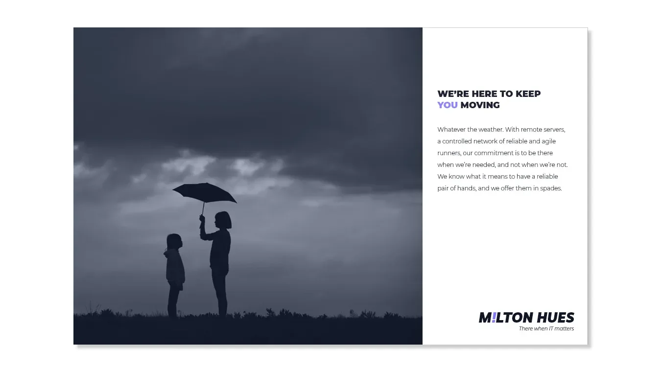
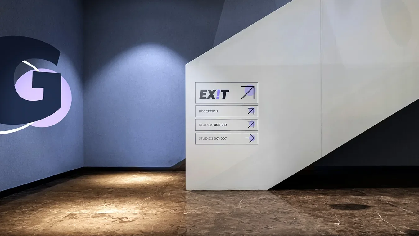
Toy Creative designed this agile new creative branding identity for Milton Hues to visualise their mobility and action-first method of working.
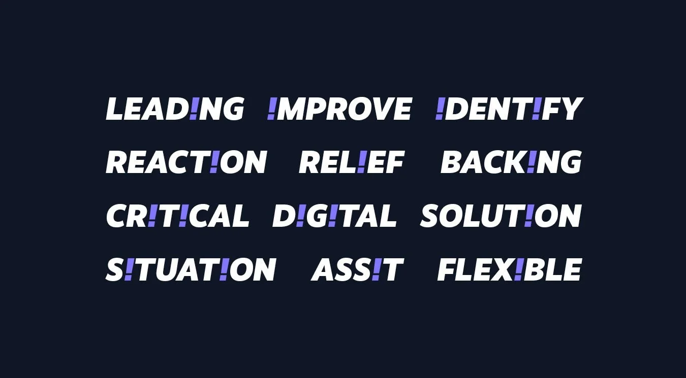
‘There when IT matters’ is a testament to the companies reactive nature. It’s evokes a feeling of trust, integrity and reliability. We coupled this concept with the simple yet playful concept of reversing the ‘i’ in Milton to create the explanation mark. A symbol of attention and focus. The combination of the two resulted in a bold, dynamic identity package and launch campaign.
Campaign and branding is live, so check back soon! The opportunity to work closely with the team, allowed us to understand the impact and ecological impart that a poor IT infrastructure can encourage. To read more on the impact of IT support and sustainability- see here. To see some of our other projects, see here.