
Ballroom Beauty
Cosmetic Brand Identity Design for Ballroom Beauty
Toy Creative developed the brand identity for Ballroom Beauty, a Watford-based beauty brand, creating a refined visual language that reflects elegance, confidence and modern beauty culture. The project focused on designing a logo and visual system that would position the brand within the premium beauty market while remaining approachable and distinctive.
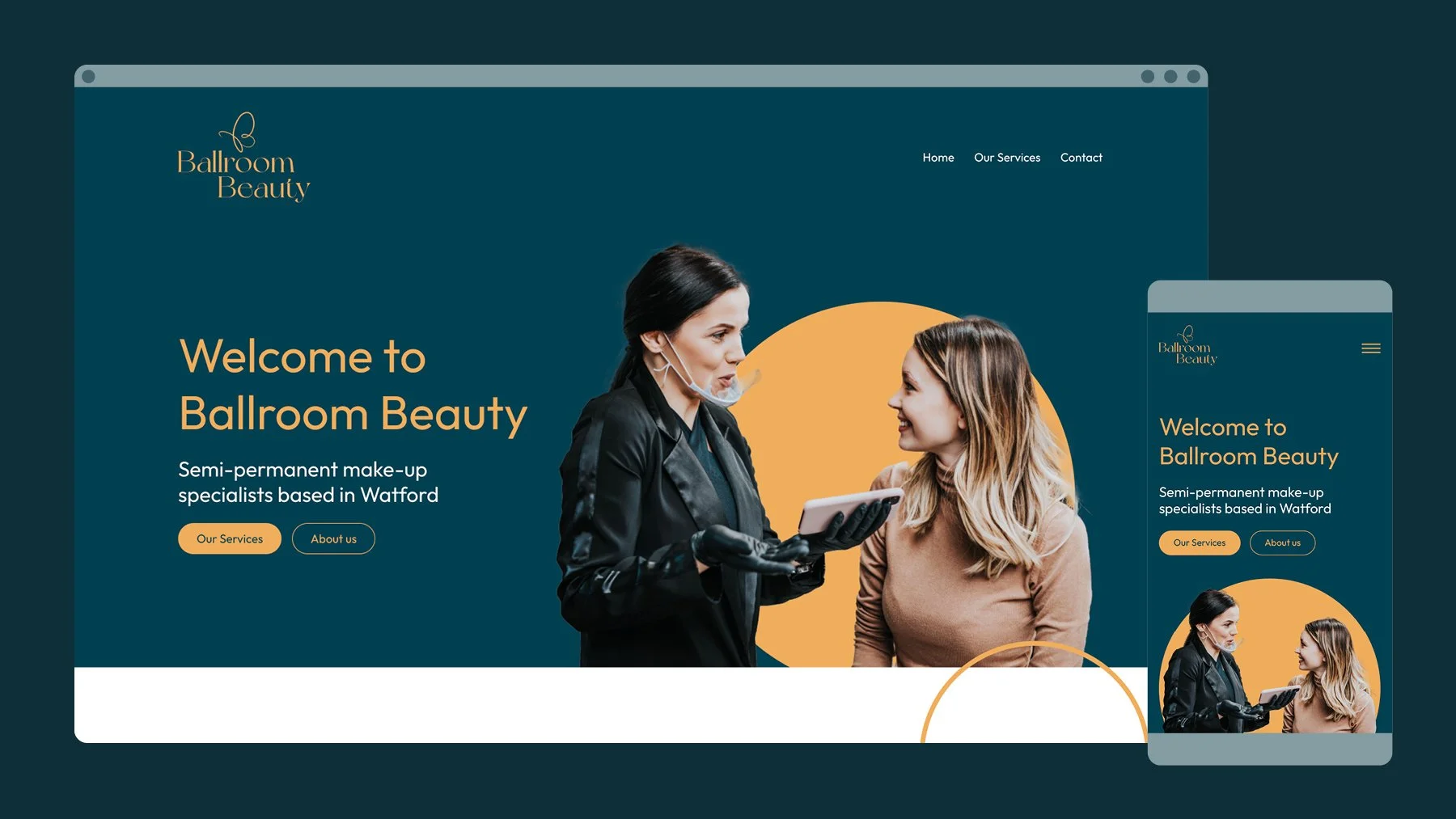
Calm, elegant and quietly confident
-
Ballroom Beauty required a brand identity that would capture the elegance and glamour associated with the brand’s name.
The goal was to create a visual identity that communicates sophistication and confidence while appealing to a modern beauty audience.
-
Toy Creative developed a logo and identity that balances classic elegance with contemporary design.
The typography and graphic elements were carefully crafted to reflect the sense of style and refinement associated with the brand, while ensuring the identity remains versatile across different marketing applications.
-
The visual identity focuses on a clean and elegant design language built around refined typography, balanced composition and subtle luxury cues.
This approach allows the brand to appear both stylish and professional while remaining flexible across print and digital media.
-
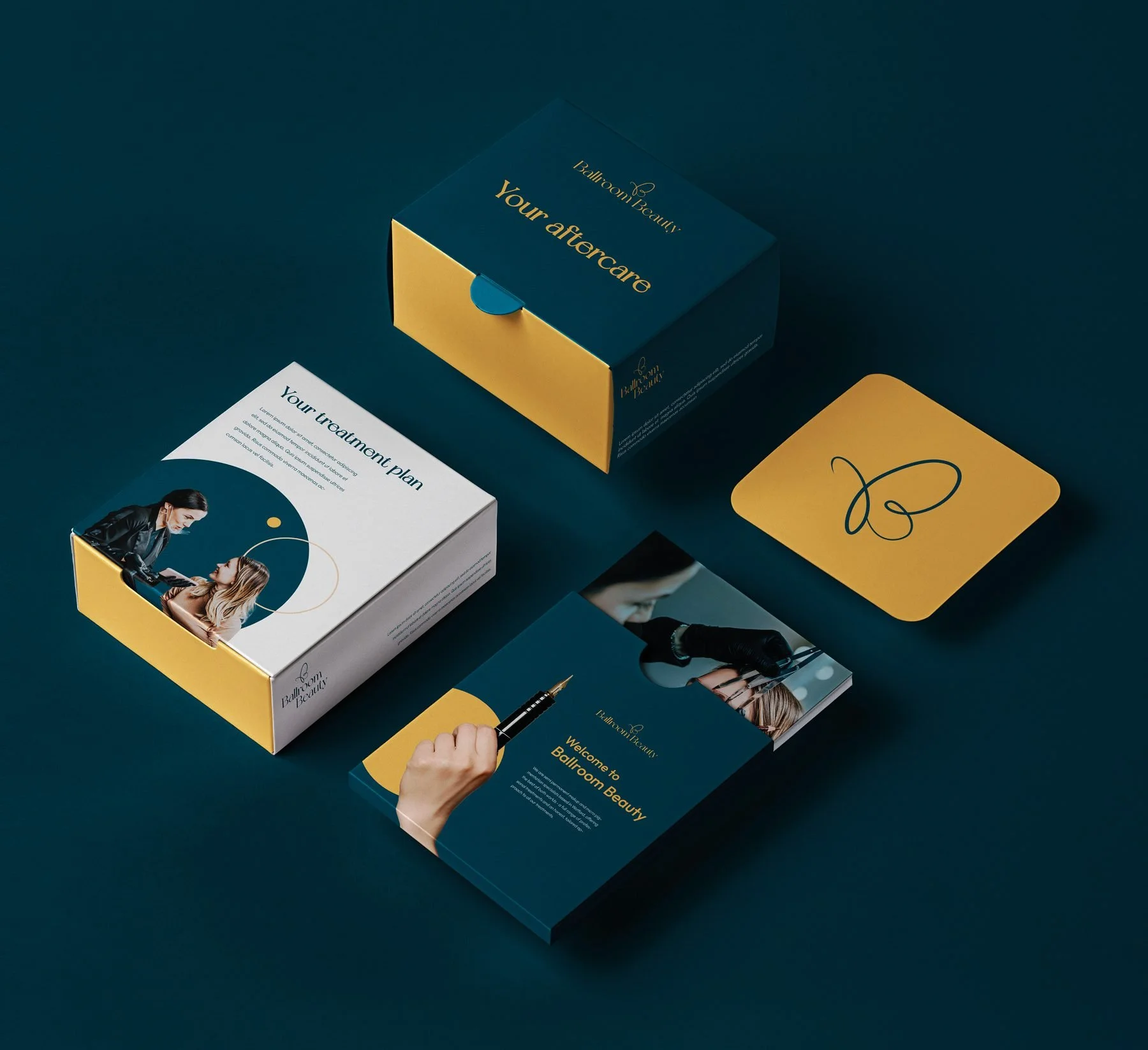
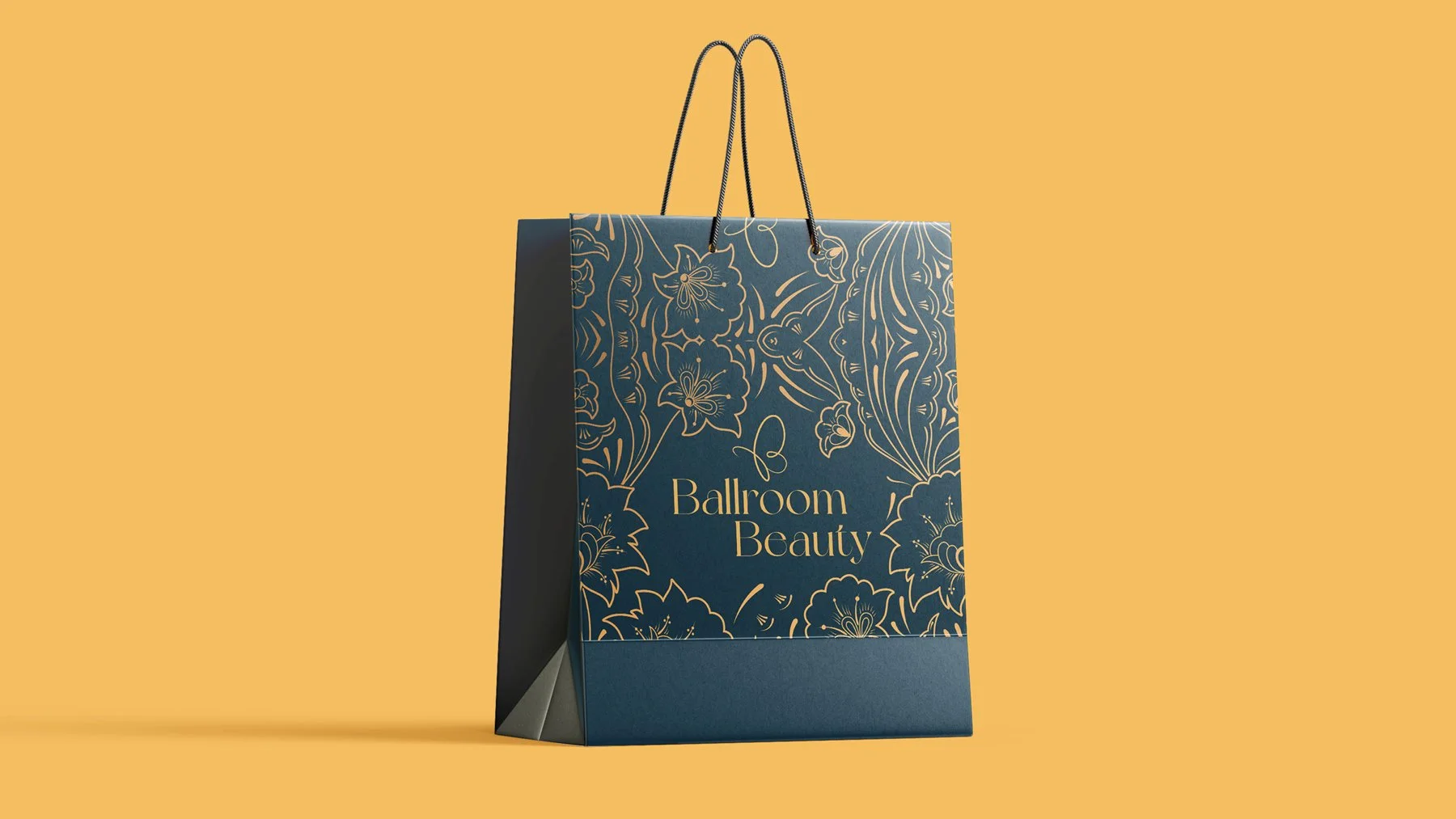
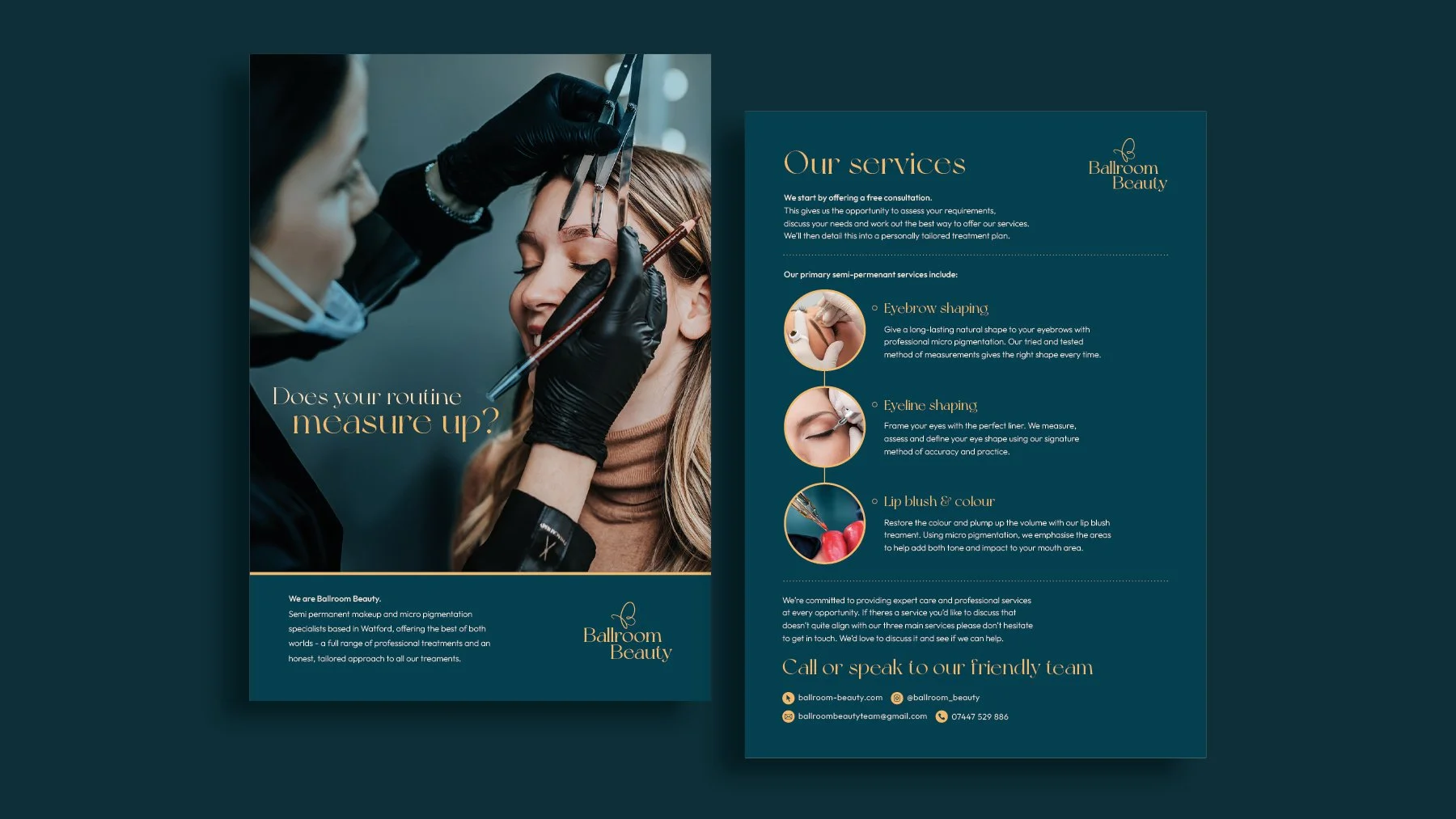
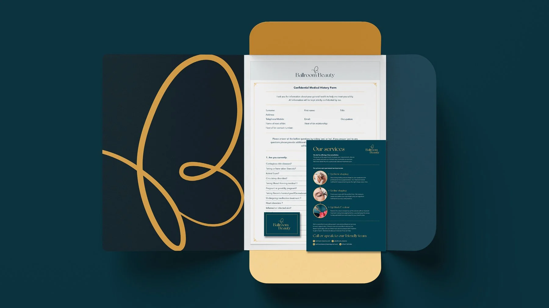
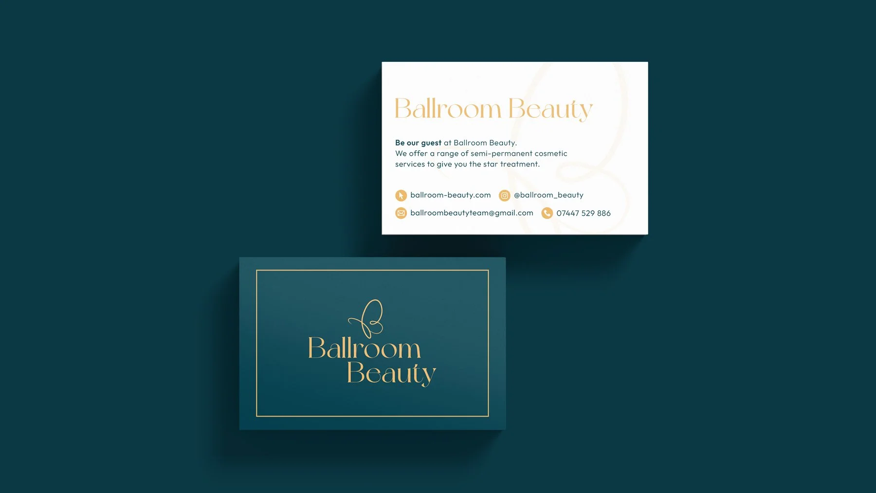
The identity was designed to work across a range of brand touchpoints including salon signage, marketing materials, packaging and product labels, and digital content and social media.
This ensures the brand maintains a consistent visual presence wherever it appears.
-
The finished identity gives Ballroom Beauty a distinctive and elegant brand presence within the beauty industry.
Through a combination of refined typography and clean visual design, the brand communicates sophistication while remaining accessible to a modern audience.

-
We created the full brand identity and website for Ballroom Beauty, a local salon based in Bushey, Watford. The goal was to craft a beauty salon brand identity that feels calm, elegant and welcoming. The brand needed to reflect the salon’s gentle approach while standing out in a competitive beauty market.
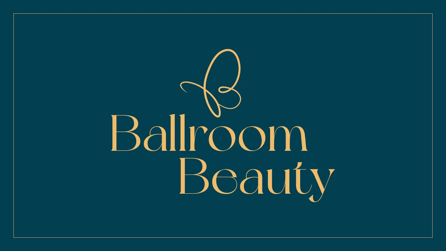
The identity centres on an aqua green and gold palette. Aqua green conveys freshness and serenity. Gold adds warmth, trust and a touch of luxury. Together, these colours create a soothing atmosphere that mirrors the experience clients can expect inside the salon. Every colour choice supports the promise of care and comfort.
The logo features a butterfly emblem. The butterfly symbolises renewal, lightness and transformation. Its delicate form echoes the salon’s gentle touch during treatments, and it serves as a memorable symbol that can be applied across signage, packaging and digital assets. The lines are refined to feel elegant without being overly intricate.
Typography and layout were designed with the same philosophy. Soft curves, open spacing and clean structures allow the brand to breathe. The result is a calm, confident identity that appeals to clients seeking a relaxing, high-quality beauty experience.
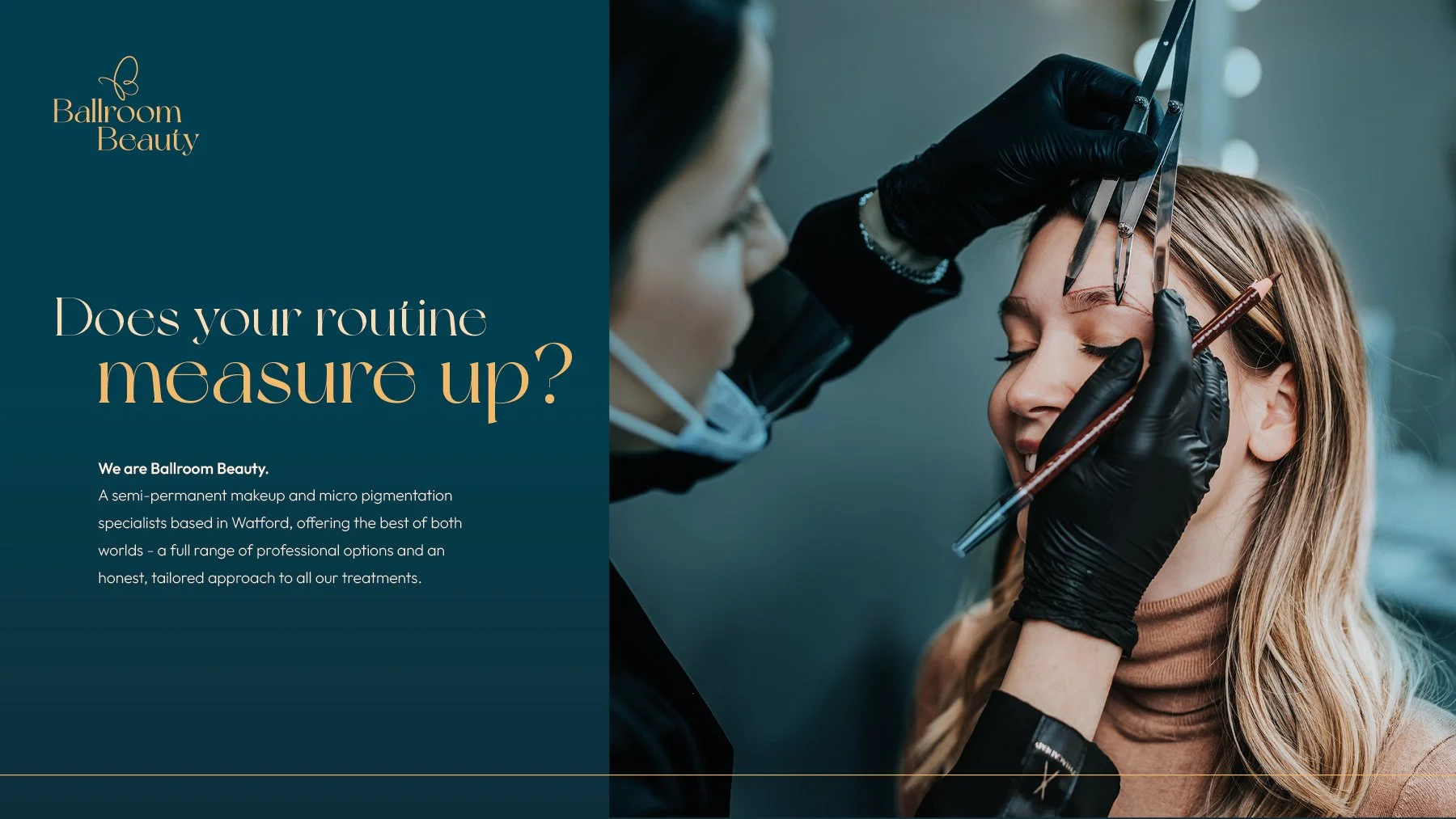
The website carries the same visual language. Flowing shapes, subtle gradients and clear navigation create an inviting online presence. Clients can easily explore treatments, learn about the salon and book appointments. Photography focuses on natural tones and close-up details to reinforce the feeling of gentle, attentive care.
Overall, the project brings Ballroom Beauty’s brand to life in Bushey, Watford. It provides a cohesive identity and digital presence that communicates elegance, professionalism and the salon’s commitment to a calming, luxurious client experience.